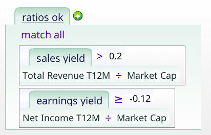
Screen vs Normal Money losers
Sometimes we don’t get to pick our universe of stocks. We just have to take the universe we’re given, and see if it can be worked with. In this article, I experiment with a restricted set of stocks: money losing stocks, and try to do the following:
- Understand the restricted set more clearly
- Improve the returns
- Reduce the volatility
- Understand what works, and where the bright spots are
- Understand when the restrictions hurt, and when they make little difference
- Create a reasonable screen, given the constraints I’m working with
- Wall off a set of stocks as truly hopeless (or maybe as good short selling candidates)
Why do this?
This exercise actually helps investing in two complementary ways.
Understand our restricted set
Once we’re done, we’ll truly understand our restricted set of stocks more clearly, and how it contrasts with the wider market as a whole. We’ll have a bag of tricks, and feelings about our restricted set. If, in some other context, we learn a stock belongs to our set, we’ll either know that we can stop looking, and go onto our next stock, or decide what we need to learn.
Learn more about our tricks
As we try a series of tricks and filters on our restricted set, they’ll either work, fail, or have too few matches to matter, or exclude too few stocks to matter. That will, in turn, tell us about the tools in our belt.
For the thrill of a good duel
Pick a side. Root for the power of the restriction, or for your gentle author. Pull up a chair, and get some popcorn. One of us will emerge victorious.
Examining normal money losers
In this section we’ll answer several questions:
- How does a stock qualify as a “normal money loser”?
- How do “normal money losers” do?
- Why did we pick the criteria we did?
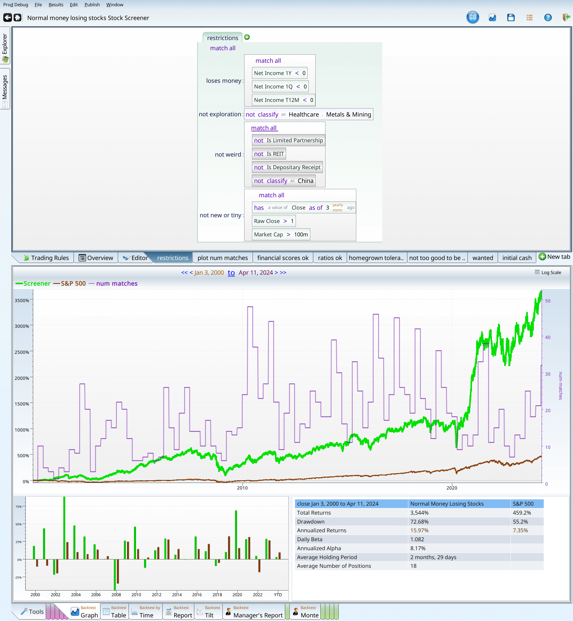
The criteria
Looking at the picture above, we see four themes:
- Money loser — we want companies that actually lost money, both in the last quarter, the last trailing twelve months, and the last yearly report. No ambiguity, no excuses. Just 100% red blooded money losers.
- No binary option type stocks — Biotech companies can have have a very odd configuration, as can metals and mining companies. In both cases, companies are hoping to strike gold — either figurative gold, or literal gold. Either the companie’s future blockbuster drug gets FDA approval, and they go up hugely, or they don’t, and they go out of business. Investing in such stocks can be lucrative, or a way to lose your shirt. But the financials will tell you nothing about whether they do or don’t have a good drug. Similarly, mining companies will or won’t strike gold. Either way, they’re not what we’re looking at here.
- No weird corporate structures — REIT’s, pipelines, ADR’s and Chinese companies can be wonderful or terrible investments. But they definitely don’t count as normal.
- No IPO’s or penny stocks, or microcap stocks — IPO’s don’t have a lot of financial history on which to judge the company. They also can feature large, locked up shareholders, who will sell stock as their lockup period ends. Penny stocks are hard to invest in because you’d have to invest too many shares to actually make a difference, and they typically lack liquidity. Micro caps (under $100M) also lack liquidity. In all three cases, they don’t really count as normal, so they get excluded.
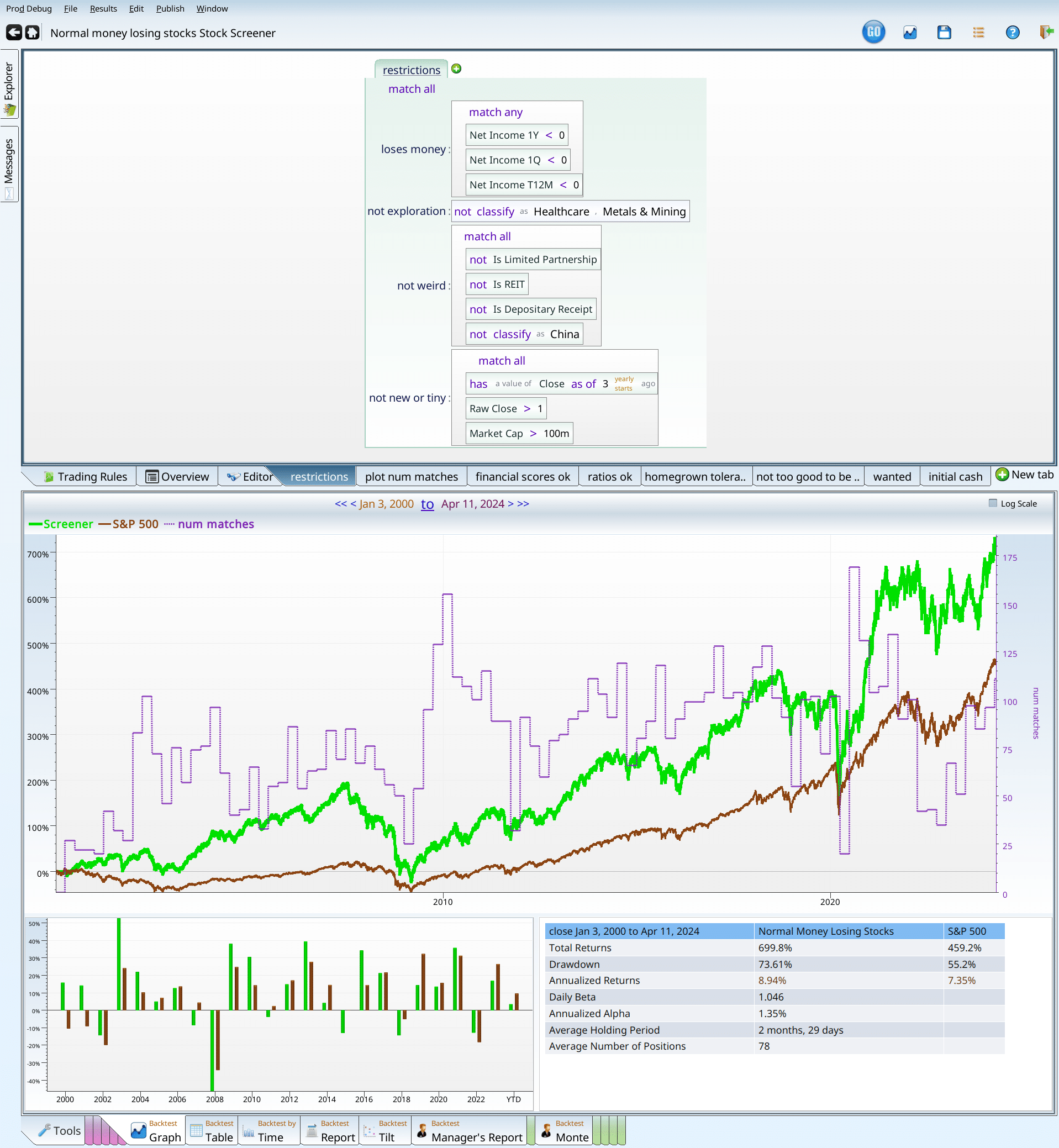
With these criteria locked in, we get 400-ish stocks.

It looks like a bit of everything, (except healthcare), although there’s a lot of technology. Breaking our results down further (the pun will tell you to go to results breakdown tab), we can see that for the most part, the results are all over the place.
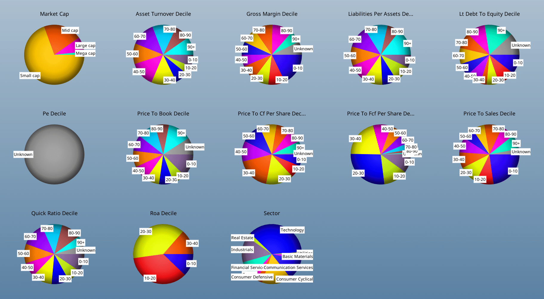
A few stand out results: The P/E deciles are all “unknown”, because stocks with negative earnings do not have P/E ratios. Perhaps people don’t use income as a pricing metric if it is negative… Similarly, the Roa decile pie chart is all 40 or less, indicating that 60% of companies make money. Just not these ones.
With slightly less surprise, we can note that the companies tend to the small side; there are very few mega caps. Price to X ratios all tend to be weighted to the lower values, as investors are willing to pay less for money losing companies than they are for money making ones.
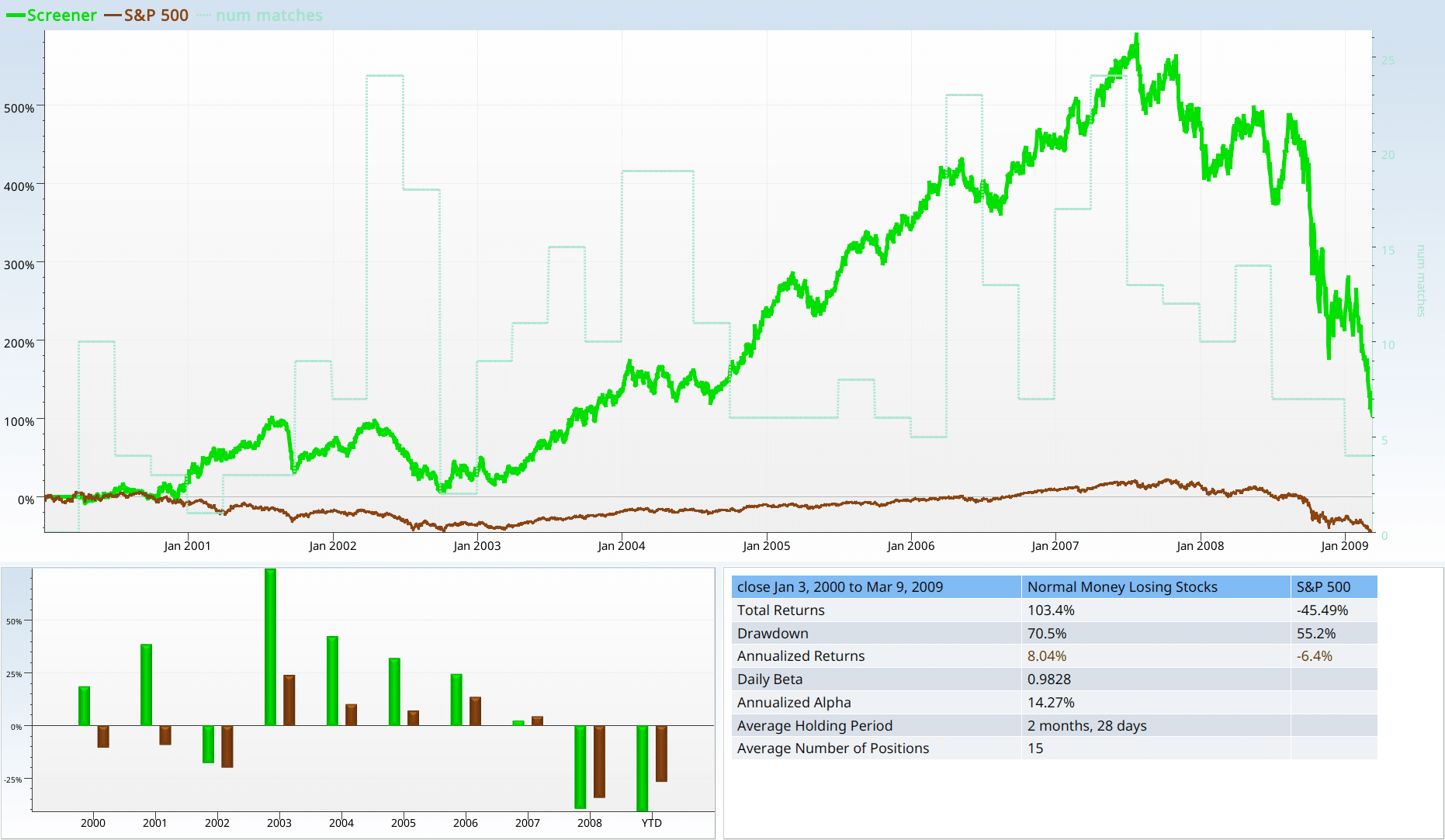
The performance of normal money losing companies
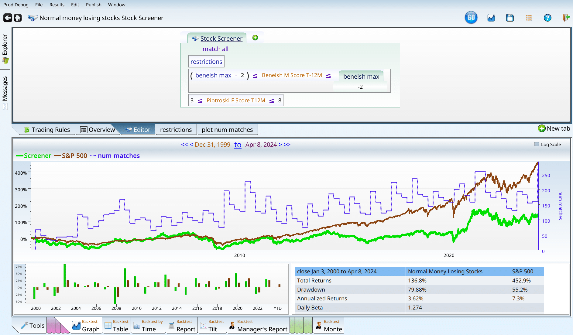
I’m delighted to tell you that if you follow a rigorous strategy of investing in normal money losing companies, rebalancing faithfully each quarter over a 24 year span, you can look forward with great anticipation to your $100,000 turning into …. $72,000. Clearly not a good strategy.
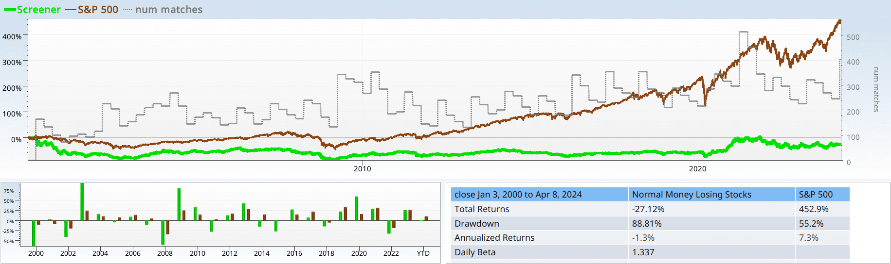
Yet, if you look at the backtest by time, it trounced the market in 2003, 2009, and 2020. It kept up with the market at other times. And fell on its face 11 years our of the 24. Our alpha was -10%, and our drawdown was 88%. So, yeah, not a winner. Notice, also, that we have about 300 stocks on average in our portfolio. This will matter later, as we trim this number of holdings into fewer, hopefully better stocks.
Recap: introduction
If we don’t know anything else, other than that a stock is losing money, we should not be excited to make it part of our portfolio. If we have a stock, and it is losing money, (yearly, quarterly, and over the last trailing twelve months), we should consider letting it go.
Can we win with normal money losers?
To try to assess our odds (its more fun to wrestle with a human than a polar bear), we turn to the positions heat map, sorted by return. If it were negative across the board, we might throw in the towel right here.
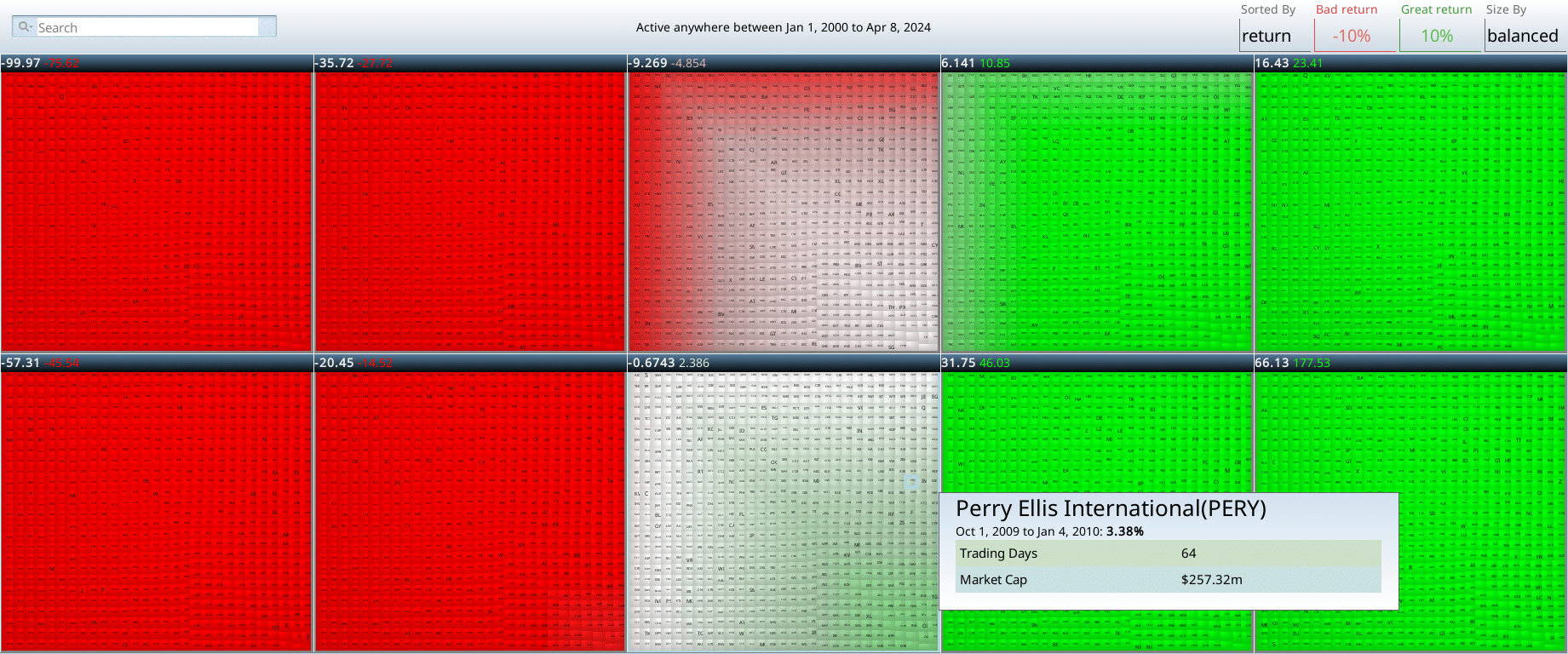
It’s more than half negative, which is one of criteria we use to classify “normal money losers” as a red flag. The other flag (negative performance since 2000) also applies, so I may be in for a bit of a struggle. That said, I’m not going to slink off the stage without a fight. So, I list my go-to strategies for improving a screen:
- Large cap/High volume — maybe we can hide in a crowd…
- Validated academic regressions — maybe we can use an academically validated regression to control our junk, and get good results.
- Price per whatever — Valuation for the win?
- Momentum — We use change over 3 months, 1 year and 5 year.
- Homegrown scores — using Income statement score, Balance Sheet score, Cash flow score, and Value Score to try to improve the results
- Market conditions — Maybe it’s OK if more people are losing money or SPY is going down.
If some reasonable combination of these factors doesn’t make marketlike returns, while matching a reasonable number of stocks (at least 30, most of the time), then I declare the red flag the winner. Otherwise, if I manage to trounce the market, with less than 60% drawdown, I declare myself the winner. Finally, if these factors push our restricted set into a marketlike performance profile, I declare that to be an uninspiring, insipid tie.
Market cap and trading volume
My first thought is to decide that this is a small cap problem, and that if I can rule out small caps, I can get reasonable results, and build from there. I first tried $10B as my cutoff, and almost skipped to the next section without any further analysis.
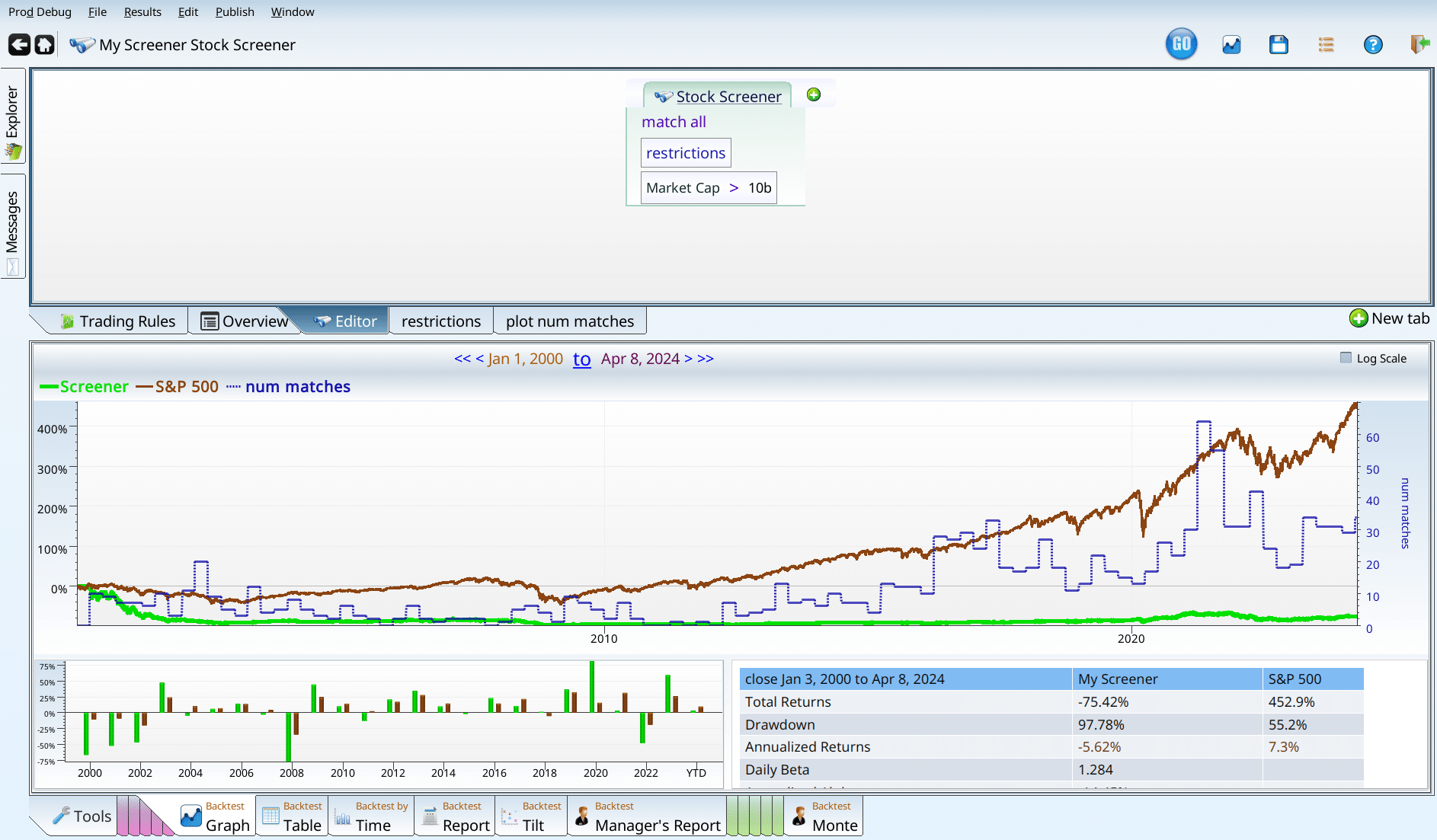
The drawdown of 97% is a complete catastrophe all by itself. Trying out $1B, I get better results.
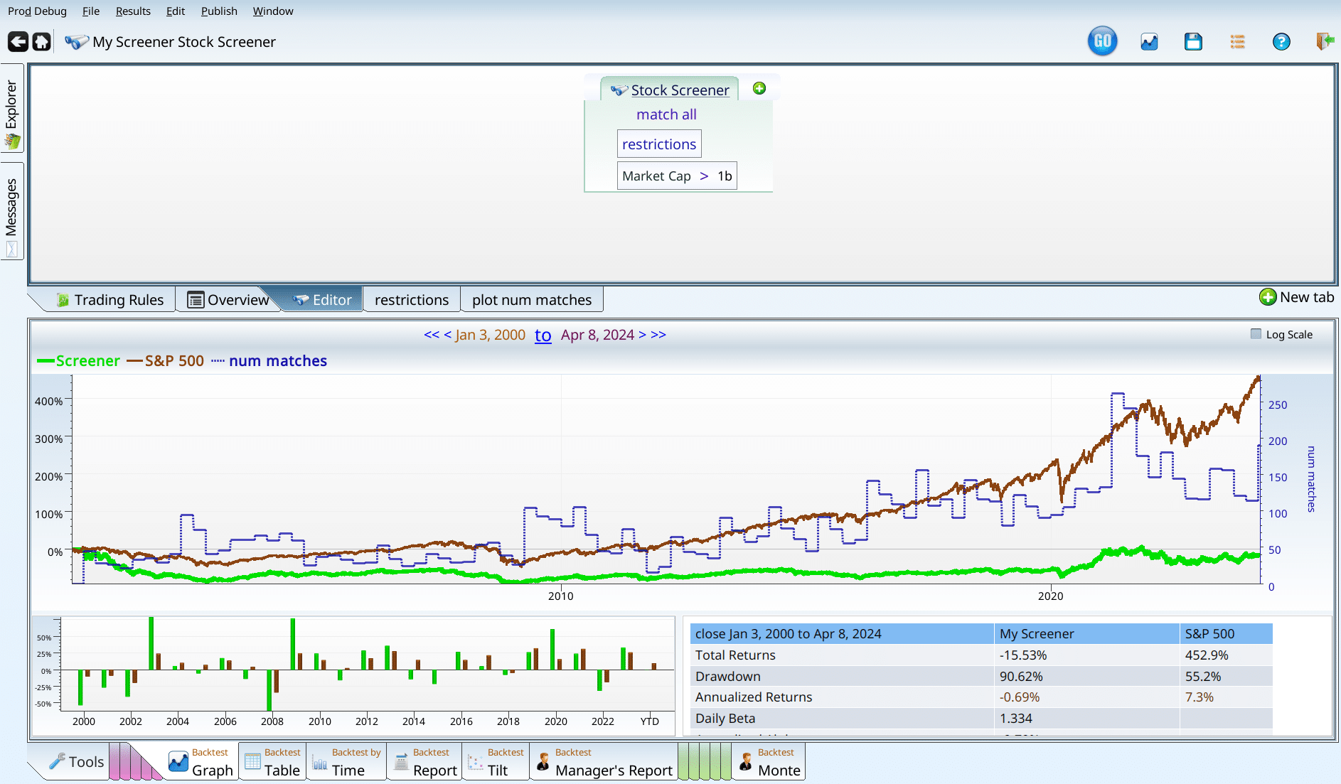
That said, I don’t like these results enough to push on with market cap. Similarly, testing with Close * volume in the top half (or top 10%) just yield more depressing graphs (which lose more than 27%), and a slightly frustrated (but still gentle) author.
Recap: market cap and trading volume
Popular stocks that lose money are still likely bad investments. Large companies that lose money are likely bad investments. To repeat (or rephrase): money loss trumps popularity and size. There are counter examples (Tesla and Amazon), but the general rule is clear.
Validated academic regressions
The Piotroski score is an amazing tool: it can repair a broken portfolio, and sneaks its way into quite a number of screens found in Equities Lab, and elsewhere. So it’s perfectly natural to try Piotroski here, and see what we get. To save on screenshots, the results are below using our monte-carlo operator. This lets us run multiple backtests in the same screen, and quickly see the results. Like this.
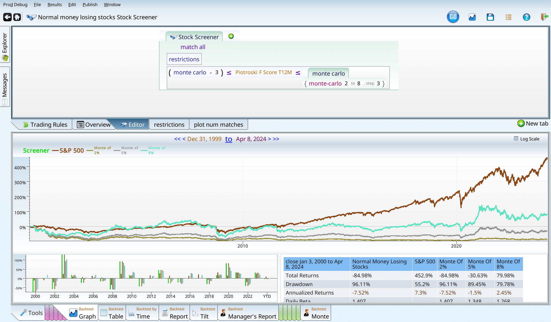
Sharp eyed readers will notice that we didn’t test Piotroski scores of 9. What gives? Money losing stocks automatically lose a point, because they …. didn’t make money. So no nines.
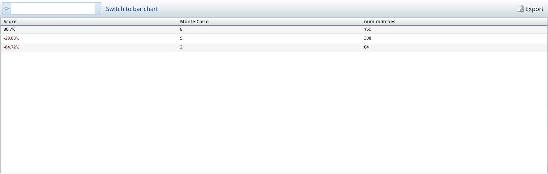
Although most of the stocks are in the 2-5 range, the stocks that get positive performance are in the 5-8 range. Next we try the beneish score. We break it into blocks of 5, starting at -10. According to the literature, -3 is ideal. So we want plenty of space on both sides. Running this, we get that -5 to 0 is the only range worth considering.
Should we push in further on that magic range?
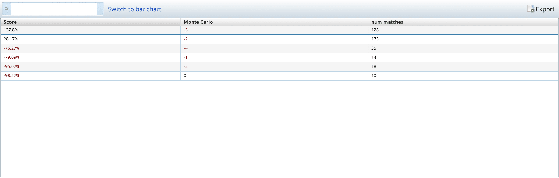
We see that -4 to -3 is the perfect range, and that -3 to -2 isn’t as good, but it is still positive. Here you can see the first problem I face when trying to build a screen. It is really easy to get too selective early in the process, and run out of raw material to build with. Although it is tempting to put Piotroski 5-8 together with Beneish -4 to -3, and stop there, I’m going to argue we should push on with weaker criteria.
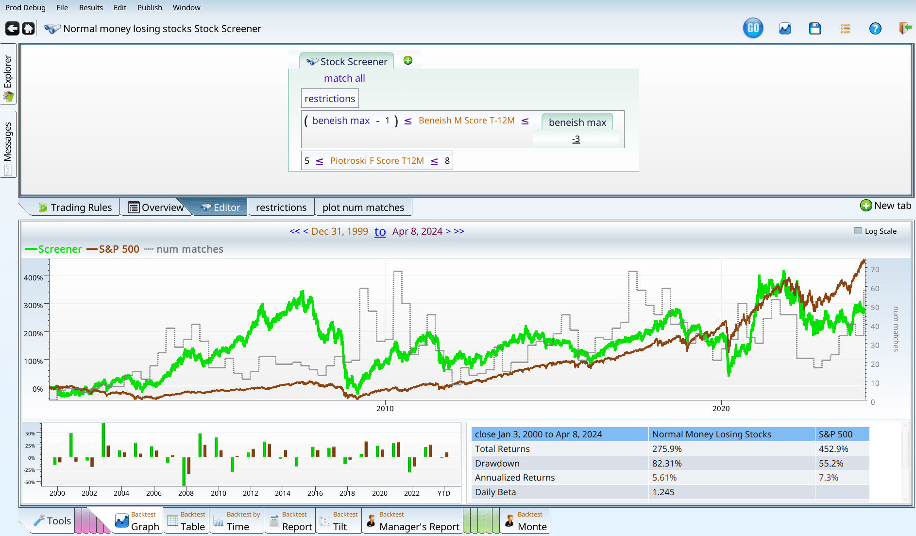
Notice that we have 30-ish matches throughout. That means we really can’t filter too many more stocks out. If we had to stop here, I’d declare this a mild loss, because we underperformed the market, and suffered an 82% drawdown while doing so. I’m not quite ready to give up. So my next thought is to loosen the criteria until we get something much closer to our original screen, just with a some low quality stocks removed.
We took both of the beneish sections that had positive performance, and did the same with the two best Piotroski bands, excluding only the no good, really bad, terrible, rotten Piotroski that lost 85% of its money.
Recap: Validated academic regressions
It seems that the Beneish score and the Piotroski score are really really good at excluding bad stocks. This makes sense — that is their job. It’s encouraging to see that they work even when used in a restricted domain where no one makes any money. We’ve also learned that some combinations of Piotroski and/or Beneish lead to irrecoverable loss.
Using price per whatever
First up we try P/E. Because its popular, and everybody uses it.
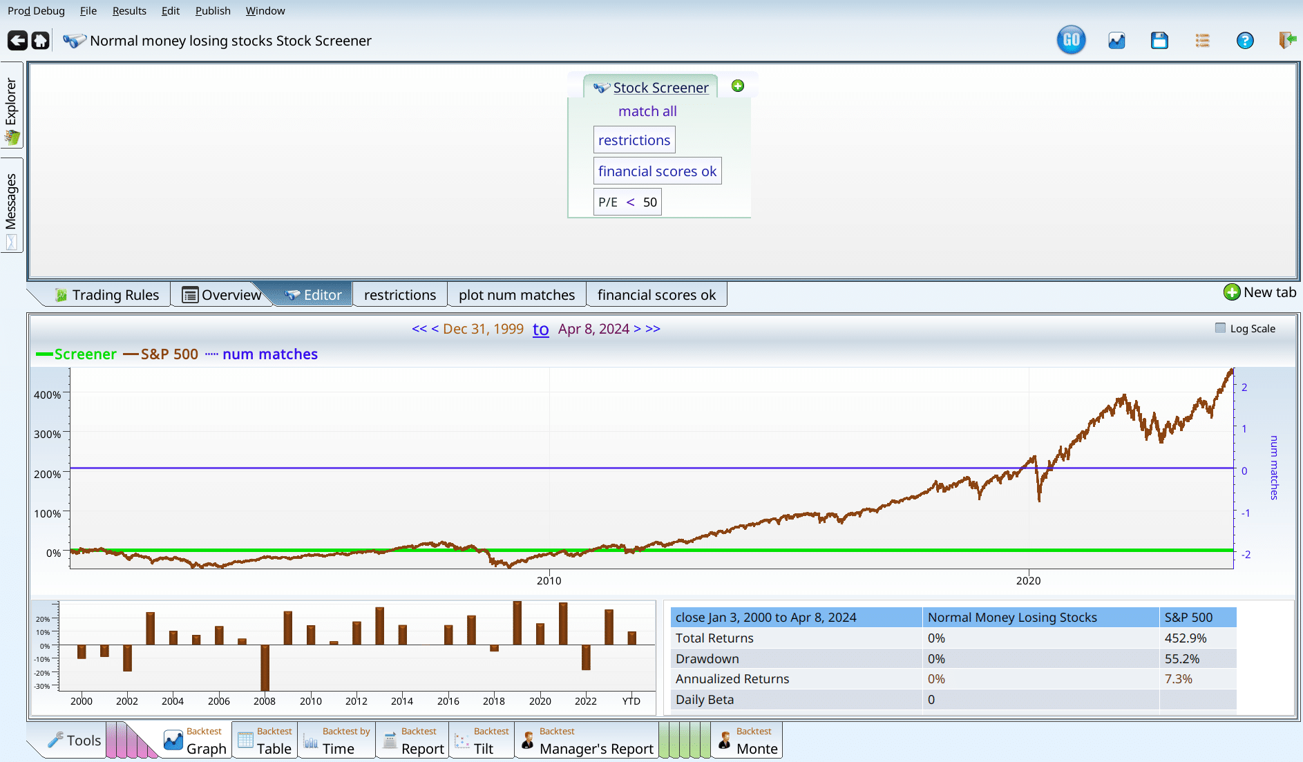
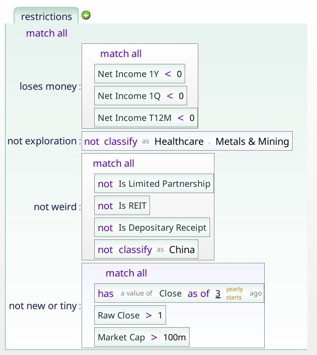
Oh, wait, we have no positive earnings. The joke’s on me. What if we use earnings yield, which is allowed to be negative? We disable the financial scores ok part of the screen (notice that it has a darker background than the other two), and run our test, going by intervals of 3%.
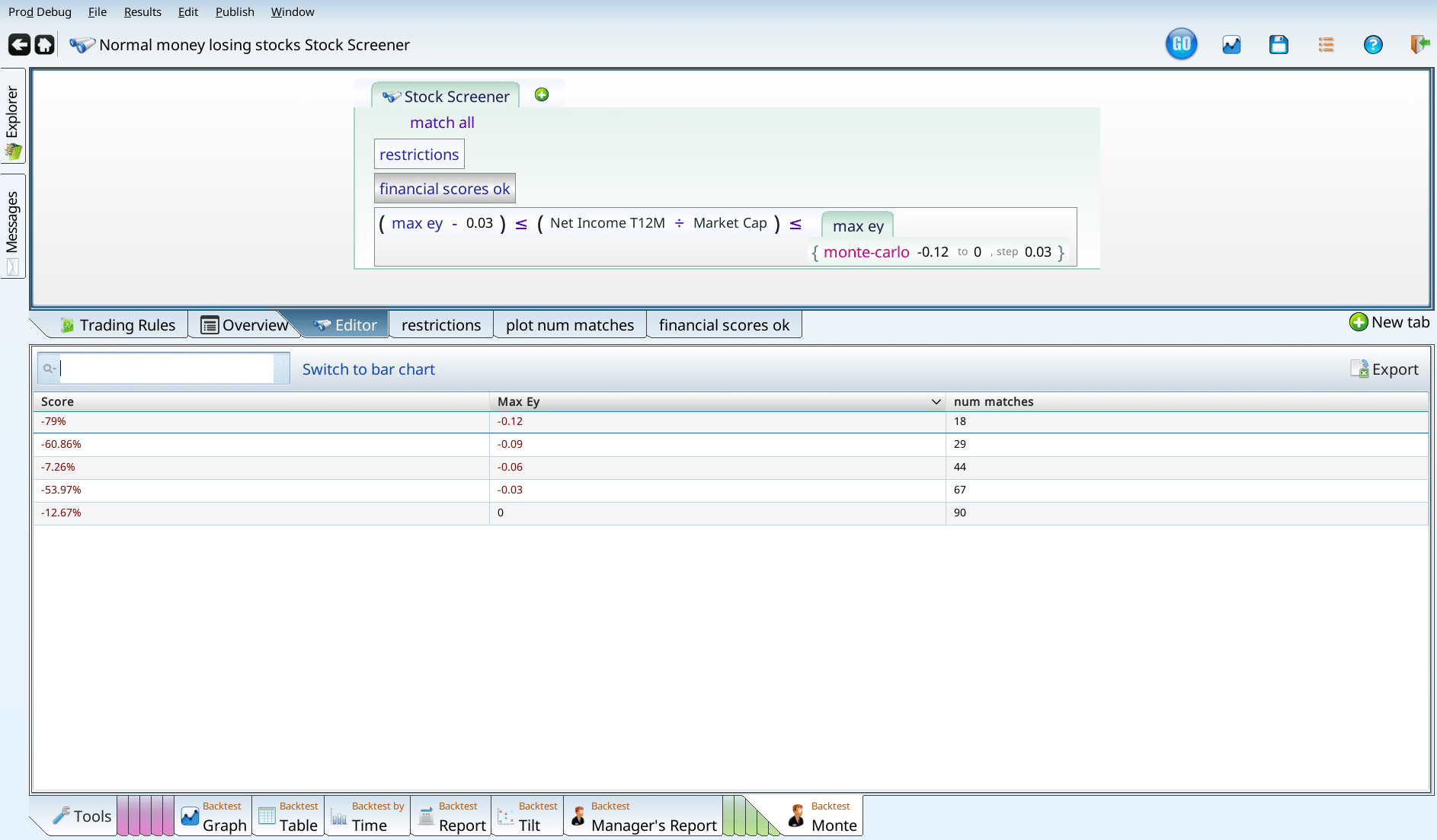
So, the -79% disaster is all the companies that lost between 15% and 12% of their market cap, while the ones that lost between 9% and 12% of their market cap in income created a strategy that lost its investors “only” 60%. What if we enable the financial scores? Since we are going to use them anyway, we really need to see how things look with th
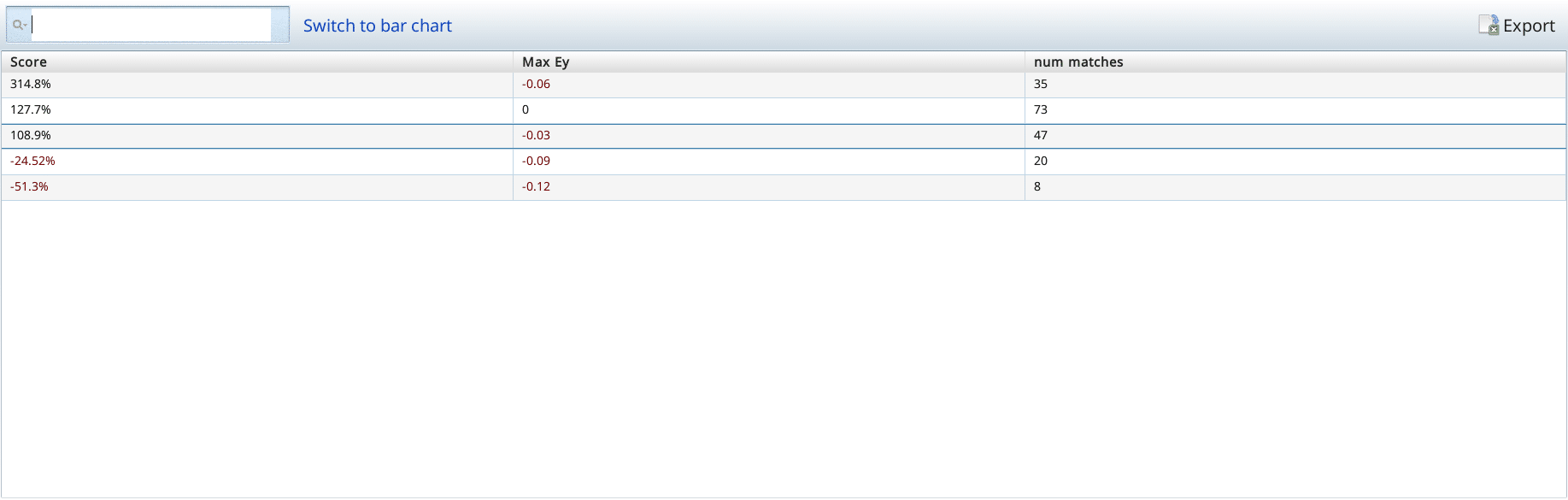
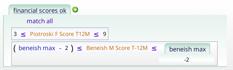
With the financial scores enabled (and our earnings yield criteria), we have four non-disasters and one disaster. Filtering out the disaster, we can now add sales yield, and filter out the disasters.
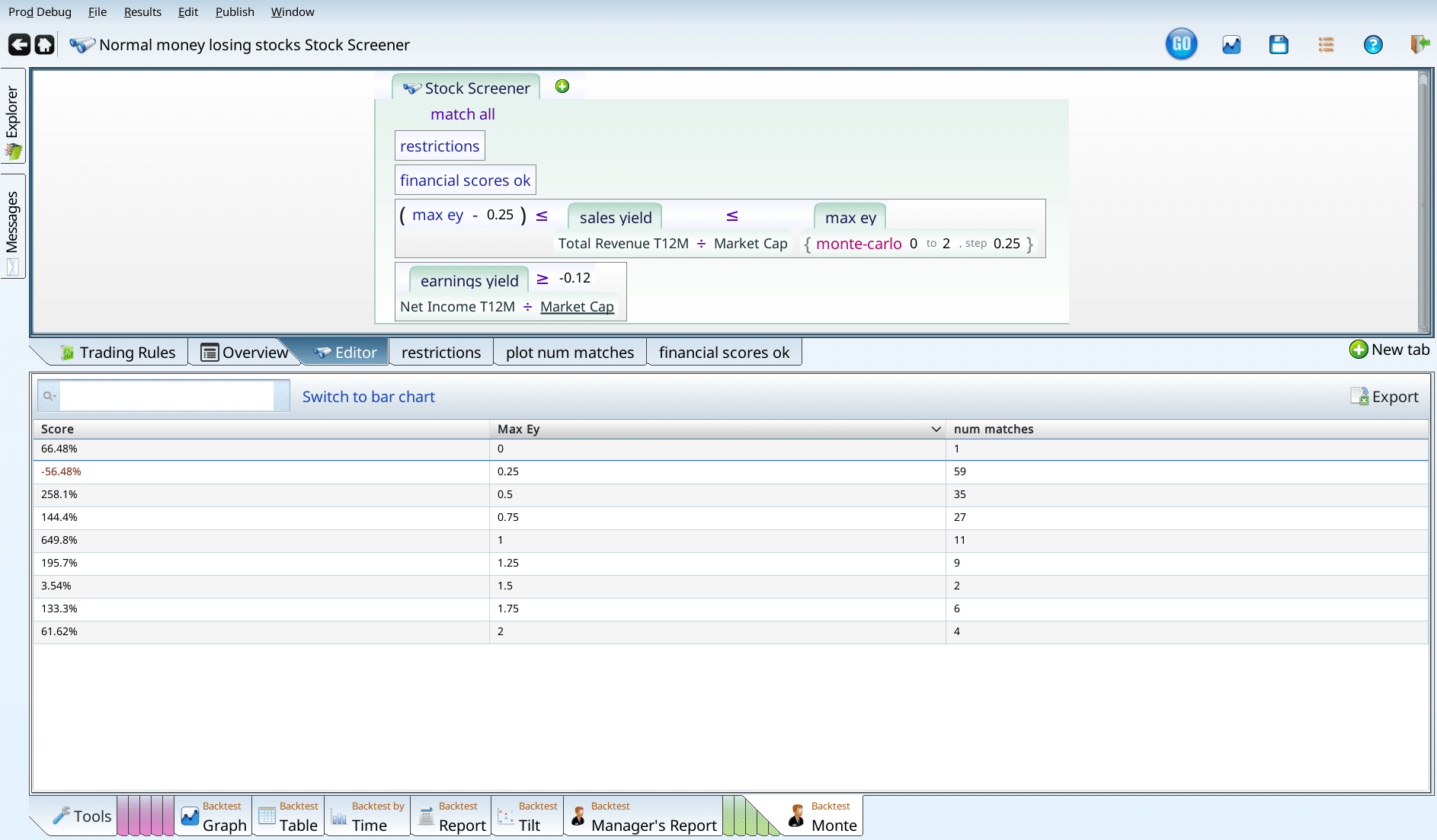
Clearly most of the disasters are in the 0-0.25 range. Lets push in so we don’t have to throw out nearly 60 stocks. Going in increments of 5% from 0 to 1, we get a bunch of horrible results of the left edge — which makes sense. Companies that are super expensive in terms of their revenue, and which aren’t making any money are disasters.
It seems like 0.2 is a good cutoff. One could argue for 0.1, as that slightly positive bar from 0.15-0.1 could have a gem or two in it. But I like 0.2 better, as we get rid of more bad bars, and I don’t much care about a bar that is that close to zero.
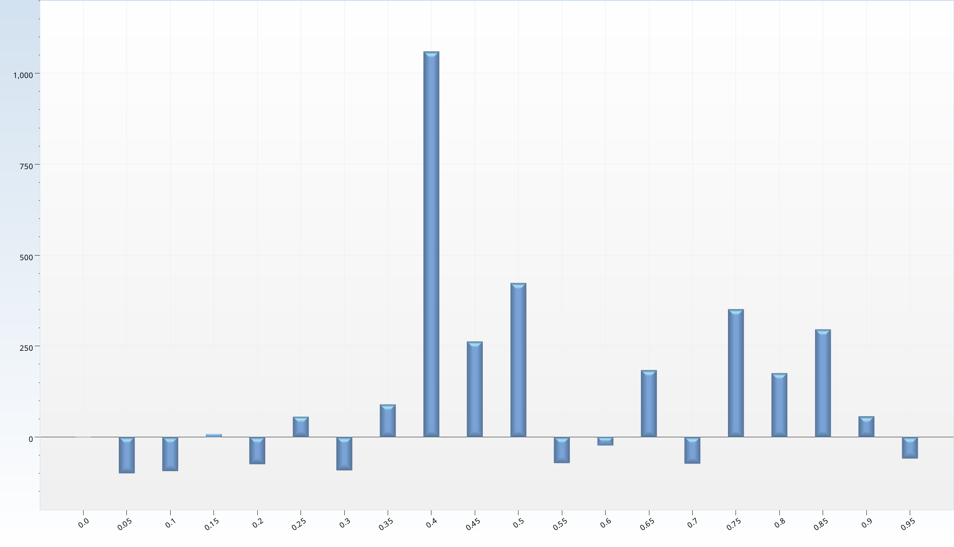
Keeping our exclusion of the sales yields below 0.2, we now test each interval from 0 to 1 on Free Cash Flow Yield, hoping for a few really terrible bars to exclude. Instead I get two bars of pure awesomeness on one side, and drifting indecision after that.
Each of the bars after the 0.1 is created by a very small number of stocks; these portfolios frequently have nothing in them. Further, the fact that some go up and some go down with no clear pattern makes me dislike it further. I actually am not going to make any changes to the screen based on this data; it doesn’t really feel reliable.
Recap: price per whatever
When we just run the financial scores, and valuation ones, we arrive at a solid tie. We have gotten market-like performance from a bunch of money losing stocks, with an average of 50-75 stocks. We are no longer exactly losing. But we are not really winning either. The drawdown at 76% is unacceptable, and there’s just no point to taking all this risk for slightly negative gain. If I had to create a money losing portfolio, this is a good approach. But I hope to do better.
Notice we have about 70ish stocks being held at any given time. So we are not done yet, but we have to be careful about what we cut from here.
We’ve also learned that the two academically validated financial scores are really good at getting rid of bad companies. They do better than pricing ratios (earnings yield, sales yield, and FCF yield).
Homegrown scores
I next turn to homegrown scores, and see how they stack up. I consider five scores, each of which range from 0 to 10 (inspired by the Piotroski Score).
The Value Score
The value Score doesn’t look for amazingly cheap stocks as much as it favors stocks that are cheap across a broad range of valuation metrics. So how does it do, once we have all our other criteria in place? The simplest way to test this is to backtest the criteria, with one more: value score = X. Varying X from 0 to 10, we can see how each does.
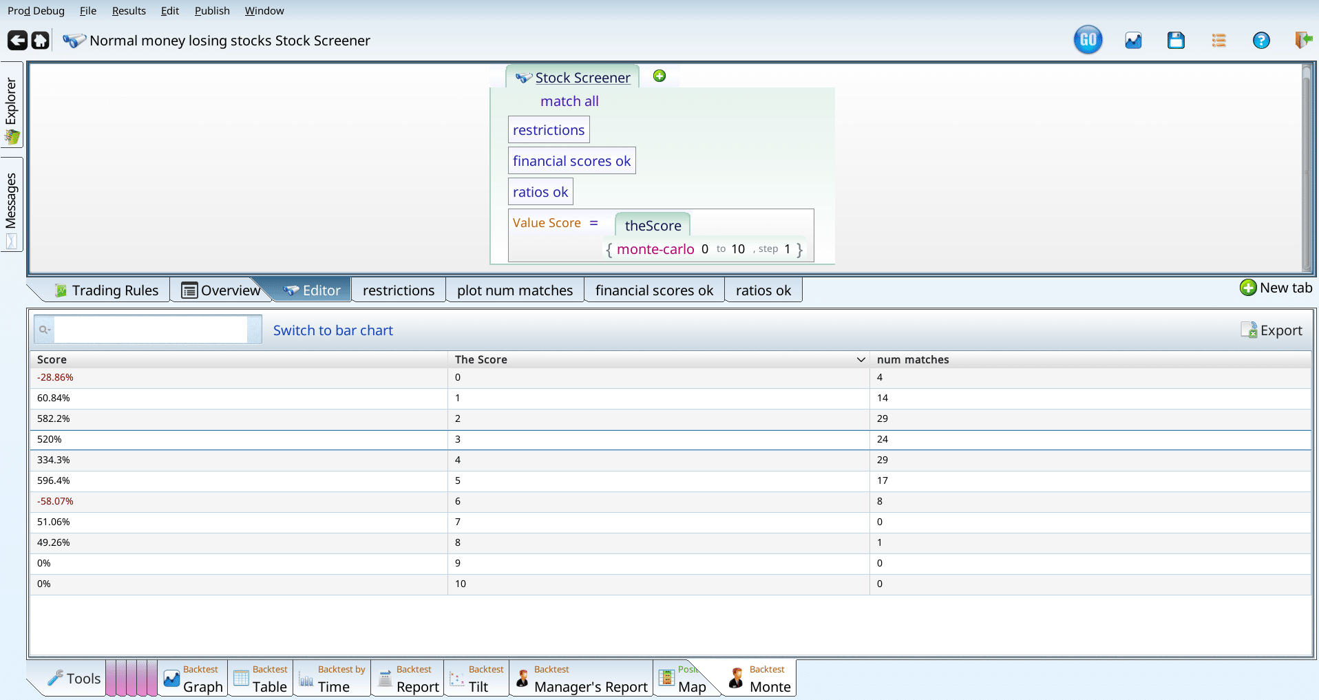
When we look at the entries, we see very few matches for 0 and for anything over 5. Both look worse than the baseline, but we have just too few entries to make a good decision. How do we fix this? Go get more data, of course. In our case, I do this by disabling the financial_scores_ok and ratios_ok terms, so we get more matches. This means our conclusion is based on all normal money losing stocks, not just money losers with healthy scores and good ratios. That said, we do get more stocks.
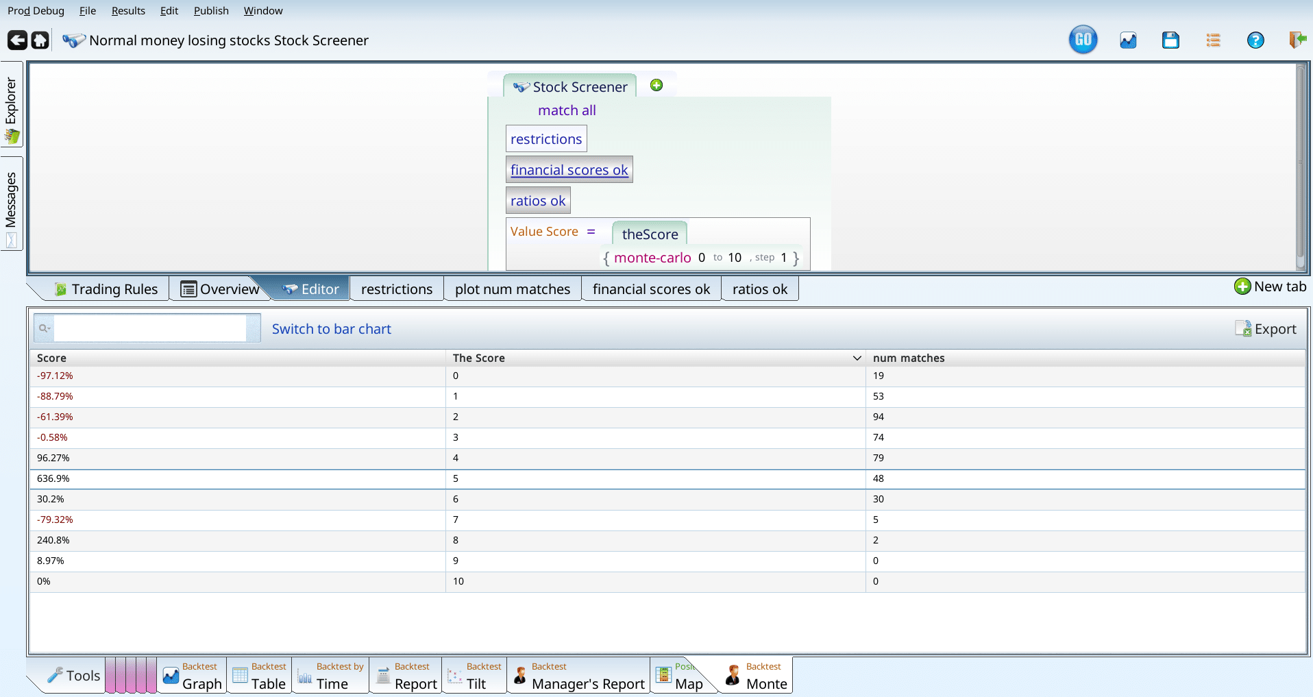
Those results seem pretty clear: really low value scores are no good. We can say the same about some of the high value score results, but even with our extra stocks we still don’t have enough stocks to make a good conclusion. So, I’m going to add the condition that the value score must be over 1, and continue. Can we actually continue? We have so few stocks that we have to use any remaining criteria very gingerly, or else we end up with too few stocks. That said, I think we have room for one more criterion.
The income statement score
The income statement score is a 10 point checklist of things we like to see on the income statement part of the company’s financials. We can use this to see if it helps in the weird corner of the market we are in.
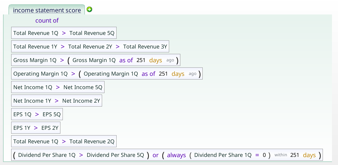
My first worry was that, like the Piotroski, it would lose a point or two right off the bat. But, no, there’s no references to 0 in that term. Since -1.5B income is greater than -2B income, if a company was losing $2B and managed to only lose $1.5B, it would get that point.
Running our income statement score on top of the other criteria produces the chart below which argues that high income statement scores are bad.
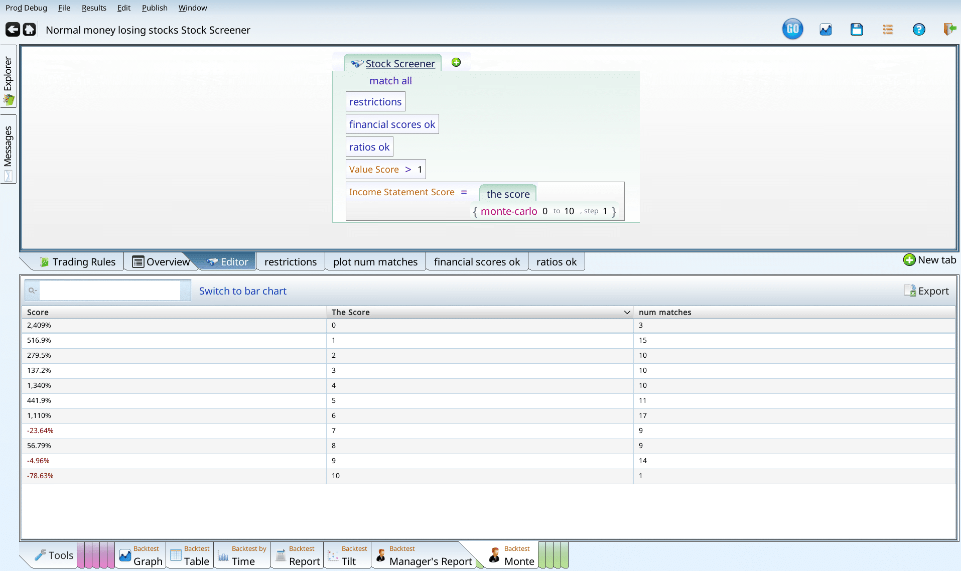
This is a good time to highlight the role of intuition or “gut feeling” in building screens. I really don’t like high income statement scores being bad. That said, after some thought, I do see the rationale — if a thing seems too good to be true, it probably is. So we let the high income statement stocks go.
Balance sheet score
When I do the same analysis for balance sheet scores on normal money losers (without our other criteria), the choices range from awful to even worse.
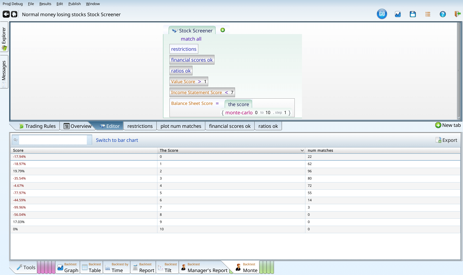
This is hard to even make sense of, since there’s only one positive number that has more than zero num_matches, and it seems to be low. Pressing on, I reenable the criteria, and get the following thrilling chart.

It seems that everything over 5 is problematic. We don’t have that many companies with really high balance sheet scores that are losing money, but those that are are apparently menaces. We could filter at “over 5” or “over 7” I give in to temptation to not experience that -60% and set the cutoff to include everything under 6.
Cash Flow Score
Our Cash Flow Score looks for features from the cash flow part of the financial statement that tend to go hand-in-hand with good future performance. When we add the Cash Flow Score to our screen, changing the desired values randomly, and testing each one, we get that really low scores are bad, and everything else is OK.
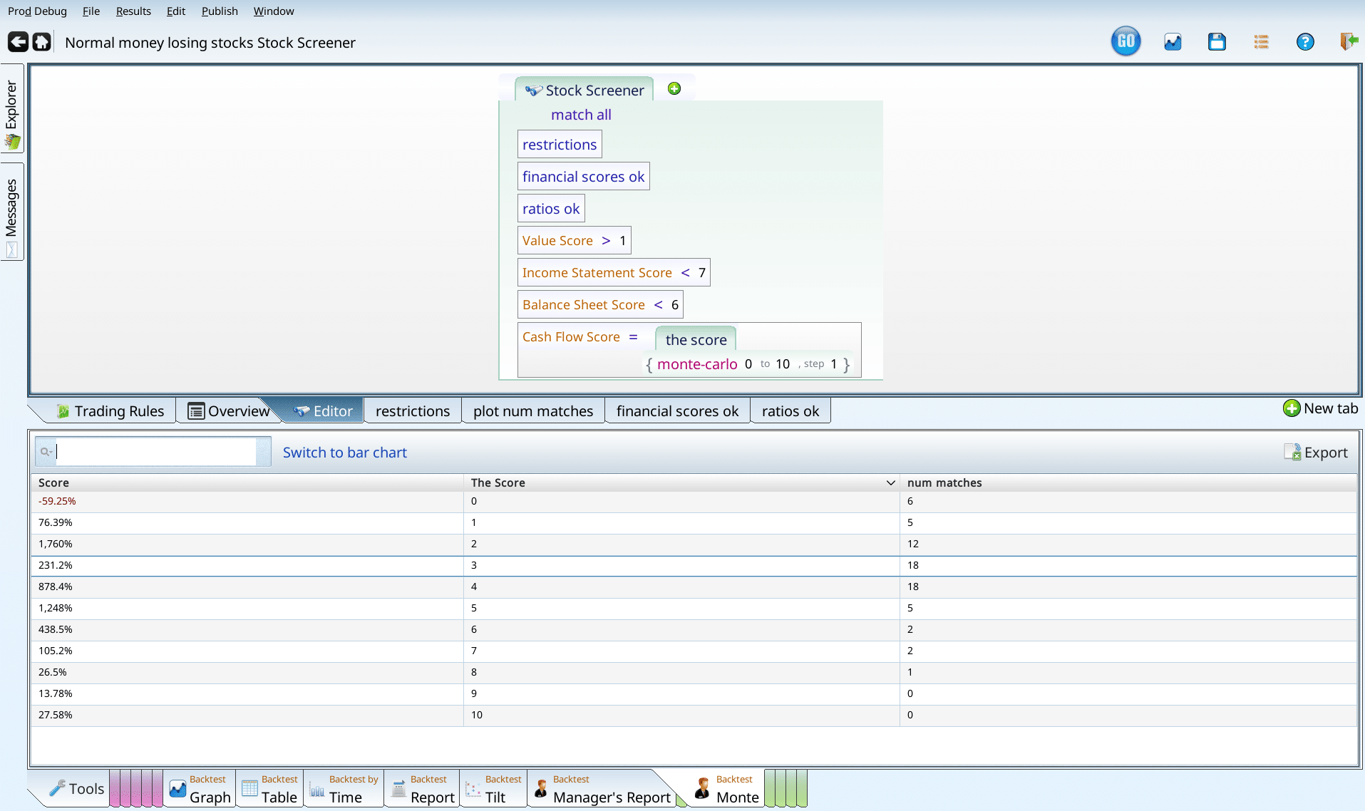
But, again, we have the curse of the small number of matches. So, we disable the financial scores, ratios, and value score, and see if there is any guidance from the larger community of money losing stocks. Again low is bad (worse), and high is better.
We use this as evidence to add an exclusion of stocks with cash flow scores of 0 or 1 from our screen.
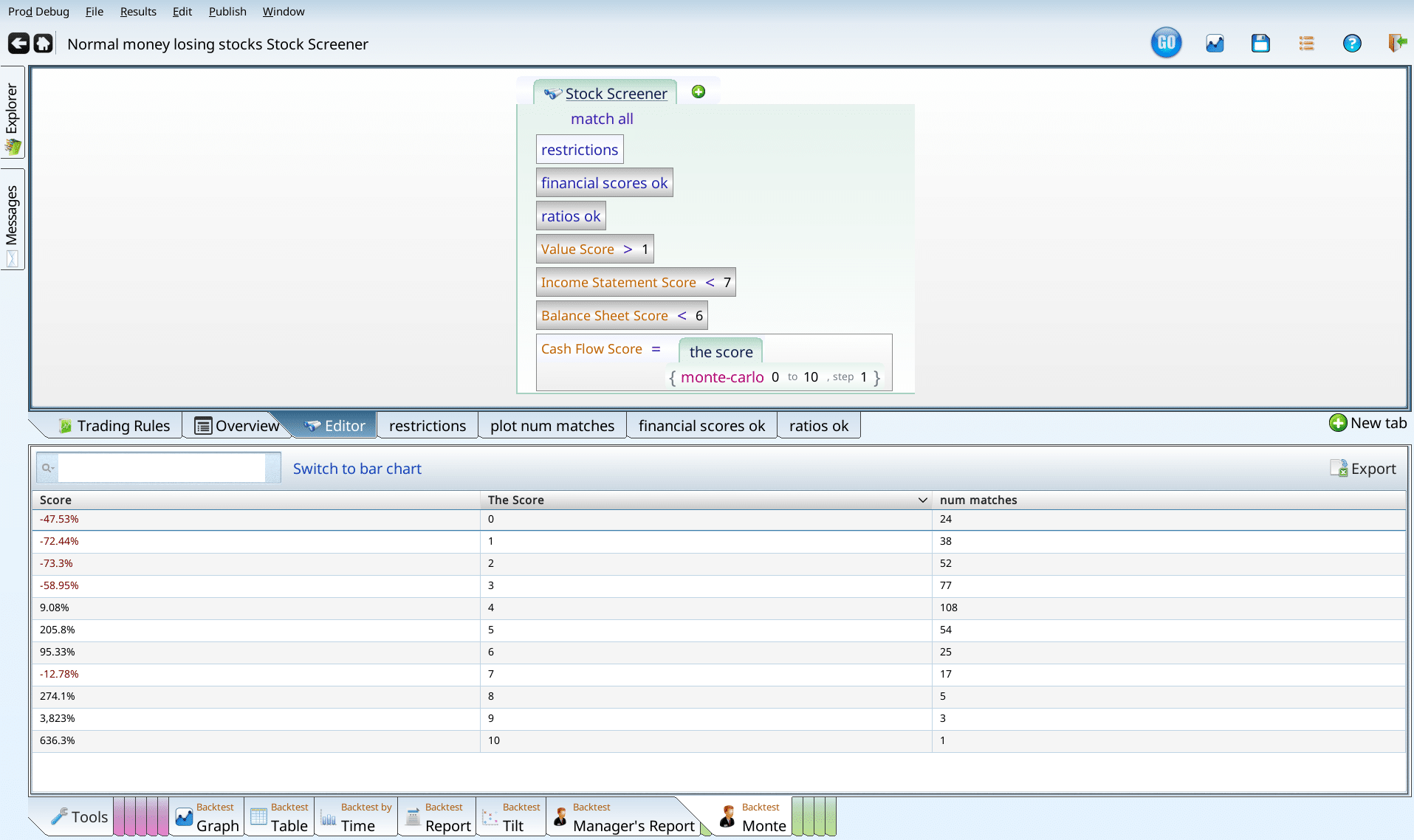
Momo Score
The momo score is our last score for this section. It checks that the performance over a variety of time periods is within bounds. Excess performance, or very bad performance is an indicator of future trouble. Using this score as one more score, and running our test, we get a clear sign that momo scores less than 4 are bad news.
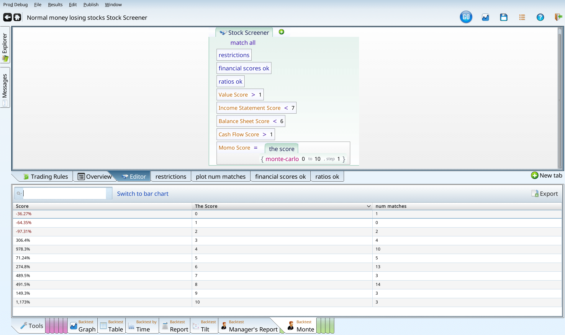
Again, we notice that most of the matches (at this stage) are not in our exclusion zone, and that the number of matches is really small. So again, we disable all the criteria except for normal money losing, and run our test of Momo Score again.

Without all of our other criteria, anything under 8 loses money. Notice that if you want to keep more than 10% of your initial money, you need a Momo score greater than 3. So there’s something very ominous about low Momo values.
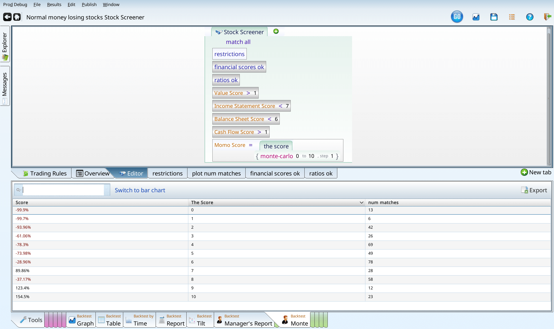
I’m going to add an exclusion that Momo Score must be over 3, since that’s the timid thing to do, and our screen’s performance is already pretty good.
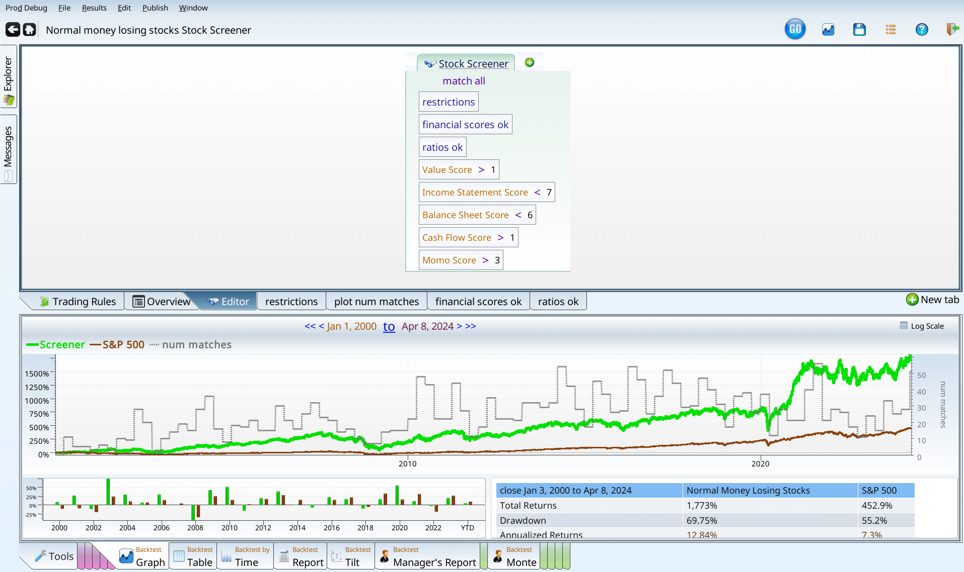
Homegrown score recap
We found all five of the five homegrown scores we tested useful, and arrived at a screen that gets good performance. We have almost 13% annualized performance, and an alpha of 5%. Not bad for money losting stocks.
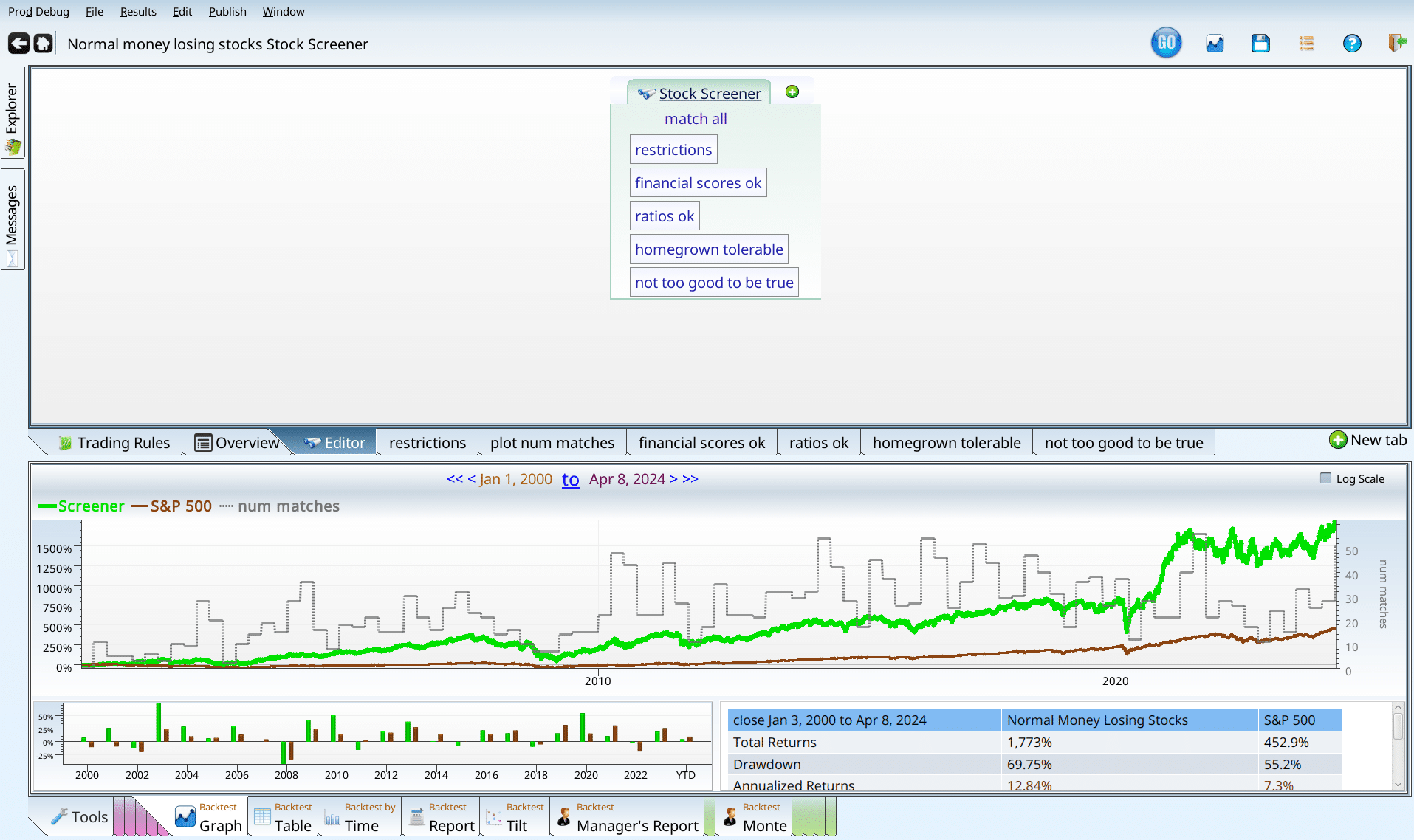
Now is the time for a bit of clean up and organization. We’ve added six things to the screener, and three of them seem more generic than the other three. So, we create two variables “not too good to be true”, and “homegrown_tolerable”. Why do I use tolerable rather than OK? We’re using the scores very timidly, to cut off the very worst offenders, rather than as a primary filtering mechanism. I think that “tolerable” cues the reader that stocks with pretty bad value scores or cash flow scores are still getting in.
Past Earnings
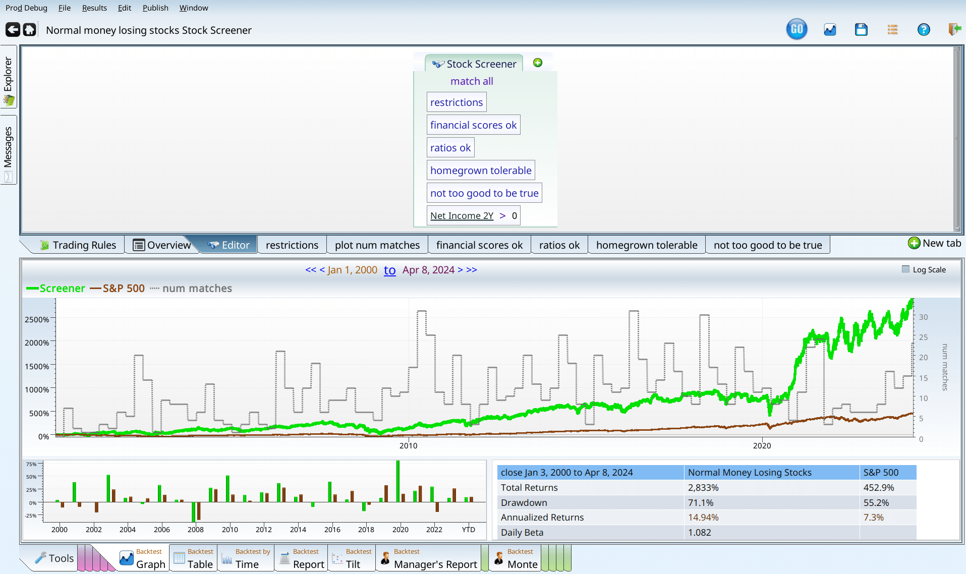
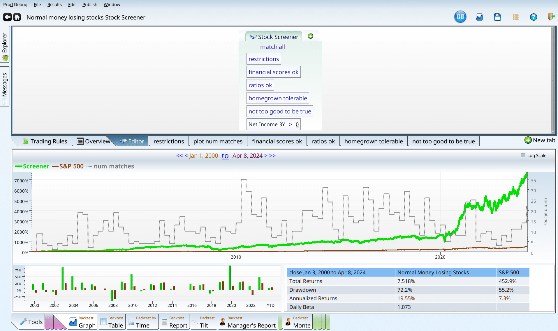
I was about to declare victory when a thought occurred to me: does having made money in the past make a difference? Just to check, I added the term “NetIncome_2Y > 0” to the screener, and was blown away.
Just to check to make sure I wasn’t hallucinating, I tried one year before that, changing the NetIncome_2Y to NetIncome_3Y.
Just to see how far it went, I ran the same screen with “NetIncome_4Y”, and was frankly relieved to see that the party stopped sometime.
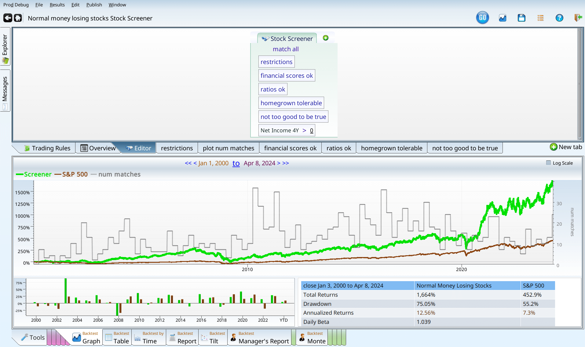
In all three cases, the number of matches is really small, which means we need to combine screens. So we try the lovely “or” operator, to give us the larger group of still awesome money losers we want, insisting that it had to make money two years ago, or three years ago.
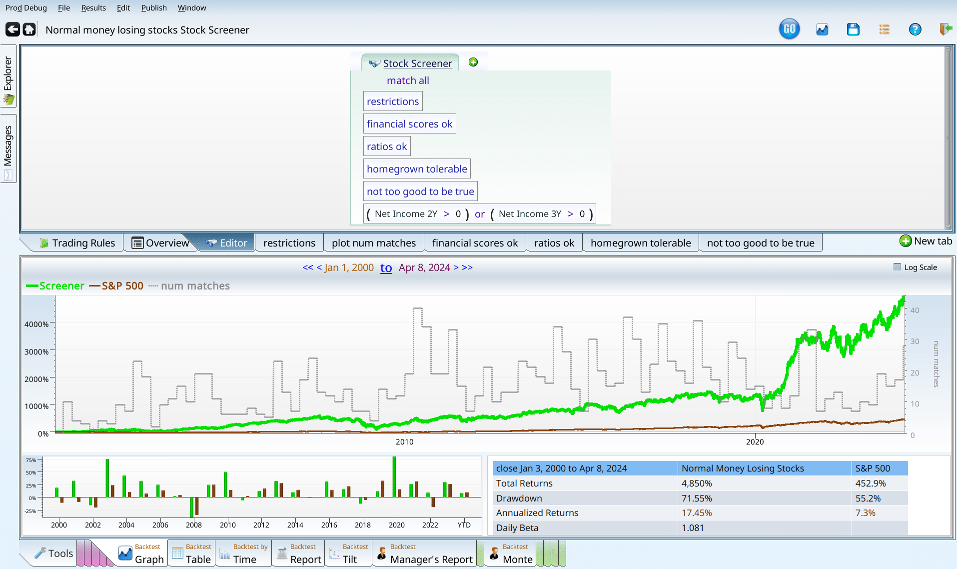
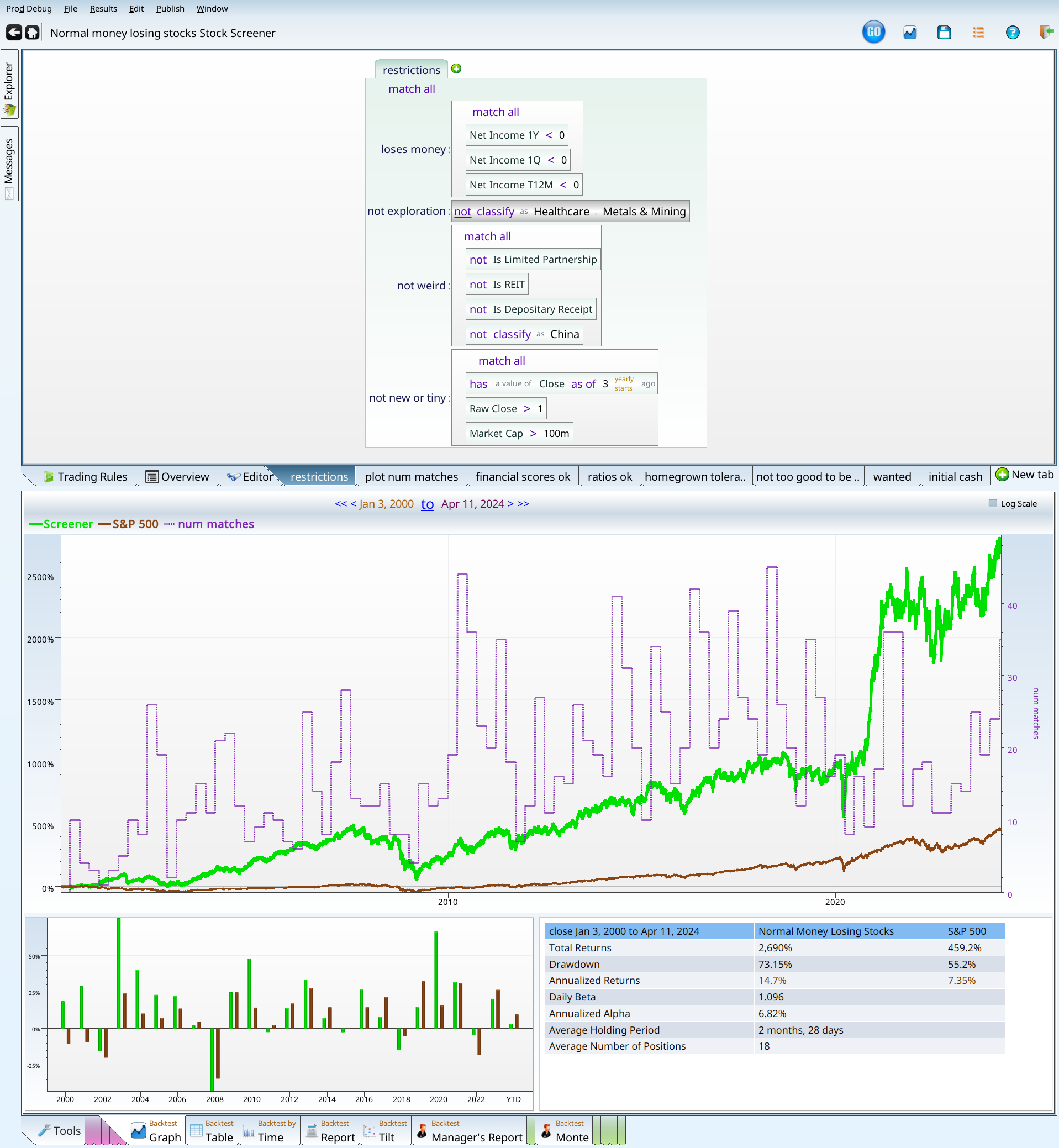
And now, finally, we are done adding terms to the screen.
Having won, what have we got?
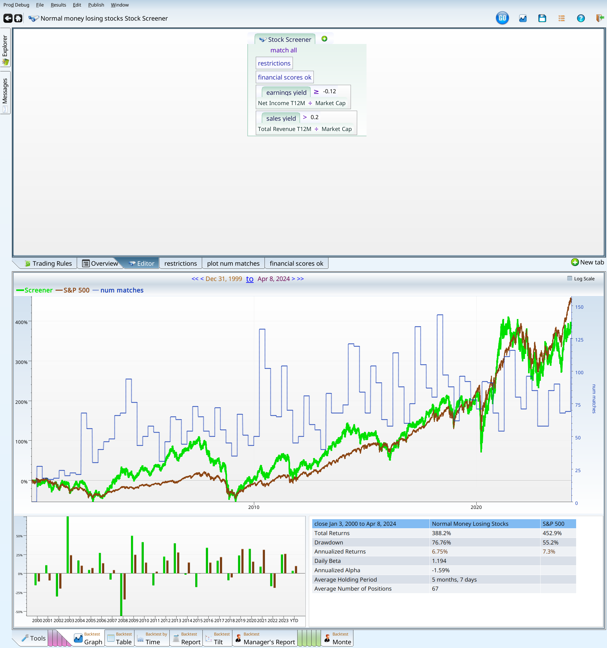
Looking at that screen, there’s a lot going on. The performance is more than 17%, and it manages to beat the S&P 500 in 14 out of the 24 years since 2000. Yes, I know that 2024 is less than half done. But the screen still underperforms for that year fragment. So there.
More seriously, we have monster drawdown. During the great financial crisis, 70% drawdown wasn’t that unusual, but it’s still a bitter pill to take. It’s the sort of thing that would convince people to throw in the towel, and abandon investing entirely.
Before we can spend the time required to mold this strategy into something useful, we need to verify that it isn’t some cute artifact of the data. We can do this in several ways.
Examining the results
Our first tool is to look at the positions. The positions tabs consist of every trade placed by the system. In order to get more detail I reran the backtester with the new style backtester, which is enabled by adding an “initial_cash” tab and setting the term to 1m. Any value there would do, but $1 million makes the math easy.
Using Positions
We want to make sure that one (or a few) positions don’t have all the return in them, leaving nothing but dregs for the rest. To do this I click on the positions tab, and then on the positions table tab, and sort by score.
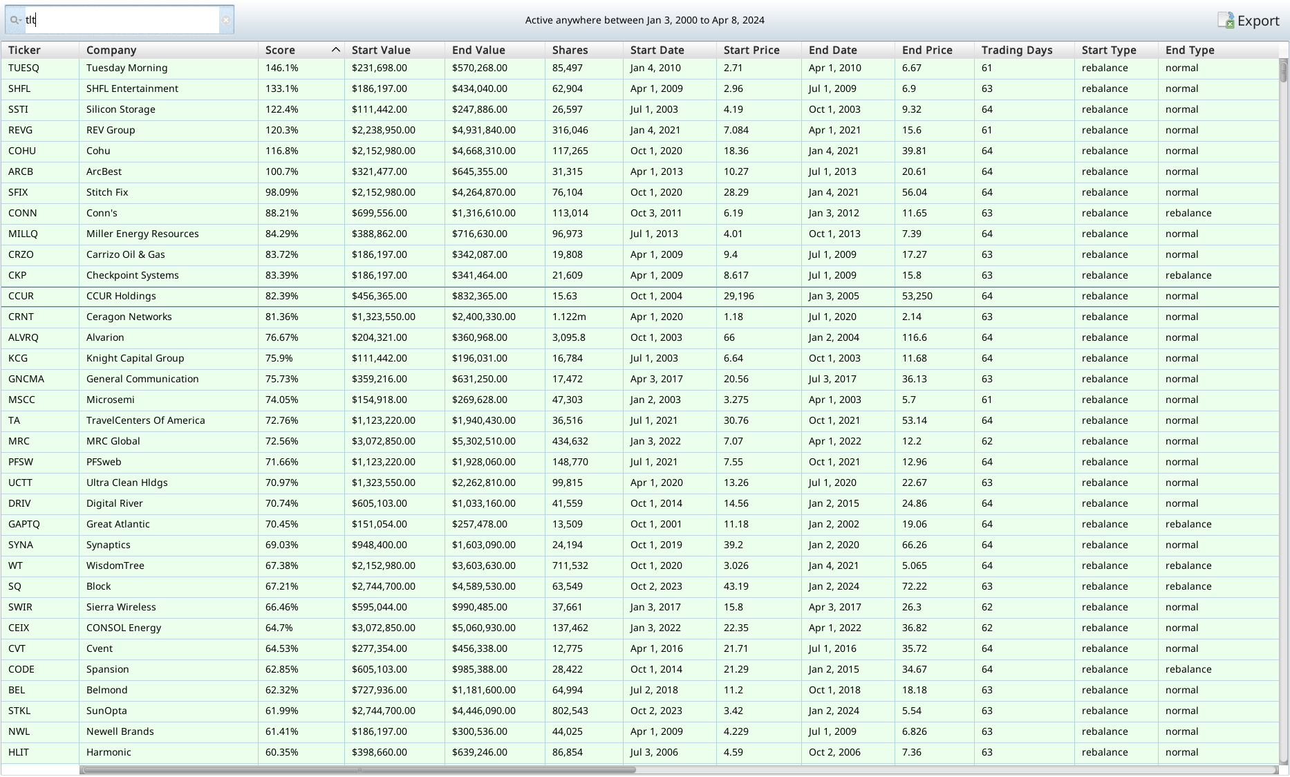
There’s a lot of green at the top of the positions table — as there should be. But there are also no huge 12,000% gainers that gained everything in a few months. If there were I’d want to make sure we hadn’t accidentally bought a stock that went from $0.03 to $34 in one day. Pricing errors happen to good backtests. If there was an error like that, we’d have to add a “not ticker is XXX” to the criteria, and screen again. Luckily for us, there was no such error (there usually isn’t), and so we can move on to the next.
Next I look at the positions map, and sort it to see if there are any obvious patterns that worry me. First step is to sort by returns, and look at the results.
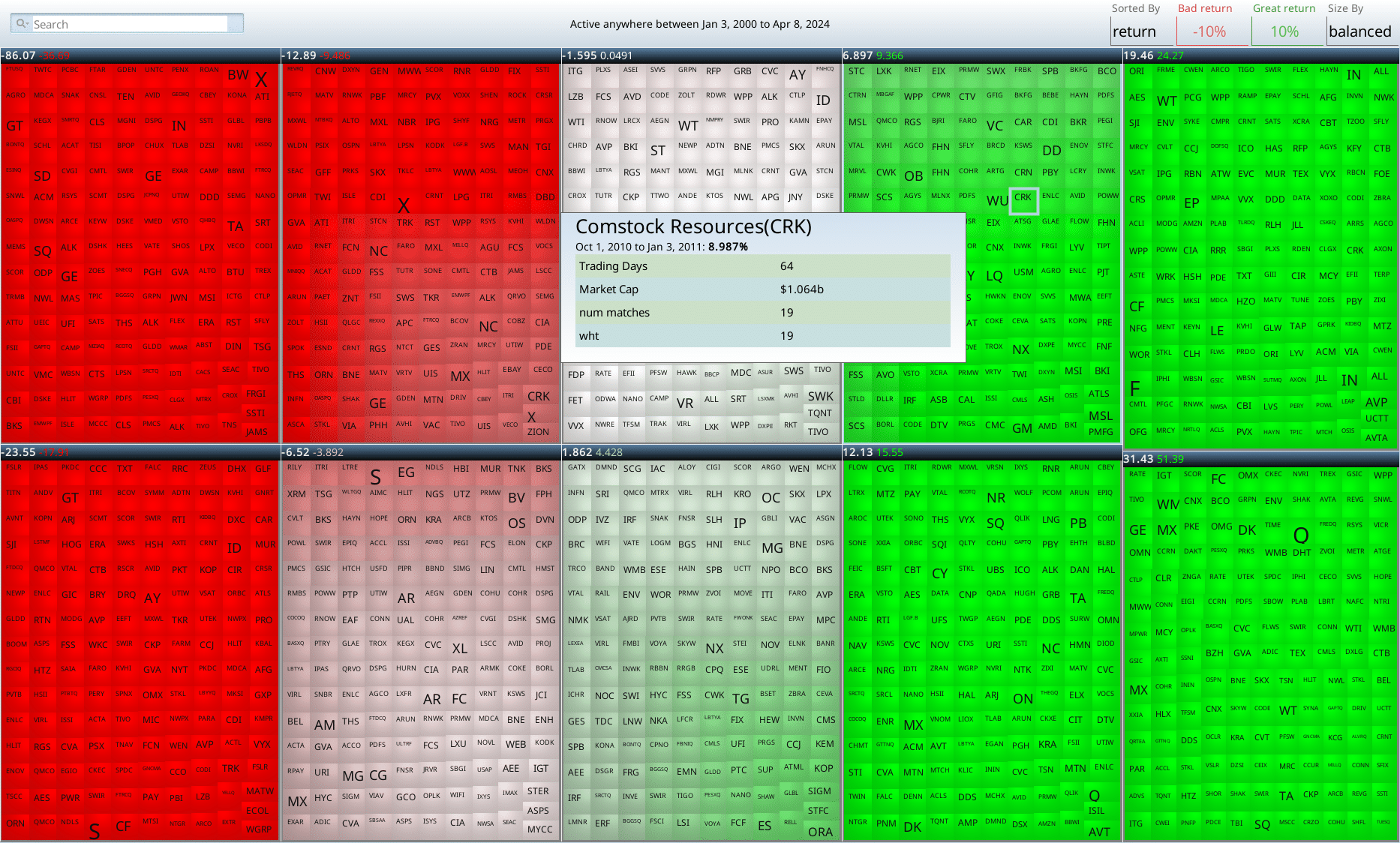
This yields a hoverable map of all all the trades. If you look at the headlines of each box, you can see the cutoffs (uncolored text), and the averages within that box. You can see that there are five boxes that are all winners, one box that is a mix of winners and losers (uncolored text -1.595), and four boxes with losers. Each box represents 3 months with a company, so you can see right away that these stocks are volatile. That makes sense given the drawdown.
Lastly (for the positions) we head over to the positions breakdown.
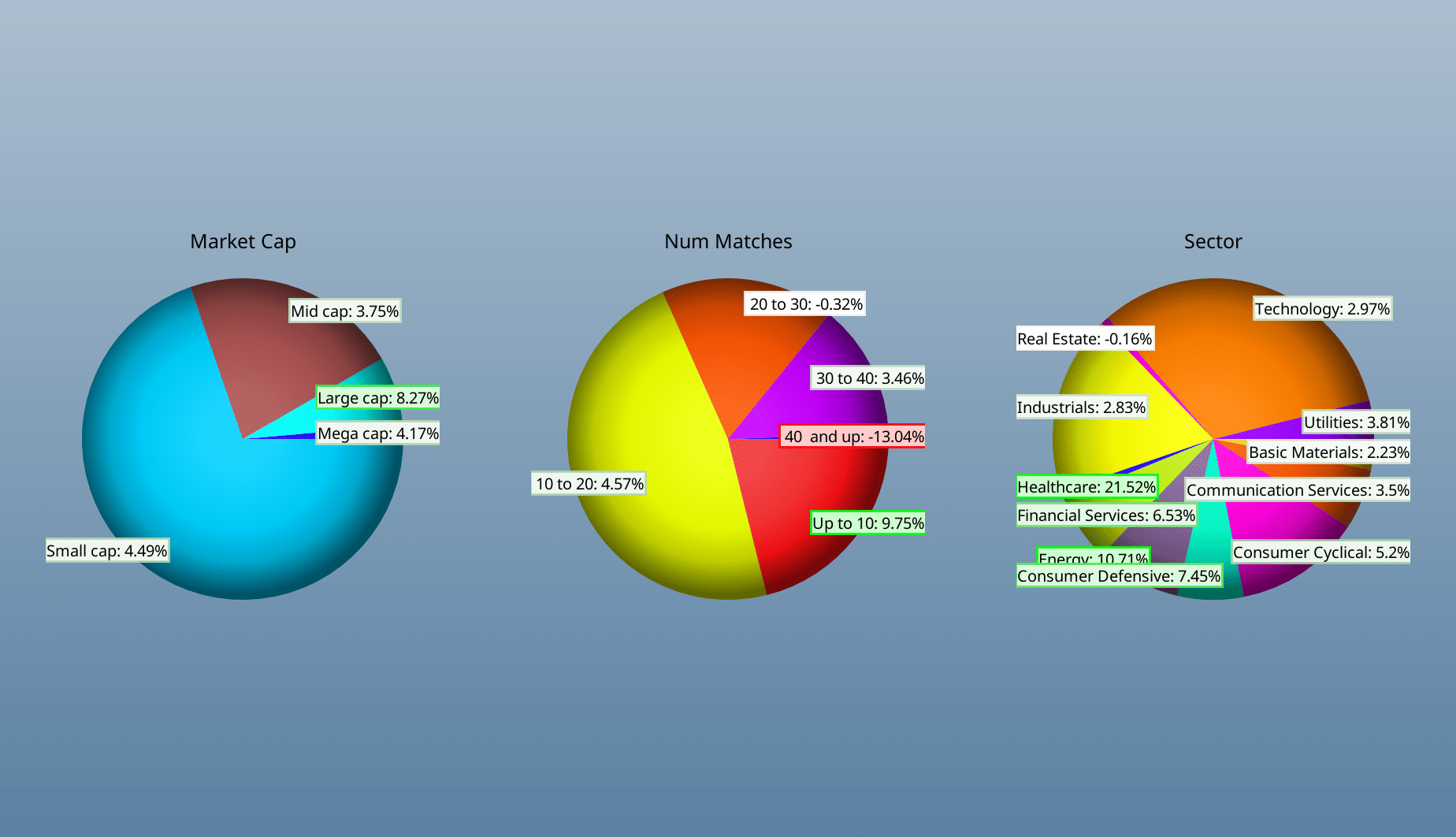
We can see that the various company sizes went up about 4%, and that sector returns positive in almost all sectors.
Backtest over time
We look at the returns year by year, to see if all the returns are concentrated in one year or time period. This can sometimes happen, but it doesn’t make for a very good screen, as spending years underperforming waiting for your magic to work is frustrating, at best.
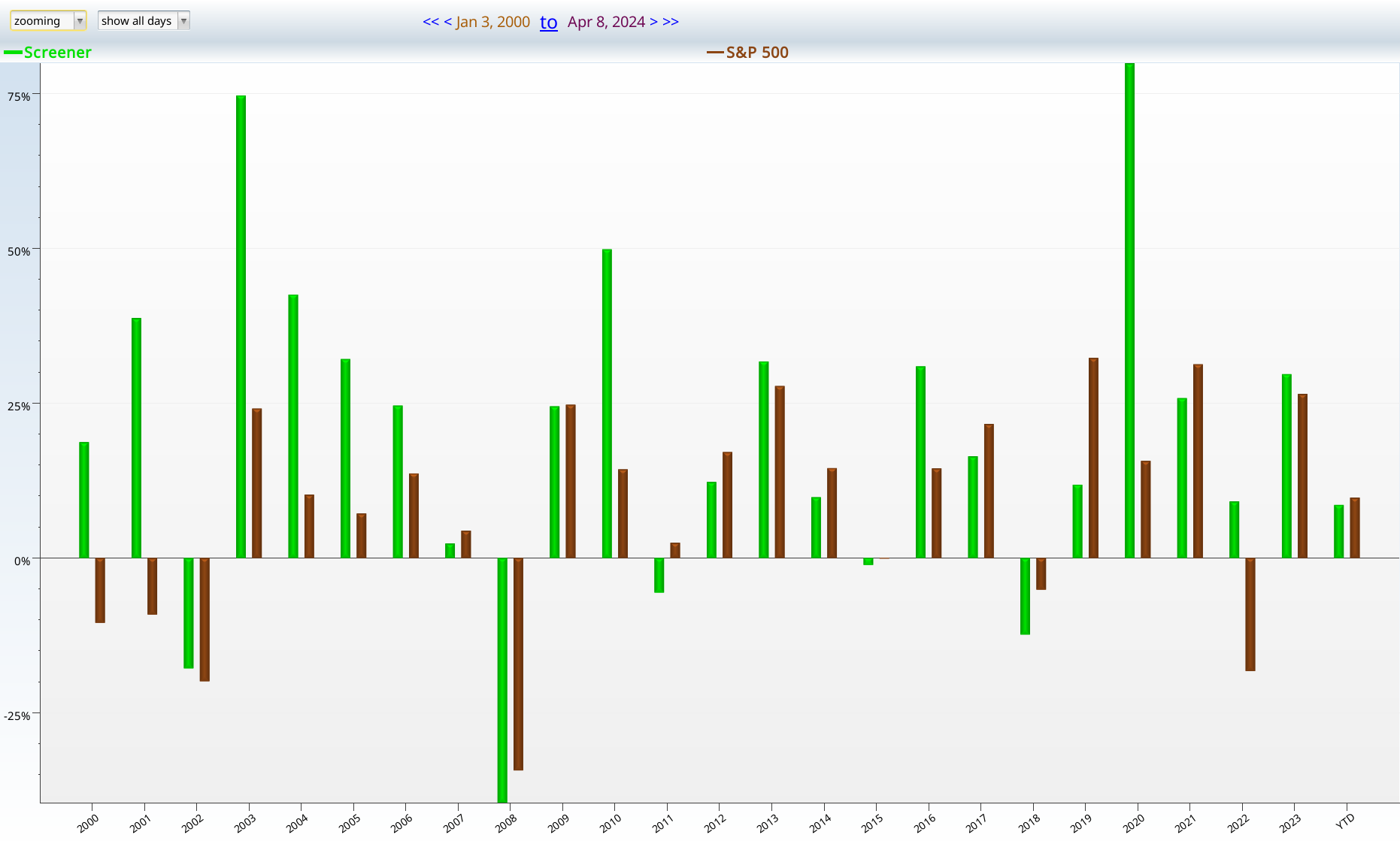
We can see from the chart, that we outperform in 12/24 of the years under test. This is unimpressive, but not horrible. More concerning is that many of the rediculous outperformance years are in the deep past. But not all of them. 2020 was remarkable. 2022, and 2023 weren’t bad either. That leads me to conclude the screen probably still works. Probably. Not guaranteedly.
Backtest Report
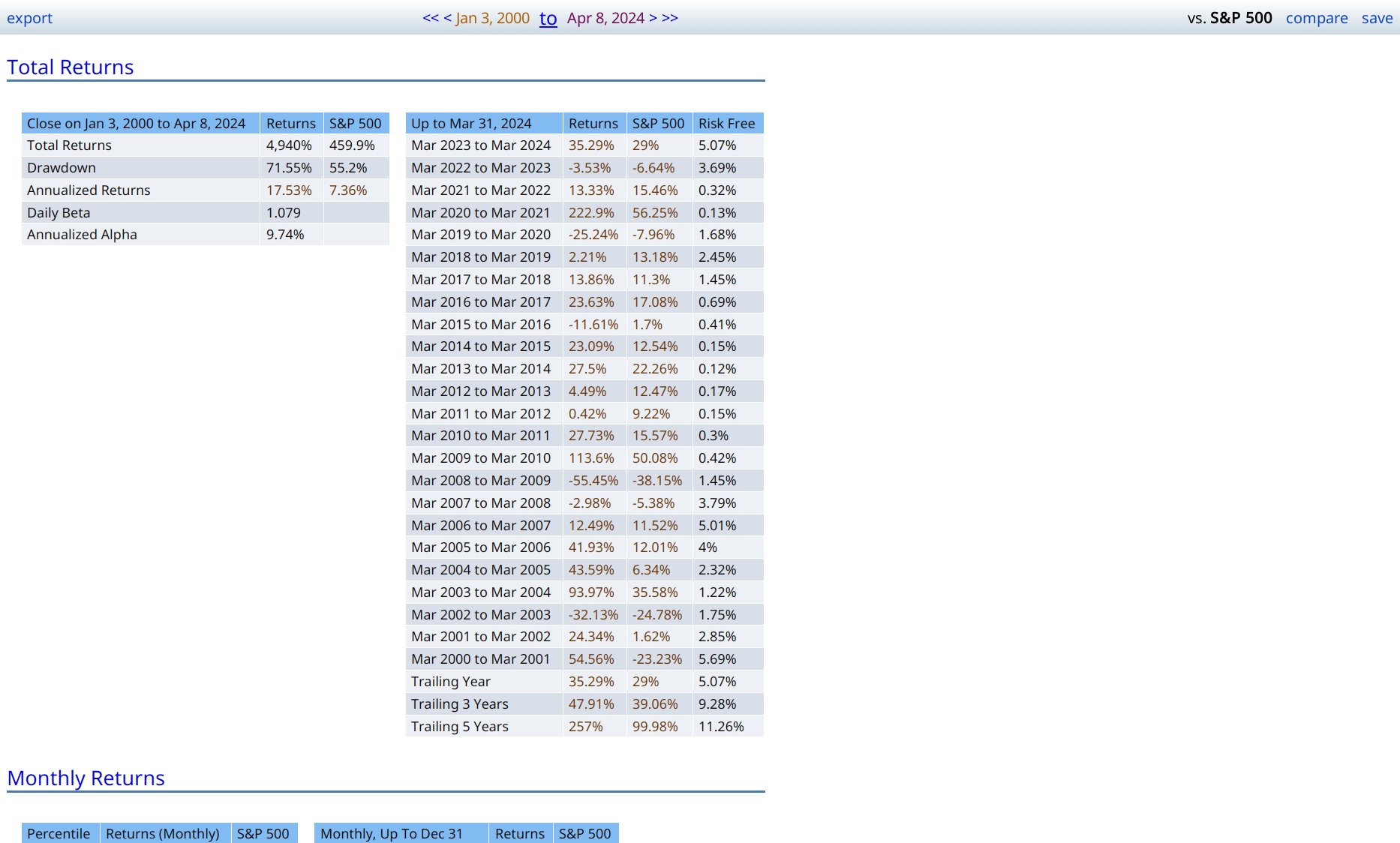
The thing that jumps out here is the 71% drawdown. This is not a low risk strategy. Losing 70% of your money is worse than losing 55% of it. Much worse. It’s beta is not as high as I’d expect given its drawdown. Looking back at the returns by time (or hovering over the drawdown number) tells you that the crash occured during the Great Financial Crisis, when everyone lost their mind. The 8 years before that had been so absurdly great that 28% of your portfolio still beat 45% of the S&P 500.
Notice that the green line is still positive, having managed to double your money (even after cutting it in 4!). The S&P 500 just looks sad by comparison. That said, I still would be very reluctant to use it as my sole or even majority strategy. It seems more like something I’d add to an existing portfolio, to give it diversification and/or extra returns.
What have we learned?
Avoid money losing stocks
If you look up at the tables where we found the ideal ranges, you can see that many of them are money losing, and almost all of them lag the S&P 500. As an exercise, go back through the tables, and see how often numbers greater than 452% show up. That 452% is the market return. Negative earnings prove to be a worthy opponent to your portfolio’s returns.
Validated financial ratios work
Notice that we turned a corner, and started to make real progress after we used the Piotroski and Beneish scores, exactly as directed. This is no accident. Their hard research paid off here. Other validated scores can be useful, but we wanted an article of finite length.
Questions and answers
What if a company only lost money for a short time?
For the original screen we insisted that a company had to lose money quarterly AND over the last trailing twelve months, AND on the last yearly report. What if we only insisted that at least one of those had to be negative?
This is actually kind of disturbing. I would expect that allowing companies that were not as losing in would boost returns, or at least not impair them as badly as it did. So I decided to disable the money losing criteria, and got this:
This beats the market, as did the other one, but not nearly as soundly. Lastly, for sheer curiousity, I tried a run where the companies had to make money quarterly, annually, and over the last twelve months. The results were almost identical to the screenshot above.
Does the strategy fail with “abnormal companies”?
For this test we first disabled the exploration condition, allowing speculative biotechs and mining companies back in.
When we disabled the exploration term (notice the shading), we got similar returns. Not quite as good, but still good. Next up, I reenabled the exploration term, and disabled the “weird term”.
This is also good. Disabling both gave me results similar to what’s above, but slightly worse. Still got 13% annual performance, so yay.
Does the rebalance choice matter?
Yes. This screen works best with monthly (even better than the screen shots), any of the quarterly rebalances, and the twice yearly rebalances. It works with January rebalance, but April yearly, May yearly and November yearly all underperform the market. There’s something interesting going on here, but I’m not smart enough to figure out what it is.
Is it OK to hold matching stocks for the long term?
No, generally not. This is one if the reasons I don’t love this strategy.
The glossary
Here I list all the tabs we have so far, just to refresh people’s memory as to what’s going on. One should be able to type all these formulas in to your favorite investment tool, and get similar results. Of course no data set is the same, and exact reproduction of results is not possible. It is enough that they go in the same general direction, and react the same general way to the same inputs. I wish for more precision than that, but the real world is a messy place.
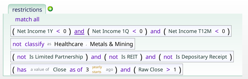
Restrictions
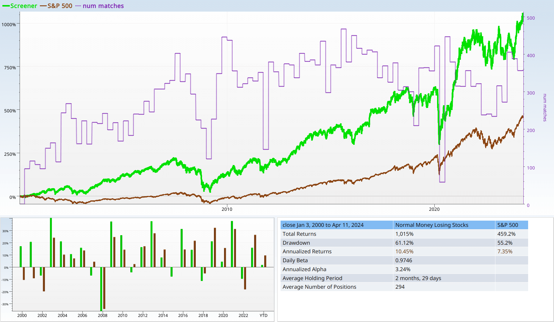
This is the set of stocks we are trying to make into a decent screen. This is a pretty harsh set of stocks to start with. Investing in them loses you 27%, while the broad market gained 452%.
The little labels are related concerns that build up restricted set. For instance, all of the negative income parts are filed together in “loses_money”.
plot_num_matches
This just gives us that line over the graph that tells us how many stocks we have.

financial_scores_ok
This is the pair of academically validated financial fitness scores we used to markedly improve our results.
The sharp eyed reader will notice that we include Piotroski values of 9 even though it is impossible for those to happen.
ratios_ok
We just want to make sure that the earnings yield is not too negative, and that the sales yield is not too terrible.
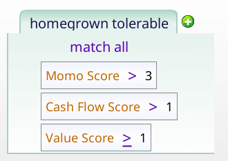
homegrown tolerable
This uses three homegrown scores to filter out the worst stocks in the money losing collection.
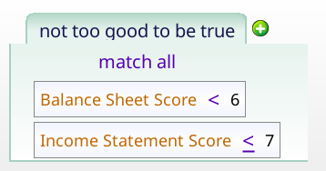
Not too good to be true
We use this to filter out stocks with too good of scores, given that we are talking about money losing stocks. I have an intuition that this distinction will be important later. Stay tuned.
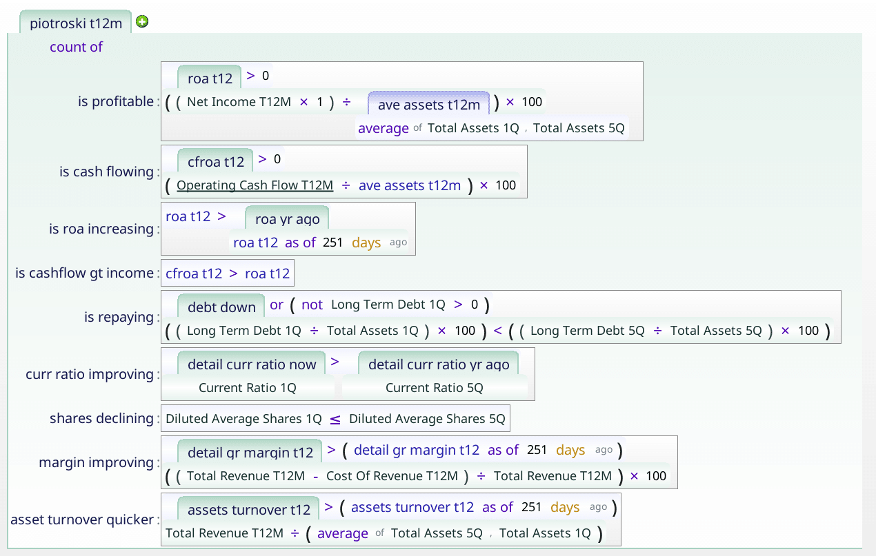
Piotroski f score t12m
The Piotroski score checks nine points, to assess how financially sound a company is.
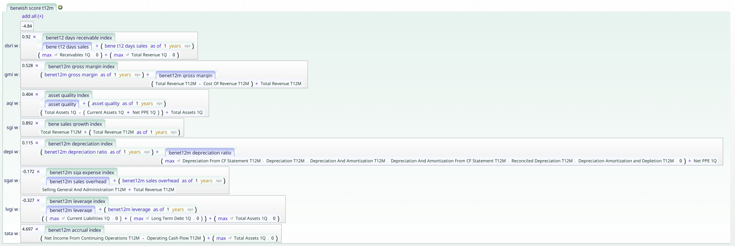
Beneish m score t12M
This linear regression checks how likely a company is to be cooking their books.
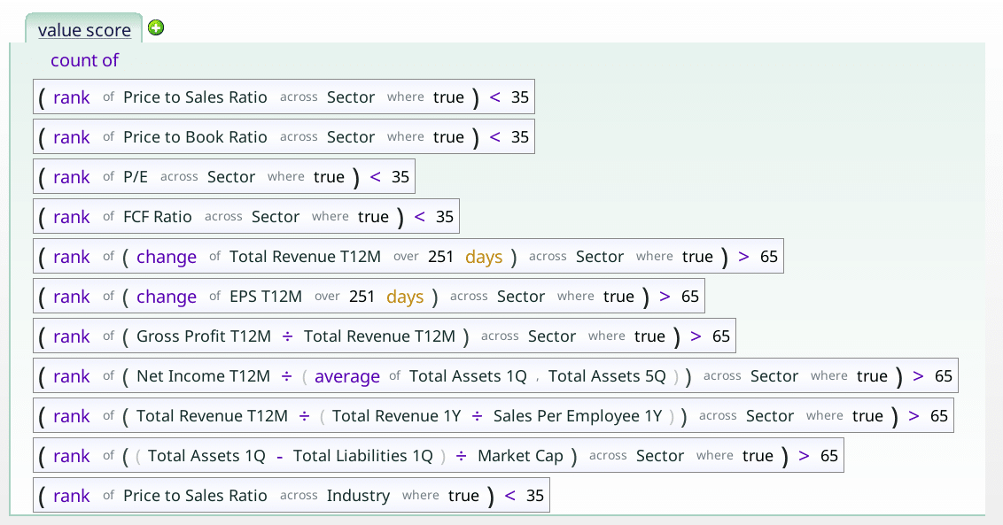
Value Score
This checks in how many ways a stock is cheap. A high value suggests that a stock in undervalued using a variety of metrics.
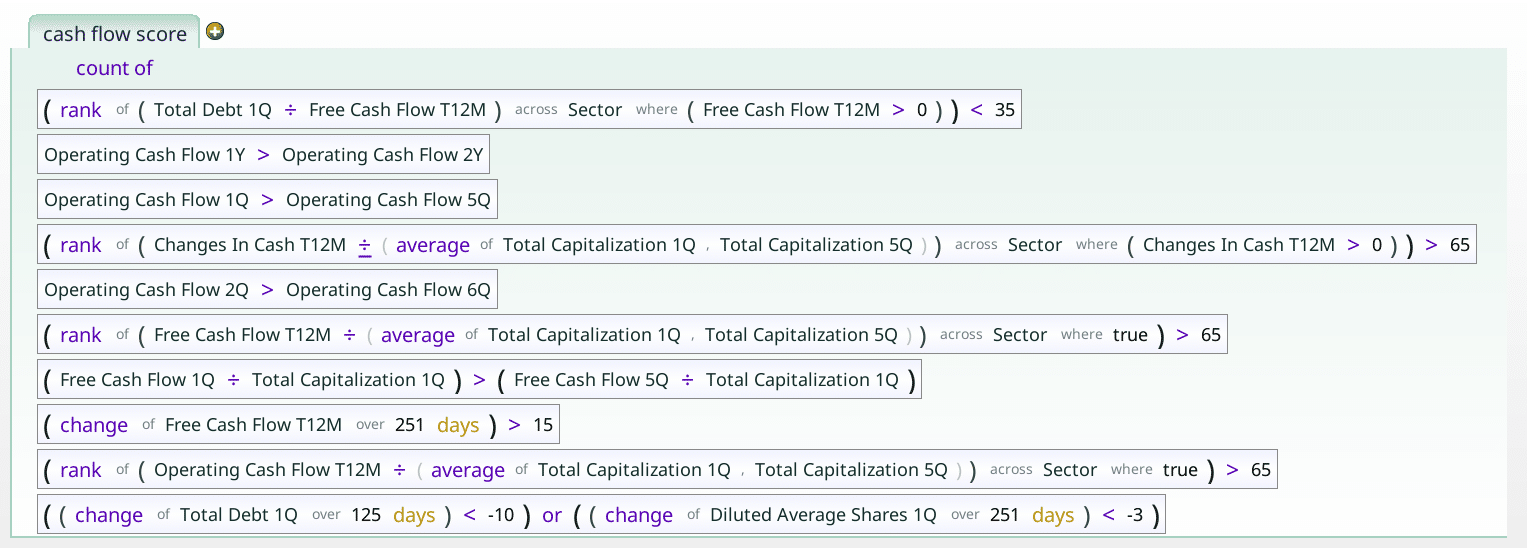
Cash flow score
The cash flow score checks how the company’s cash flow is doing. For instance, are operating cash flows increasing?
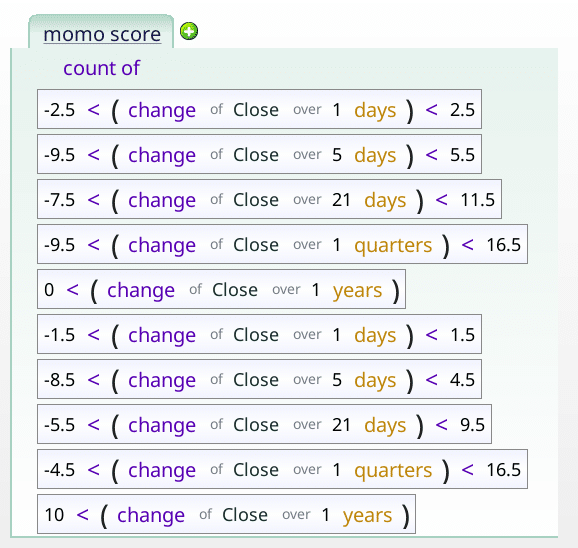
momo_score
This checks to see if the price movement is reasonable for the stock over a variety of time periods.
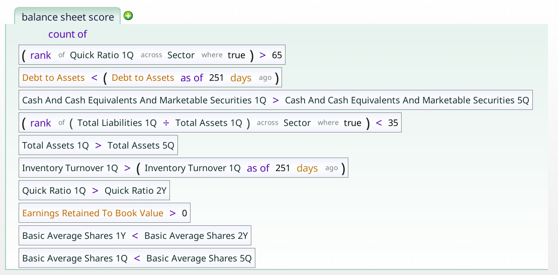
balance_sheet_score
This checks a variety of balance sheet related items that speak to the solvency of the company. Is it drowning in debt, for instance.
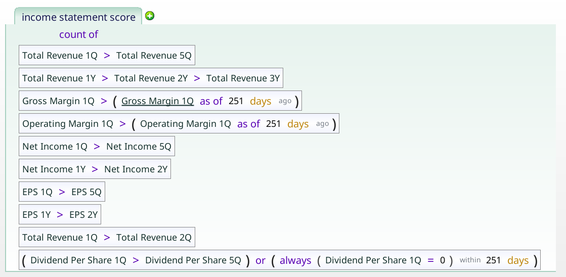
income_statement_score
This checks how many of income, revenue, earnings per share, operating margin and dividend payments are all going in the right direction.