XOM (9/16/2016)
What do I think of Exxon Mobile?
Someone asked me what I think of Exxon Mobil – here it is. The first thing I do is check the score summary and synopsis, to see if anything jumps out at me. The synopsis looks OK – tons of volume.

Only two things jump out at me:
P/E of 35. This doesn’t underperform, by itself, somewhat surprisingly.

But notice what happened to XOM’s P/E and price. P/E went up – a lot, while price did not.
Following this thread to the end, we plot XOM’s EPS, quarterly.
What happens if we look at companies where the EPS is less than 60% what it was a year ago, and that quantity is less than 60% what it was a year before?
Not as terrible as I feared, but still no walk in the park.Monster market cap – nearly $400b! I’m pretty sure it has been in the top 10. Here we use the average market cap for the year, to get rid of shot squeezes, and similar.

Clearly being in the top 10 is not a blessing.
Putting it all together
What do you get when you take a large company and insist that it’s earnings are in free fall?

You get a slow, interminable grind downwards, apparently towards zero, with occasional rallies to pull in more suckers. Avoid XOM.
XOM (2/27/2017)
Companies’ stock prices generally go up when earnings do. So, when faced with a stalwart household name whose earnings have been steadily going down for two years, what should we do? Consider Exxon Mobil. Since it has some history (Rockerfeller founded Standard Oil in 1870), we can take the long view. Here I present 20 years of price history.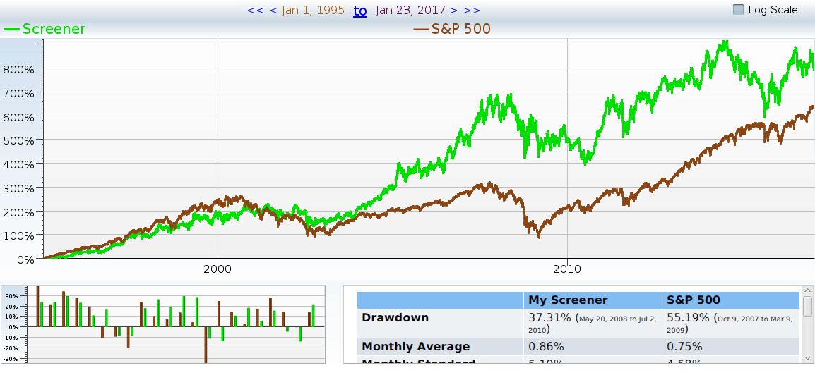
Figure 1 20 years of XOM price history
Since 2007 (halfway across the chart) XOM has gone up about 5% annually, while the S&P 500 went up almost 10%. What’s more, XOM had the same volatility as the general market . That means investors got the same risk, but half the reward, even including the dividends. What happened? Is it was worth holding on to XOM? It’s time to look at the fundamentals, and see if there are any clues.
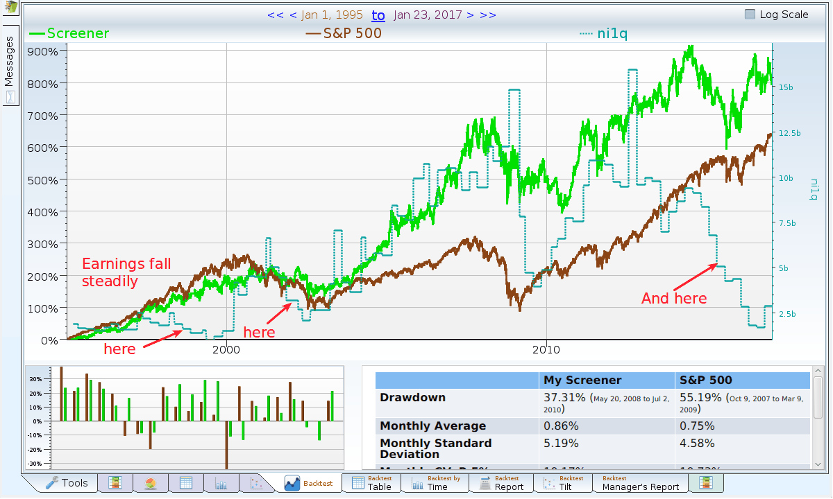
Figure 2 20 years of XOM with earnings
Looking at earnings (unadjusted Net Income), there’s an eerie correspondence between earnings and future stock price appreciation. It certainly is not perfect, but it is there. Perhaps it is splitting hairs to notice that in the two earnings slides that preceded poor stock performance, the slides were fairly deep. Alternatively, one could argue that in the ’90s, earnings didn’t matter, and that shows in the stock price. Either way, it seems dangerous to try to reach for a conclusion with only three data points.
Big data to the rescue
Let’s find large (greater than $20 billion market cap) companies that also in an earnings slide, and see how they did. An “earnings slide” is here defined to be yearly net income less than 80% of last year’s net income, last year’s net income less than 80% of the prior year’s, the most recent quarter’s net income less than 80% of the matching quarter’s income a year ago. The quarterly check insures the company isn’t (yet) getting its act back together. Which companies are currently large cap companies in an earnings slide?
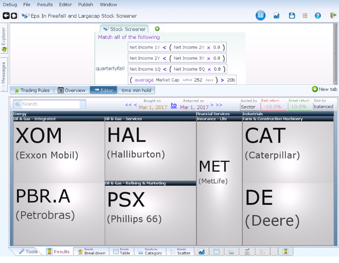
Figure 3 Defining the Earnings Sliders
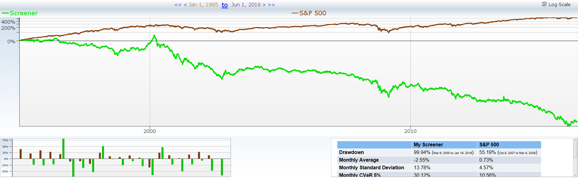
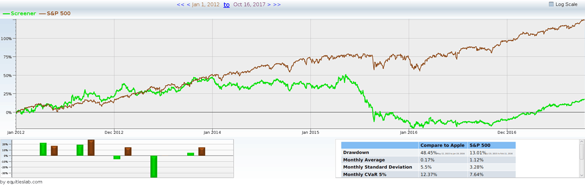
OK, so there are four companies in the oil patch, and three others. What does this mean, exactly? The only way to find out is to go back into the past, and find companies that matched these criteria in the past, and see how they did. Imagine there was a mutual fund whose job it was to invest in these large companies that are in the middle of an earnings slide. Every quarter, it invested in the current match, held them for one quarter, and sold them off. Then, it is time to buy the new earnings sliders, and do it all again next quarter. The same company may match for multiple quarters. One obvious question is “How would this mutual fund do?” If it did poorly, perhaps we should be wary of these companies. The chart below depicts what investors in this mythical mutual fund might experience. We use a log scale chart, so it’s easier to see what’s going on. The brown line is the S&P 500, while the green line is our earnings slide mutual fund.
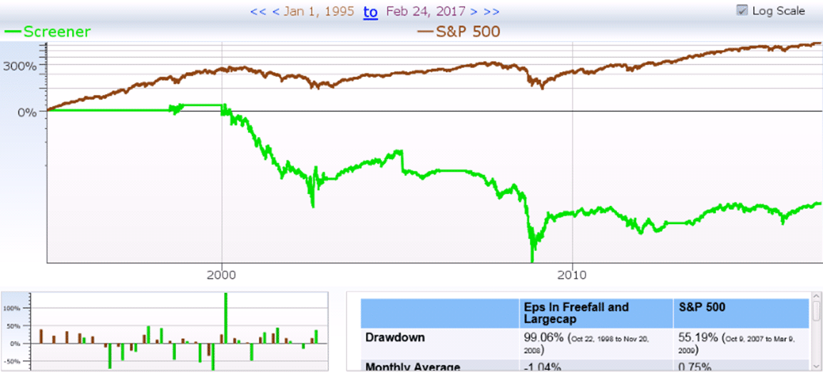
Investors in this fund who invested at the “peak” in 1998, and held through to the trough got less than two cents back for every dollar put in. Investors who started at the beginning, and held on through the end did better – they lost “only” 92% of their money. The year by year view of performance tells a similar story: some years this mutual fund made money, or even outperformed. Similarly, some stocks made money, or even outperformed. On average, however, this did not seem to be a good strategy.
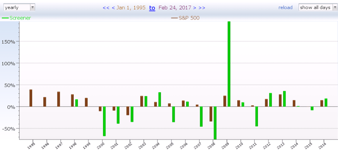
Figure 4 Earnings sliders year by year
What does this prove? This only shows what happened to investors who bought these companies and held them while they slid, and sold them the quarter after they stopped sliding. Who really does that? It is time to run a few different (hopefully more realistic) scenarios. Perhaps, if one holds these companies long enough, they might be good investments. The table below varies the minimum holding times of these earnings sliders, and how often new companies are added to the portfolio.
| Add new companies quarterly | Average yearly performance | Add new companies monthly | Average yearly performance |
| Hold one quarter | -11.74% | Hold one quarter | -18.94% |
| Hold six months | -10.94% | Hold six months | -12.7% |
| Hold one year | -8.22% | Hold one year | -10.98% |
| Hold two years | -5.8% | Hold two years | -6.34% |
| Hold three years | -5.11% | Hold three years | -6.92% |
| Hold five years | -3.54% | Hold five years | -4.69% |
Faith Face plant — explain rebalance and timing issues!!!
Look at the green line (our rebalancing portfolio of earnings sliders), above, as it falls from 0% change to almost nothing, going down 10% annually. The brown line (the S&P 500) goes up, while the these companies fall. I’m not implying that XOM will lose 10% annually, as the companies that match that screen do. But it does throw up a red flag, as this looks like a promising short screen. That’s not where I want my holdings to end up! Correlation to X month performance in the future…
Does Exxon really fit this mold. Certainly. It’s earnings have gone down 40+% year over year for the last two years, and it has not had a market cap as small as $20 billion at any point on this chart.
What about money losers?
An important hair to split here is that Exxon Mobil has not lost any money, and our screen includes companies that go from profit to loss, or from loss to bigger loss. These terrible companies could be besmirching the reputation of our stalwart. It’s time to find out.
 The portfolio lost “only” 2% per year, making money in 6 out of the 13 years, and losing money the other 7. So, yes, the companies that lost money were even worse. Yes, they besmirched the reputation of our stalwart, and others. But, these stalwarts were no prize.
Expedia (12-20-2019)
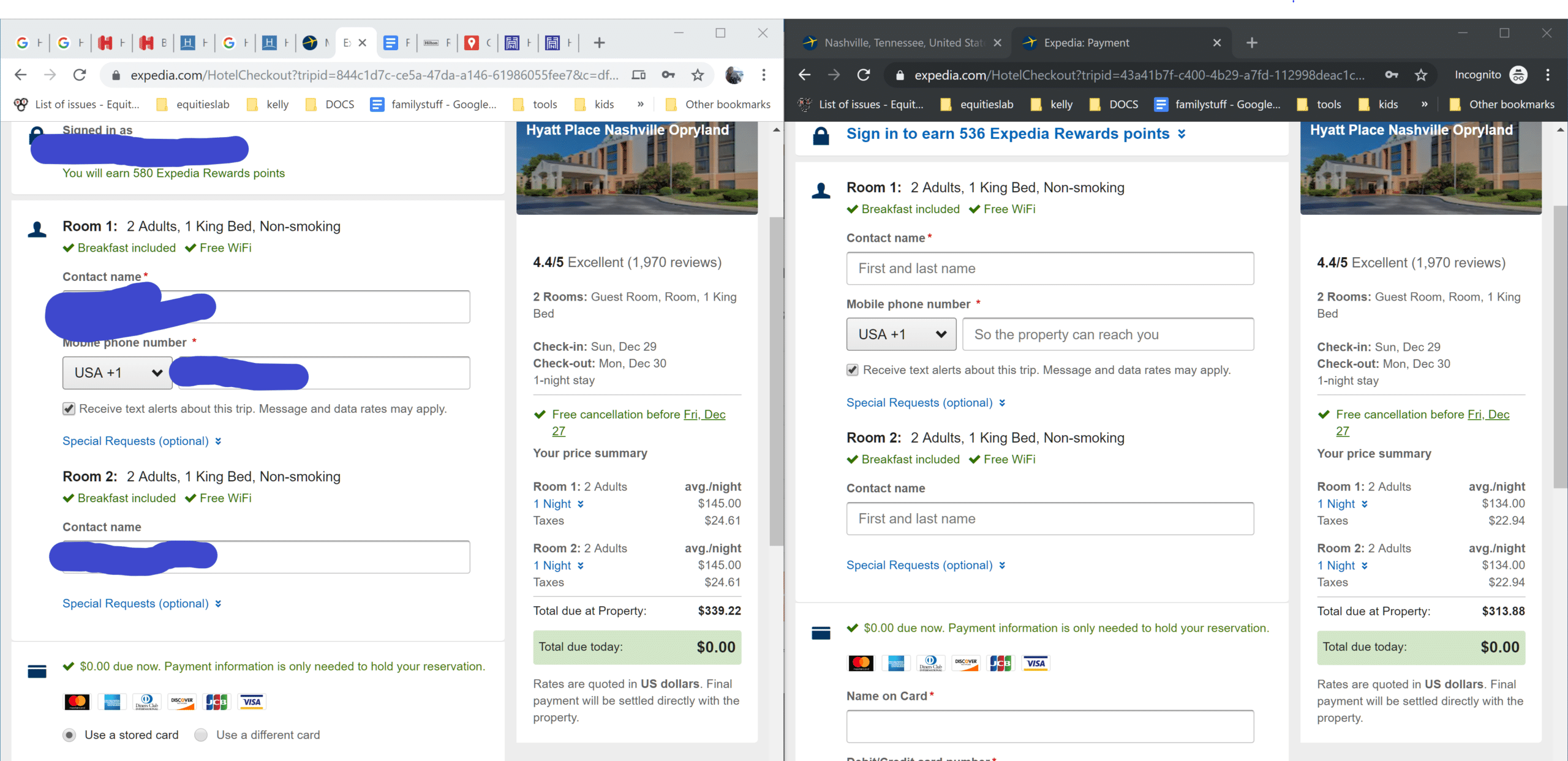
Recently, I tried to use Expedia to rent a hotel room, which I have done many, many times before. Everything went well… until I logged into my account and reloaded the price page. It turned out the Expedia was charging me, personally, more money for the hotel stay. I was honestly shocked. Just to make sure that prices hadn’t must magically gone up at that exact second, I browsed to the same pricing page with an incognito browser. Sure enough, Expedia was charging me almost $30 more the then same rooms when I was logged in!
I reached out to Expedia to ask why they were charging me more, and got the following infuriating answer:
[blockquote author=”expedia customer support” link=”https://twitter.com/Expedia/status/1205570413159317504″ target=”_blank”]As options sell out the prices and availability are subject to change[/blockquote]
Yeh, sure the price just magically happened to be lower every time I reloaded the incognito tab. Sure, the price went up just when I loaded the logged in user tab. That was really believable…
After I (mostly) got over being steamed at Expedia, I started wondering: what on earth were they thinking? I am a heavy Expedia user. I spent a tremendous amount of money through their sites. Clearly whatever their algorithm was, it was willing to target large individual accounts.
Yes, logged in customers may not always double check the prices they are getting… BUT once they do, Expedia converts a loyal customer to a severely annoyed customer. An annoyed customer who will no longer uses Expedia’s services. An annoyed customer who would definitely not recommend Expedia to friends.
So why do it? Why risk long term customers for the sake of a small amount of extra profit? I double checked a few days later, and they don’t always charge logged in customers more, so why is it worth ever doing it?
Expedia’s Earnings Problem
Well, the answer is pretty clear if you look at Expedia’s stock price. It crashed in October because the company missed their earnings estimates.
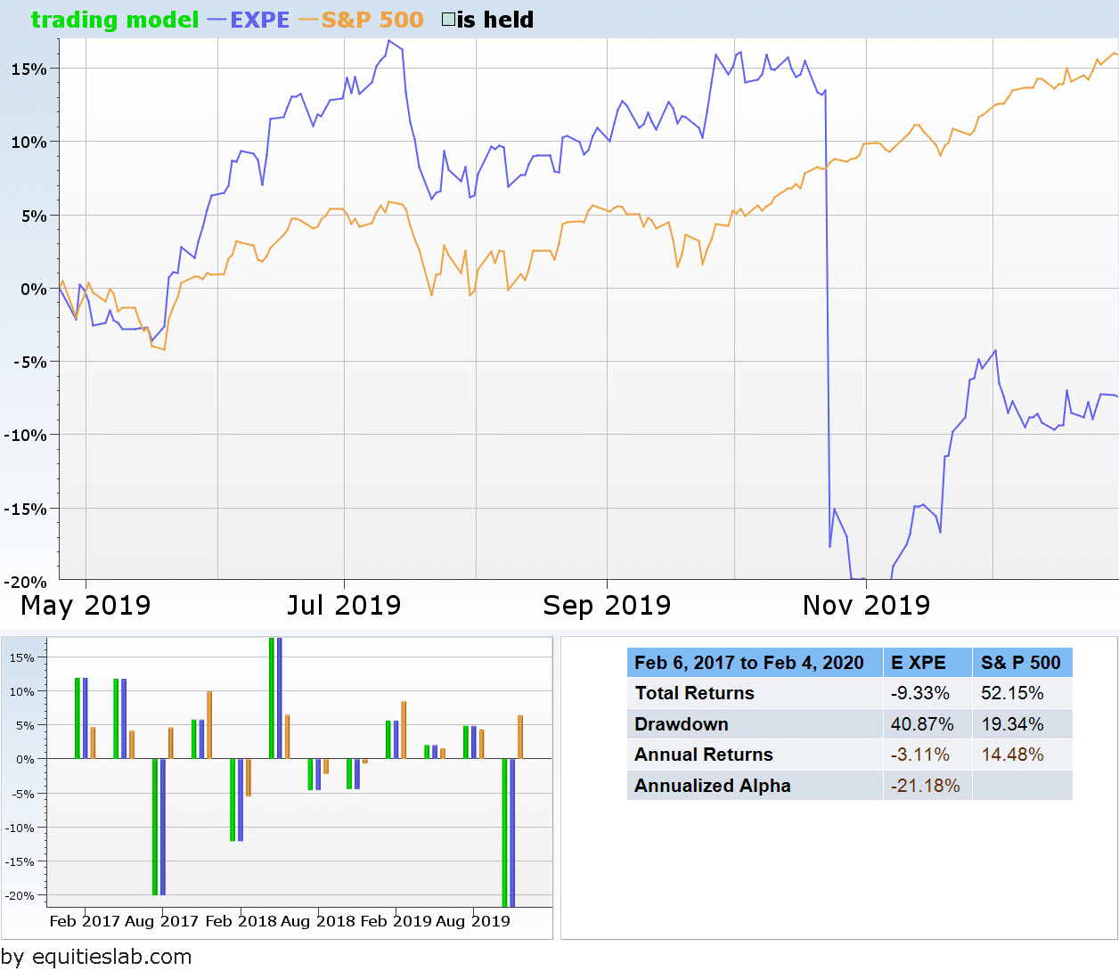
Expedia lost over 20% of its value in one day! Yes, the price did recover (somewhat), but still… Why did one missed earnings report create such a huge dip in Expedia’s price?
The answer is tha Expedia’s earnings yield has been lagging now for several years, not just one quarter. You can see in the graph below. Since 2017, Expedia’s yield has been consistently lower than the average large cap travel company.
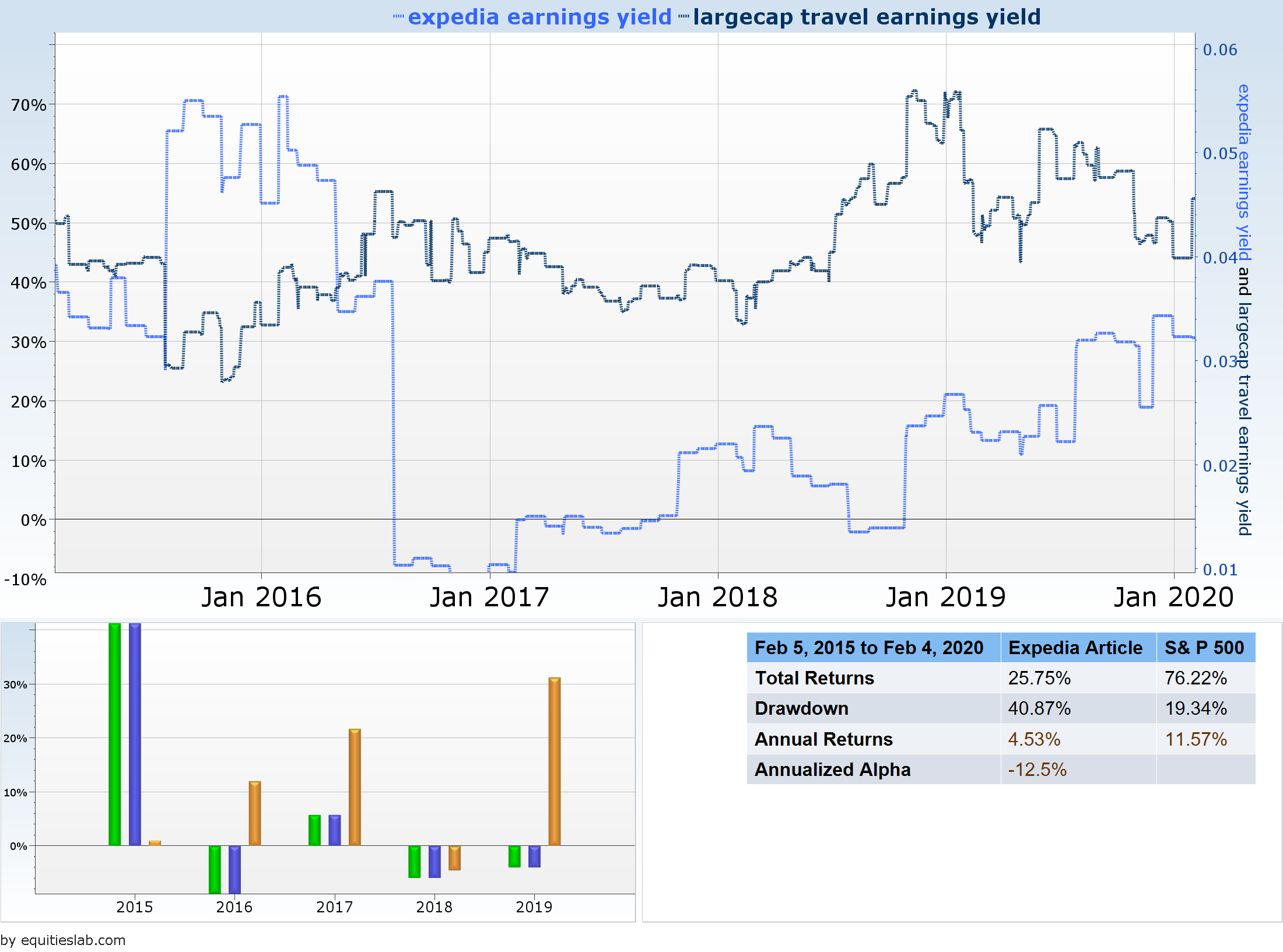
Right now all of Expedia’s companies are being pressured to produce earnings regardless of the long term cost. If they have any hope of raising their stock price, they must improve earnings. This will probably help its balance sheet temporarily, but if you are holding it as a long term investment, I would definitely reconsider your position.
TSLA (3-14-2016)
Description of the company(From Yahoo Finance) – “Tesla Motors, Inc. designs, develops, manufactures, and sells electric vehicles and stationary energy storage products in the United States, China, Norway, and internationally. It primarily offers sedans and sport utility vehicles. The company also offers electric vehicle powertrain components and systems to other manufacturers. Tesla Motors, Inc. sells its products through a network of Tesla stores and galleries, as well as through Internet. ”
Tesla Motors gives us many reasons to be wary:
- Piotroski score of 2
- Stating that risk-free deposits are equivalent to pre-orders
- Beneish M Score of over 7.5
Green Flag
-People Love the Stock: This isn’t a quantiative reason, and as a result I can give you a chart without creating a long strategy, but people absolutely love TSLA and will stay invested in TSLA no matter what the company is doing. These people will most likely keep the share price high no matter what. However, I don’t believe this will create growth in the share price, and may actually be bad for Tesla in the coming years.
-Low Positive Beta: Beta identifies how correlated that company is to the overall market, and as a result how volatile that company is. If a company has a beta of 1 it is almost exactly correlated to the overall market. If beta is negative, it has a negative correlation to the market i.e if the market goes up the stock price typically goes down. Tesla has a beta of 1.01, so, in theory the risk of Tesla mirrors the risk of the market.
When we create a strategy that looks for companies that have a beta between 1 and 1.5 we find that we actually do make money. This may be a good sign for Tesla.
Red Flags:
Low Piotroski Score: A piotroski score is a score developed by a University of Chicago professor that analyzes nine different criteria based on a company’s financials and returns a score that reflects a company’s value. In the case of Tesla, they scored a 2 out of 9. How does a score this low effect a company, let’s figure that out
This screen takes every company that has a score lower than 3 and holds them for a quarter. Though you don’t lose money you don’t make much money, and you do so at a standard deviation that is double the overall market.
High Beneish Score: The Beneish M-Score is one of the best ways to analyze whether or not a company is being truthful on their financial statements. With all of the speculation around how TSLA is reporting their earnings we can reference this score to figure out the real probability that Tesla is being dishonest. For a company to pass this test they must have a score below -2.22. However, in the case of Tesla, they have a score over 7.5.
Here is a strategy where we take and invest in companies that have a score above 7.5 – like Tesla. We hold onto these companies for a quarter and then reevaluate. Unlike the first red flag we do actually lose money here; though, not a lot. Again, we lose money at a higher standard deviation than the overall market.
Negative EPS: This is a huge thing for a company, and tells investors whether or not that company is actually making money. Now, we all know that Tesla isn’t making any money, so this number isn’t all that surprising. What is surprising is the fact that they are hoping to get out of this slump after the release of their Model 3 – the entry level vehicle that should be rolling out by the end of this year. This has led to Elon Musk sending out some odd tweets regarding the “pre-orders” which are just risk free deposits to secure the possibility of getting a car. These can be cancelled at any time and there will most likely be a huge cancellation rate(over 60%) when compared to previous numbers presented by Tesla. As a result, we are going to assume that they are going to keep their incredibly high EPS of -7.00.
This strategy actually did so bad that I had to put it on a log scale so that you can get a real feel for how much money this strategy actually lost.
Summary:
All of the signs that I see point towards the fact that Tesla is incredibly overbought. Since last week Tesla shares have fallen roughly $14, and all of their fundamentals point towards the fact that this company doesn’t really have much behind it. That paired with the skepticism arising from their most recent earnings report makes me want to say to stay away from Tesla at all costs – or at least they get this whole thing under control and the launch of the Model 3 is a success.
AAPL (12/1/2017)
The iconic technology company dominates the Information Technology sector, but there’s more to the company than its success. Keep reading to hear some hesitations, an analysis of AAPL, the data surrounding the company,
Initial Hesitation with Apple
Is Apple stock worth buying? Other people have discussed (at length) its “questionable” product decisions, such as:
- The touch bar
- Replacing rouch ID with facial recognition
- Scrapping a whole ecosystem of connectors to push the “Lightning cable”
- Eliminating the headphone jack completely from new phones
Beyond those product decisions, how does Apple, the company, perform from a quantitative point of view? What do the financials illustrate, and what should investors’ next course of action be?
Analyzing Apple
To do this effectively, the company must be broken up into four individual parts:
- Income statement – Earnings, to profit margins, revenue, expenses, etc
- Balance sheet – Does it have too many liabilities? Does it look like it’s spending money sensibly, or is something odd going on?
- Growth – Is Apple growing as fast as it used to? Are cash flows growing as fast as profits?
- Financial safety – Does the company have a good Piotroski and Beneish score? (Is Apple cooking the books and entirely safe from the possibility of bankruptcy in the future?)
An Apple changing over time
Income Statement
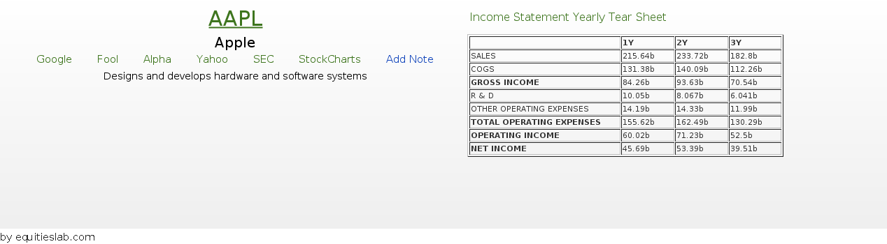
An abbreviated income statement shows that revenue was growing until about two years ago when it began to plateau. Net Income is doing the same thing. Does this persist over the long haul?
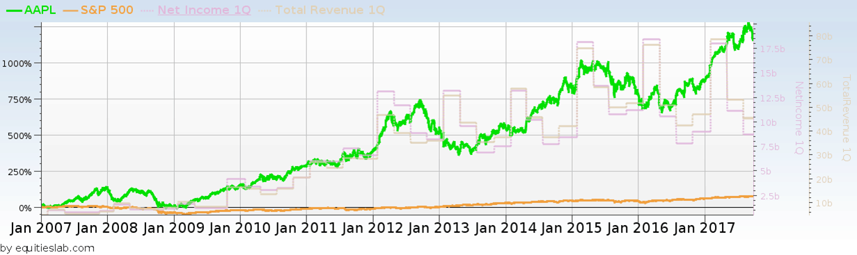
How odd… Apparently, this plateau effect has been seen before – from 2012 to 2015. Growth was steady before that, but it now happens inconsistently. Are profit margins holding up?
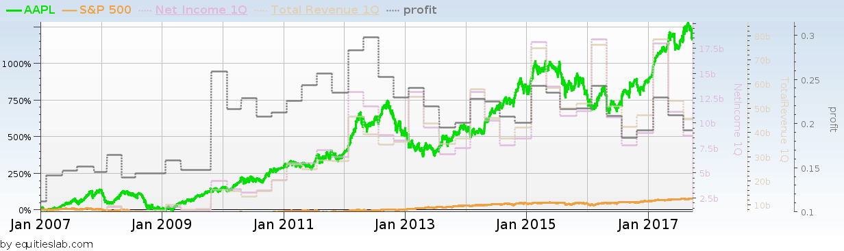
Apparently not. Profit margins were south of 15% in 2007-2008, spiked to nearly 30% for 2010 and 2011, and have been drifting back down ever since.
Balance Sheet
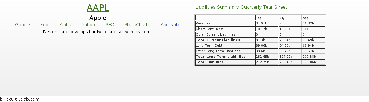
$200 billion in liabilities? That seems like a lot, but the market cap is more than three times that. The assets will put things into perspective.
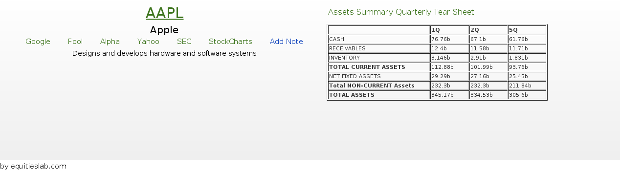
How have the liabilities been growing versus the assets over time?
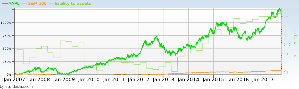
Apparently, the liabilities are growing faster. What about goodwill and other intangibles? If they grow too quickly, they can signal a failed roll-up strategy or other trouble.
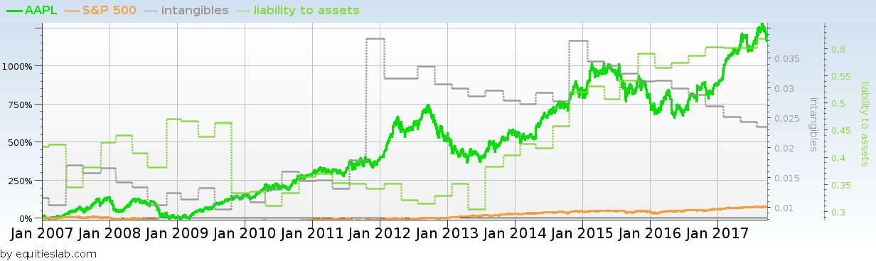
Intangibles as a share of assets peaked in 2012 and never amounted to more than three percent. Apple looks clean compared to Computer Associates (CA), with 65% of its assets being intangible.
Piotroski, Beneish and Ohlson and more
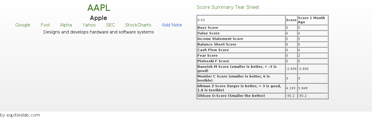
Score-wise, Apple looks mediocre. Its Piotroski score is middle of the road, its Montier C Score is 3, which seems only OK, and its Beneish score is a little too high. At least the Ohlson O score is small. Looking at Apple versus itself, it definitely seems mediocre.
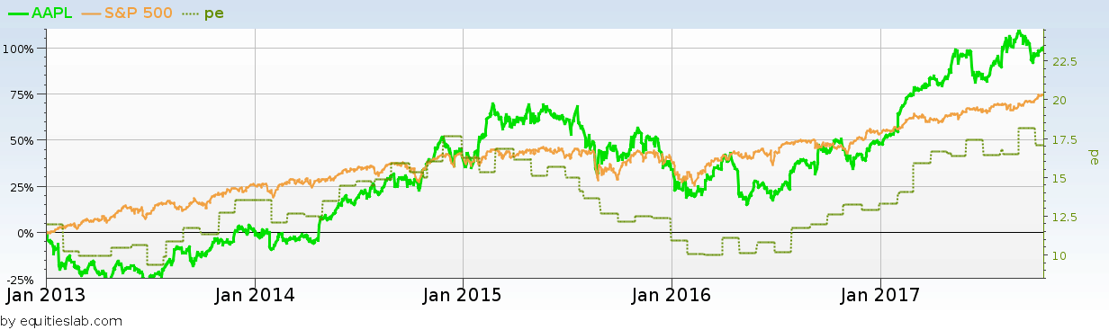
Looking at the relationship of P/E to price, they have been recently tied together almost in lockstep. There is also a hard ceiling that’s definitely less than 20. So, either earnings are going to go up, or the price is going to come down.
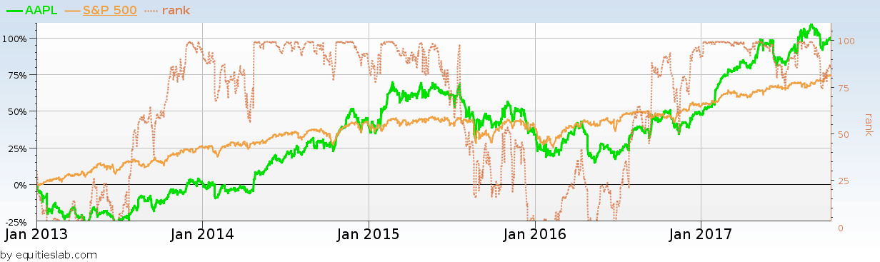
Looking at the rank of Apple’s closing price versus the last year, when it was near 100, the stock is steadily advancing. Looking at the right edge of the graph, there are minor deviations from that steady advance pattern, which cause a bit of concern, but no alarm.
Apple as part of the market
So, what does this illustrate? A screen that characterizes Apple can quickly be constructed, given what has been found (the following items must be true):
- Beneish score between -2 and -3
- Montier C Score of 2,3, or 4
- Profit margin between 15% and 25%
- Liabilities to assets at less than 70%, but getting worse each year over the last three years. We exclude companies that four years ago had less than 30% liabilities to assets, so we don’t get too excited by a large change in a small number, though this exclusion makes little difference in practice.
When the screen is run, blue chip stalwarts are returned.
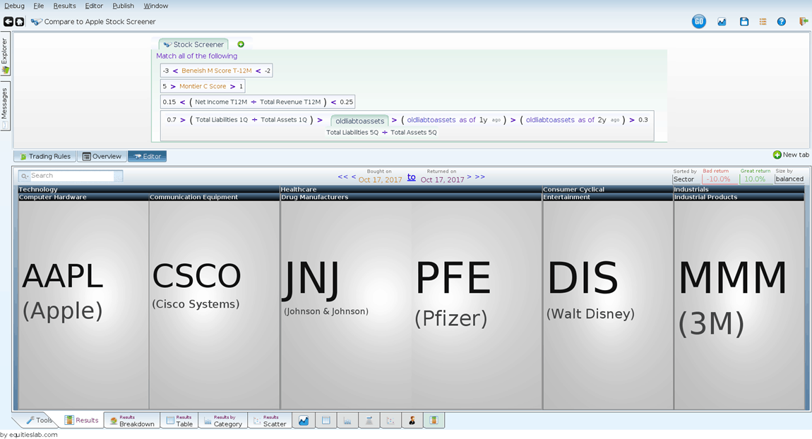
This is interesting, especially since we have no size restrictions in our criteria above. Is this isolated to only large companies?
What happens over time?
The last 5 years aren’t pretty (rebalancing quarterly):
This could be indicative of a worrisome future for Apple.
Takeaways
If you invest based on what you hear, you might put money directly into AAPL. However, with this added research, Apple appears to be a mediocre company at best regarding finances. Looking deeper into those well-known companies is valuable before putting your money directly into them.
NVR (10-16-2015)
Summary:
- Passes multiple green flags, indicating long term growth.
- Deep Value with a piotroski score of 8 and an analysis score of 7
- Consistently decreases the number of shares outstanding in the marketplace.
About the Company:
In the words of yahoo finance, NVR(NASDAQ: NVR) “operates as a homebuilder in the United States. The company operates through Homebuilding and Mortgage Banking segments. It engages in the construction and sale of single-family detached homes, townhomes, and condominium buildings under the Ryan Homes, NVHomes, Fox Ridge Homes, and Heartland Homes trade names.”
NVR is an Interesting Company to Analyze because –
- Has increased by over 25000% in the past twenty years.
- Has almost 200 more days where the stock price increased in value than days where it dropped in value.
- One of the largest homebuilding companies
Green Flags:
- Decreasing Shares & Constant Volume
- One of the first things you learn when you take economics is that supply & demand controls everything, especially price, in a marketplace. The majority of analysts that I know, including myself at times, spend a lot of time developing and looking for complicated factors in order to decide whether or not they should invest in a company. This green flag “Decreasing Shares & Constant Volume” does the exact opposite of that. Basically this factor takes on the idea that if supply decreases, and demand stays roughly the same over an extended period of time the price is going to rise based solely on basic economics.
- I have never used this green flag before, and decided that this analysis would be a good beta test for this idea. When looking at the variables I had plotted on NVR, such as volume and shares outstanding on a graph that shows the past twenty years of the stock’s price and the past twenty years of data of the plotted variables. So, I went ahead and created a screener to test my theory. I looked for companies that, over the past year, decreased the number of shares outstanding on the marketplace. I then looked for companies that had a fairly constant volume over the past quarter, meaning that there wasn’t a difference of more than 5% in either direction when comparing today’s volume with the company’s volume a quarter ago. I then backtested this screen over the past twenty years and here are the results.
 As you can see, the results may not be incredibly smooth, but they still beat the overall market by a fairly decent margin.
- High Piotroski Score
- The Piotroski Score is one of the number one ways to assess value in a security. it was developed by Professor Joseph Piotroski at the University of Chicago. This score, out of 9, can be a good indicator of whether or not one should invest in a certain stock.
- NVR has an incredibly high Piotroski score of 8/9. This indicates that the company has deep value. Deep value is typically one of the biggest green flags I look for when analyzing a company. Now, just to make sure let’s create a screen that looks for every company that has a piotroski score of exactly 8, and run a simulation(a backtest) over the past twenty years to see exactly how we would do if we purchased stocks based solely on the fact that they have a piotroski score of 8. Overall, the screen did incredibly well – beating the market by a significant margin.
- Perfect Analysis score
- The Analysis score was designed by me, Tyler McCain, as a proprietary green flag formula to be used within the Equities Lab system. This formula, much like the piotroski score, looks for specific value indicators and develops a score from 0-7. However, one thing that this score does, and why it works well in conjunction with the piotroski score, is that it looks for a growth in value over the past year.
- Surprisingly, NVR has a perfect analysis score, something that I don’t see in very many of the companies I’ve analyzed. Now, much like with piotroski, this green flag is useless if it doesn’t outperform the S&P over the past twenty years. I went ahead and created a screen that only looked for companies that had a perfect analysis score. This score not only outperformed the S&P by a considerable amount, it also outperformed the Pioroski screen we created earlier.
- Winning Days vs. Losing Days
- This analysis is more technical than it is fundamental, but it still has the ability to tell us a lot about a company’s history and potential future. We created two variables that counted the number of winning days and losing days since we started collecting data on NVR twenty years ago. We then took the difference of these two scores as (winning days – losing days). Positive results means that the stock has had more up days than down days.
- Today, NVR has a difference of 174 days between the total number of winning and losing days. To test to see whether this is a good or bad thing went ahead and created a screener, that only found companies that have 174 more winning days than losing days. I then backtested this strategy, and here are the results. Since late 2002 this strategy consistently beats the market resulting in over 250% gains. This, like all other green flags points to the fact that NVR will continue to increase in price.
Conclusion:
NVR is an incredibly expensive stock with the share price coming in at just over $1,500. However, if the quantitative fundamentals explored in this article yield the same results as they historically have than the future of NVR is incredibly bright. In the case of NVR, green flags were raised at almost every point in the analysis and the underlying financial data and historical figures make this stock a promising long term investment.