
The 99-year-old trucking company, Yellow Corp, filing for bankruptcy is a hot topic. The debate of if it was predictable has popped up.
Was the trucking company’s demise predictable? Should it have been a surprise that the company filed for bankruptcy after receiving $700 million in 2020? Is distressed debt the new best trading strategy?
Let’s jump into Yellow Corp’s history, finances, SEC reports, and what you can learn from the whole situation.
What happened to Yellow (YELL)?
Yellow is a trucking company based in the US. It employs nearly 30,000 people and is one of the largest and oldest transportation companies in the trucking industry. How did it go from receiving a massive loan to filing for bankruptcy? Let’s look at Yellow’s history.
The timeline:
- 2004: Took on $1 billion in debt to buy out rivals.
- 2003-2020: Emerging rivals demonstrate a shift in the market (Amazon, UPS, etc).
- March 2020: Consumer habits shift during the pandemic, forever changing the industry.
- July 2020: Received a $700 million loan.
- August 2020: $1.5 billion dollars in long-term debt.
- July 2023: Preparing to shut down because of inability to fulfill union pension and healthcare payments, ultimately bringing on issues from Teamsters.
- August 2023: Files for Chapter 11 relief, aka Bankruptcy.
CNN Business wrote out the contributing factors that played a role in Yellow going down. Could it be predicted using financial red flags, though? Let’s try it out.
Was it predictable?
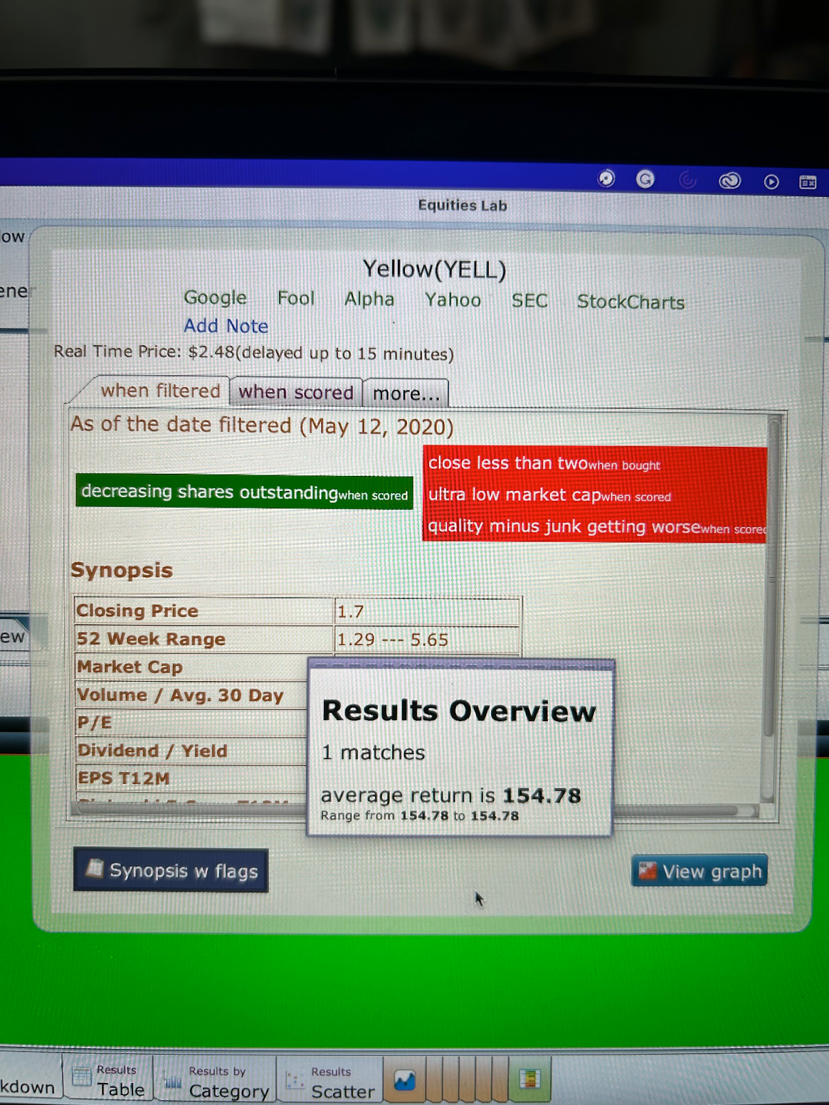
Equities Lab’s software was used to make a ticker of Yellow Corp. Click “Go”, then select the “YELL” stock. Click “Switch Tear Sheet and choose “Synopsis with Flags”. You will then see the information below.
In 2020, before the company received the $700 million loan, it had one green flag and three red flags. That seems like a sign to steer clear of the company.
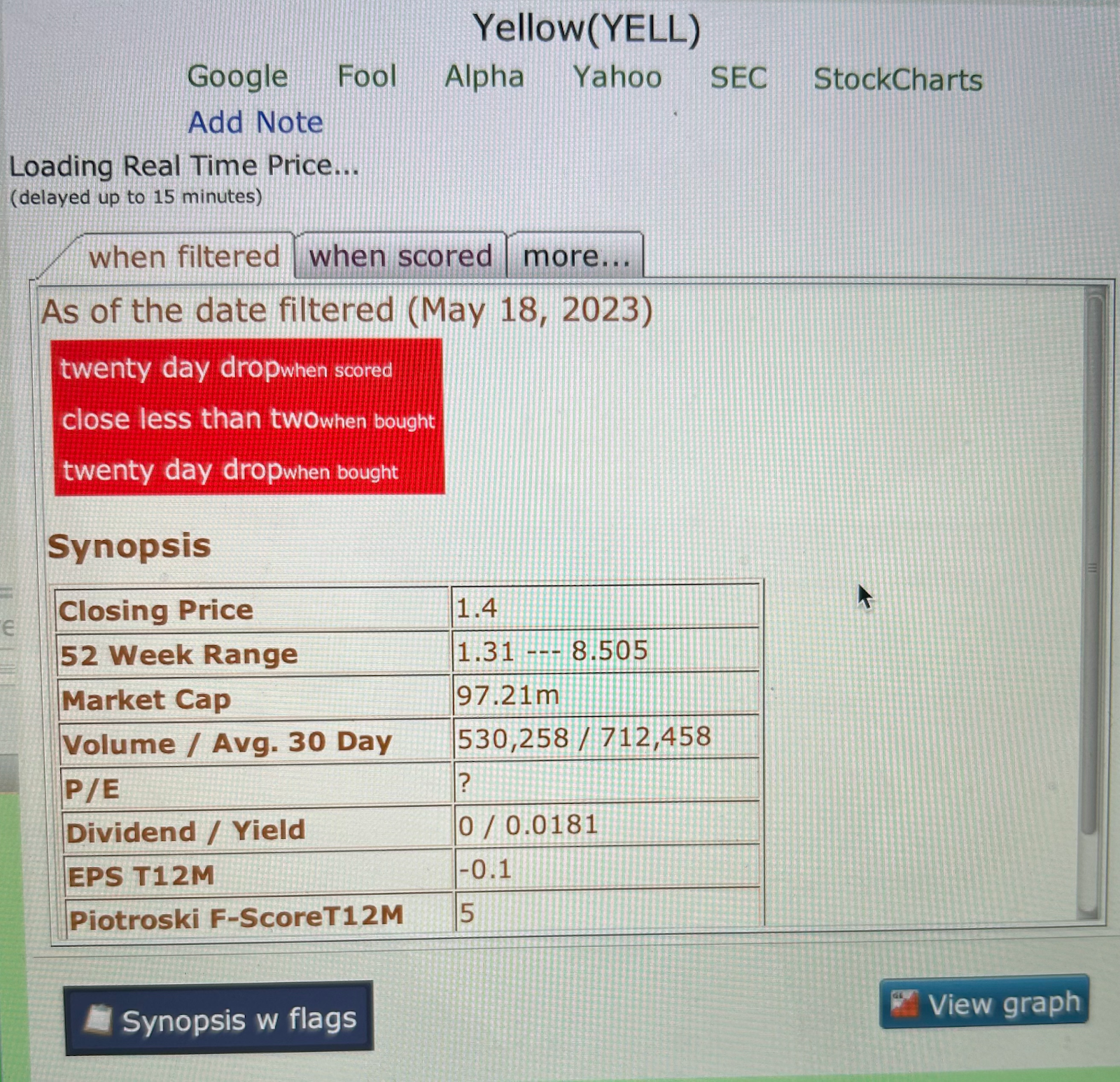
If you skip a few years to May of 2023, the company has zero green flags and three red flags, showing the continued decline of Yellow.
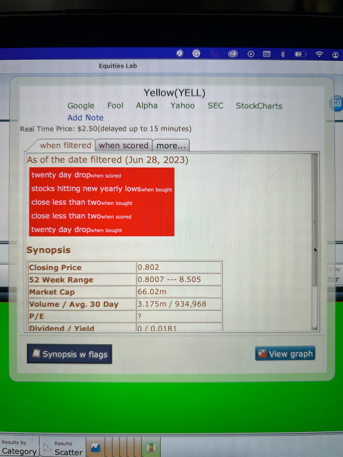
Then, just one month later, in 2023, the company jumped from three to five red flags, just a few months before filing for bankruptcy.
After using the “Synposis with Flags” tear sheet, it is clear to see on multiple occasions that Yellow was, in fact, a red flag for several years. The company’s volatility becomes clear with the below graph depicting the past 10 years.
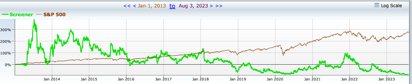
With these charts, you can see there were 5 years where Yellow outperformed the S&P 500, but the numbers swap back and forth drastically.
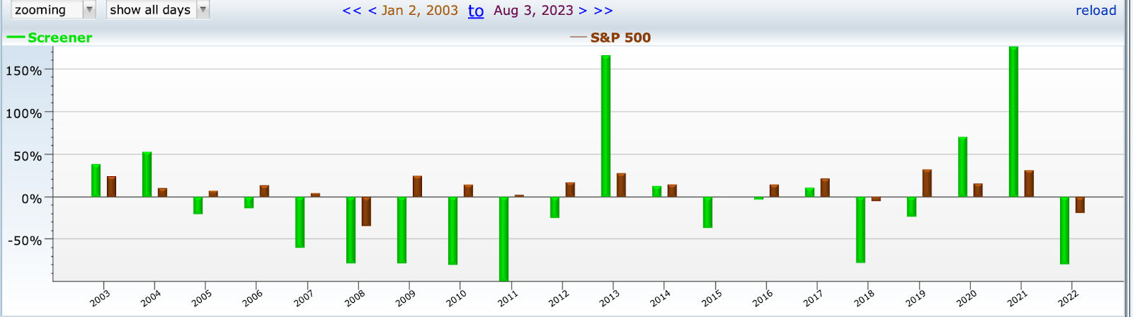
The volatility and red flags should have been enough to avoid the stock entirely.
What does the SEC say?
If you use the link in Equities Lab, you can click on SEC (Securities and Exchange Commission) and see what has been reported recently from Yellow Corp.
On August 6th, Yellow filed for bankruptcy under the Chapter 11 Bankruptcy Code.
On August 9th, Nasdaq Stock Market LLC began the process of delisting the company because it filed for bankruptcy.
Is it messy? Yes! Was it predictable? Yes! For years, the company has been having issues with competitors, debt, an evolving market, unions, teamsters, etc., The company ultimately filing for bankruptcy should not have been a surprise.
Takeaways
The market is often unpredictable; a pandemic could come out of nowhere, a trading war could break out, a market could shift because of new technology, or aliens could encourage the next job market surge. You never know what could happen, but just like Tupperware, you can see a red flag for a red flag.
Yellow Corp was going down and had been going down for quite a while. Equities Lab made it easy to visualize all the issues popping up, and nobody should have touched that stock with a 10-foot pole. Make sure you’ve got all the information on a company before investing by using Equities Lab today!