
What is a screener for?
The screener is designed to divide your stock universe into two parts: the stocks that you don’t want to look at, and those that you do. It then displays the stock you want to look at, so you can study them further and make conclusions about them. This lets you refine your ideas on a subset of the investable universe (see below about Covestro for details).
A main goal of a stock screener is to help you find stocks you want to buy — or stocks you want to sell with extreme prejudice. If you buy a uniform soup of random companies, you will (by definition) get mediocre results. A classic example of the opposite is the S&P 500 index, which is widely held up as an index people should invest in. They get better than average results, because they have a long list of criteria that companies must meet in order to be part of the index. Their complete methodology is a 59 page PDF file. For the impatient, the executive summary provided by the corporatefince.com website hits the high points. This set of criteria outperforms the mediocre random portfolios because it screens out the companies that don’t meet its criteria. Screeners do the same thing, except with your criteria. This may seem esoteric or unusual, but it is not. Any time people say any of the following, they are implicitly using a screener (manual or otherwise):
- I want to buy good companies.
- I want cheap companies.
- I want companies that are doing well.
- I like momentum.
- I want good financials.
- I want companies that are not likely to go out of business.
- I want big companies.
How does a screener work?
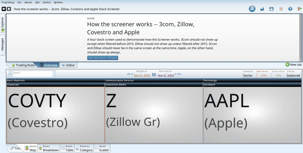
Our screener takes a term, filled in under the “Stock Screener” tab, and evaluates it on all stocks in the universe. The default universe is the investable universe (see Covestro below), but you can customize it. To be more precise, the term represents a “yes” or “no” question that someone could ask about a stock. For all the examples below, we use a simple base screen with four stocks in it. Each was chosen for different reasons:
- Apple is familar to everyone, and has the good manners to be in our data set from 1995 onwards.
- Zillow is a new company, for which we have data from 2015 onwards.
- Covestro is thinly trades, so it keeps running afoul of our investible universe implicit criteria.
- 3Com (COMS) existed until 2010, when it was acquired.
Together they provide a small, effective set of stocks we can use to demonstrate how screeners work. When we screen (use the screen “How Screeners Work — 3com, Zillow, Covestro and Apple” screener), we get three stocks — 3Com is not there. It no longer trades in 2023.
If the first date is changed to Jan 5, 2009, Zillow and Covestro will disappear and 3Com will appear. This is because the only two stocks that match our screen on Jan 5, 2009 were 3Com and Apple. The colors also changed, sporting a jazzy green theme. That is because when we score 3Com and Apple, they both did better than the 10% cutoff to garner a good score. 3Com no longer exists, but it managed to almost triple before vanishing. So it gets a green box. Apple managed to go up by more; it pushes up the average (the little green number next to hardware) up to insane levels.
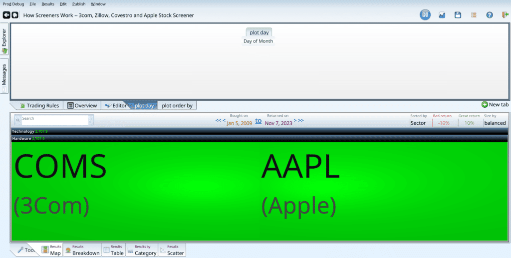
The score is the percent change of the stock from when it was chosen, to when it was scored (the second of the two dates).
What questions can a screener answer?
Since we have a large database, filled with financial information about the publicly traded companies that traded on US exchanges from 1995 onwards, as well as price history, we can answer a variety of questions, such as:
- Is the closing price over $10?
- Are the earnings higher than last year?
- Does the company report unearned income? (very few do, mostly banks)
- What is the cash flow yield of the company
- Is the price going up faster than the income over the last three years?
- Is the company a bankruptcy risk based on the Piotroski score?
- Would Clifford Asness’s Quality Minus Junk classify this company as junk?
We can also do queries that rely on long sweeps of time, such as:
- Has the company decreased dividends in the last 25 years?
- Are the standard deviation of the change of incomes increasing or decreasing over the last five years?
- Is the company’s stock price forming a declining wedge?
Your queries can also use ranking criteria:
- Is the company in the top 10 for market cap?
- Is the company in the top 10% of its sector for earnings growth, after excluding companies with a market cap less than $1 billion?
- Is the company’s sector’s average share price increase in the top two? I.E. Is the company in a hot sector?
You can also combine these queries to create complicated formulas. Quality minus Junk is multiple pages of formulas; it is one of many such formulas.
What is the investable universe?
The default universe is the universe of stocks that we think should be possible for most investors to invest in. Note this does not mean the average investor SHOULD invest in these stocks. But they will be able to, without influencing the price too much as they invest. We define an investable stock as follows:
- It must trade on a US exchange. Since we don’t have historical exchange membership, we insist that all US stocks are included. Outlawing OTC stocks adds a massive bias, and will until we get data on when stocks became OTC, or moved out of OTC onto the Nasdaq, or Amex, or wherever they went.
- It must have an average (over the last 63 trading days, a.k.a one quarter) daily dollar volume greater than $500,000. This would allow an investor to take a $50,000 position in one of these stocks, taking 10% of the daily volume. This is actually not limiting enough for some investors: taking a $1 million position in a borderline stock with $500,000 in daily volume would take 20 days! Or it would push the price sky high.
To be precise, the volume requirement is that for 1995 only, the daily volume must be over $500,000 on the given day (no averaging). After 1996, we take the 63 day average. This is a historical artifact from when our per-stock data did not go back before 1995, and averaging back one quarter meant no results in early 1995. - It must have a market capitalization greater than $50 million. Any stock with a market cap smaller than this is too tiny to usefully trade, unless you know what you are doing, and understand the risks involved. This is also not limiting enough for some. Taking a $5 million position in a $50 million market cap stock means owning 10% of the company, which subjects you to extra fun SEC reporting requirements. Only do this if you really want to.
One fiddly detail: Exchange traded funds are allowed in despite the fact that we have no market cap data for them. This is because when you buy an ETF, a new share may be generated for you and sold to you by buying the underlying index shares and combining them. Similarly, when you sell, your share may be divided back into its parts. So the market cap doesn’t really matter. The dollar volume does, to a lesser extent, but you’d have to ask an ETF expert to learn more. If you are an ETF expert, we’d love to learn more. 🙂 - The (dividend adjusted) closing price has to be more than $0.02. Ideally this should be the RawClose, which is not dividend adjusted, but we don’t have RawClose data before 2000, so that would reduce the sweep of our data. That said, this exclusion does have a few effects. First of all, it excludes any stocks that has such an amazing run that their split adjusted price is below two cents. It also gets rid of a lot of uninvestable penny stock garbage. The slippage (on US exchanges) for stocks with prices that small is intense. The middle man will get most of your profits. This line is probably too lax: many people refuse (with good reason) to buy stocks with a closing price below $5, or even $10. Outlawing closing prices less than a dollar would be sensible, except for the split adjustment effect. Adding a term such as “Year < 2000 or RawClose > 1.00” would be a sensible idea for your screen. On the other hand, Market Cap filters usually take care of a lot of this.
All of this can be configured, by creating a variable named “universe” and putting in “X_IsDefaultUniverse” AND <your awesome criteria here>. Doing so will change the ranking operators, as all stocks that aren’t part if the universe won’t count for ranking, won’t be screened for, and generally do their best to pretend they don’t exist. The first time a new universe is evaluated in a day, it will take a longer time. The second and future runs of any screens using that universe may well be faster (since there are fewer stocks).
Covestro was chosen as an example of a marginal stock (with a high market cap, but very little volume). It gets above the volume, and then falls below it. This is unfortunate, but part of life. When it is above the $500k daily average volume level, it will show up in ranks, be returned in screens, and otherwise be a fine upstanding member of the community. When it’s average volume is too small, it will stay in its house and refuse all visitors. It won’t show up in rankings, won’t match screens, and will pretend it exist.