
Debunked investment theories
Here we have a collection of theories that seem attractive or are popular, but do not hold up when tested. Knowing what does not work is as important as knowing what does. Making your screen more complicated than it needs to be will hurt its maintainability, even if it does not hurt its performance.
Obviously, there may be something worth using here, but it will require refinement or further insight to be useful.
Buyback Programs – are they a fad?
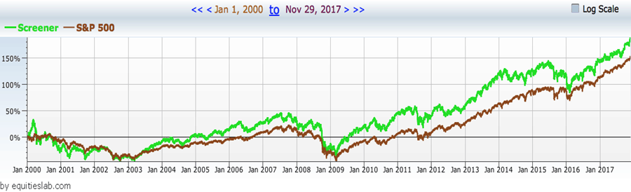
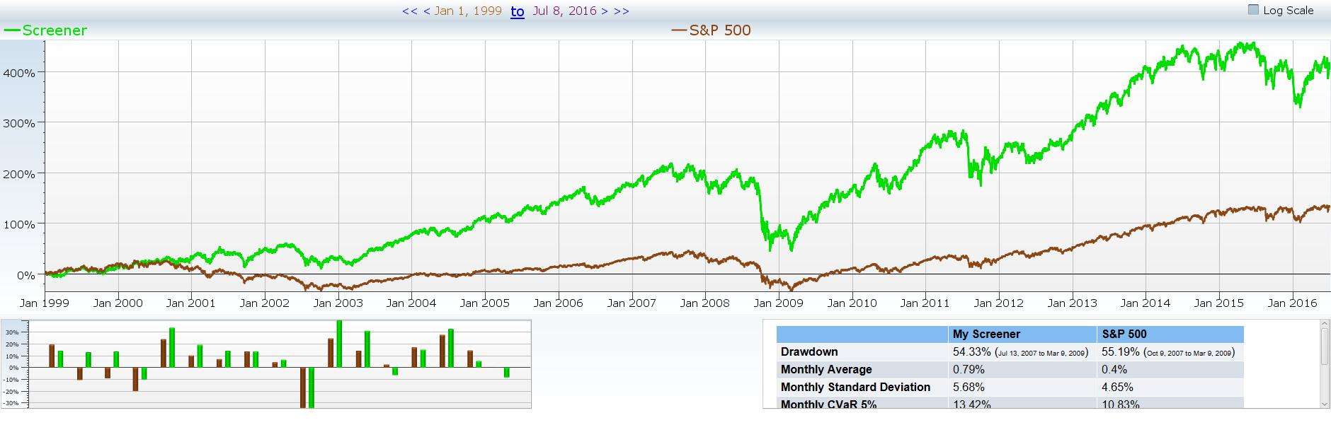
Since the market crash in 2008 it seems that all big investment funds talk about when they make a large equity purchase is the fact that the company needs to add a buyback program. This is their way of eliminating share dilution and insuring that their piece of the pie becomes more valuable as time progresses. The question is, was this as common prior to the crash? How many companies are really doing buyback programs now compared to ten years ago?
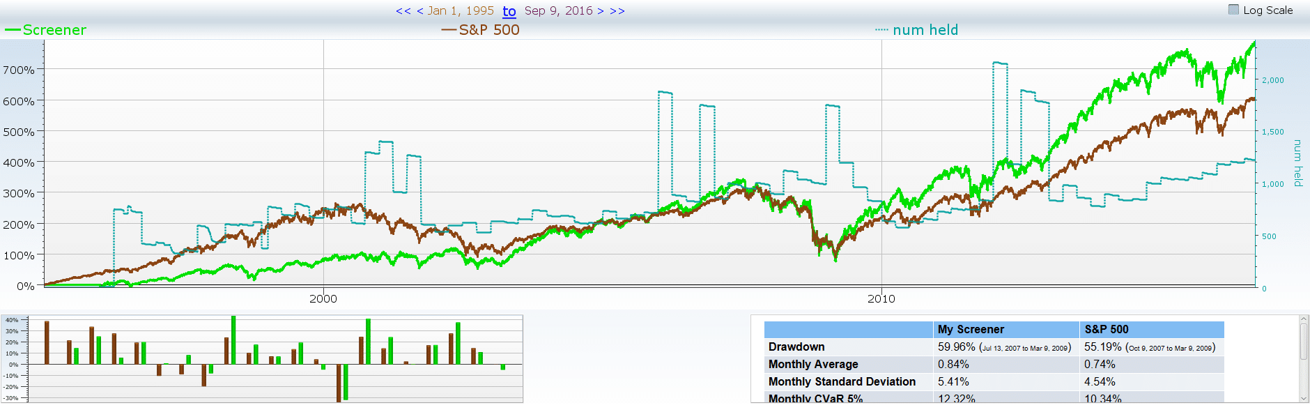
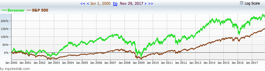
Here is an example of a backtest where we looked for all companies that decreased their shares outstanding over the past year. It beats the market, but only barely. On top of that, there isn’t a really meaningful increase in companies that are decreasing their outstanding shares in that time.
What about bigger companies?
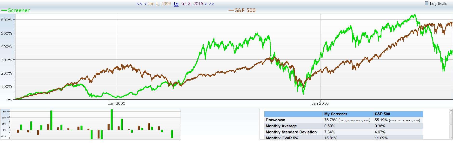
Many large firms, like Berkshire Hathaway, focus on companies with larger market caps as they have been around longer and are less likely to fail in the near future. What happens if we put in a parameter that only grabs companies that are decreasing their shares outstanding and have a market cap of greater than $3 billion?
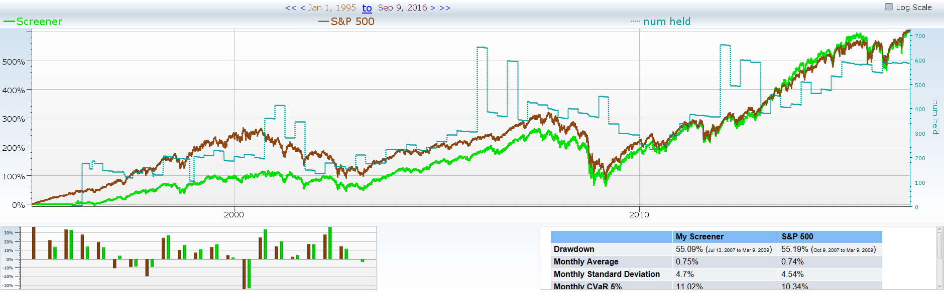
There we go! We see a noticeable change in the number of companies that match the screener as time goes on. However, it does look like our performance suffers and that we return almost equal what the S&P returns. We do so at a higher standard deviation as well. This means our strategy takes on more risk for what is essentially the same return.
What about the extreme case?
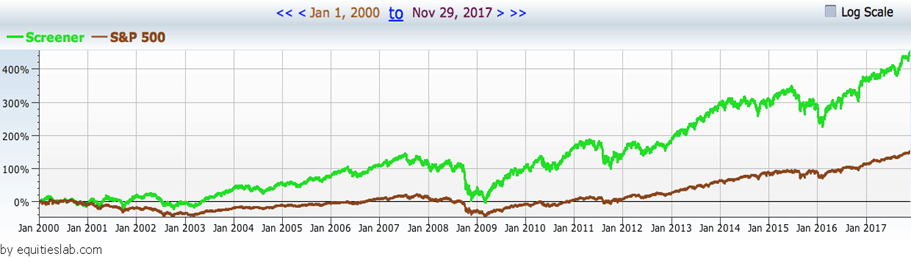
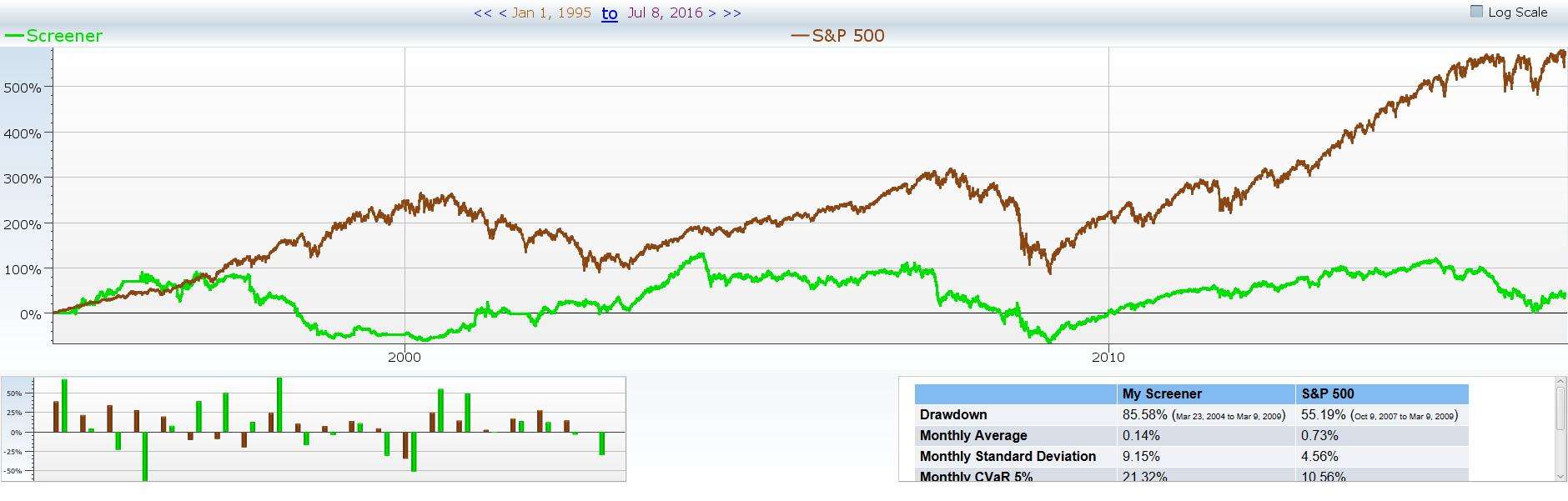
Here we look for companies that retired 10% of their shares last year. That’s a lot of shares! As a convenience, we include the large cap and buying back shares (though not at the 10% level).
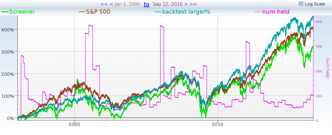
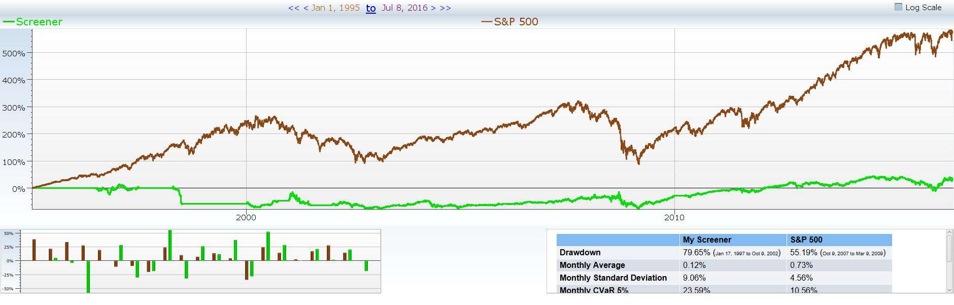
As you can see, this is not a win. How about mixing both changes, to look at only large stocks with large buybacks?
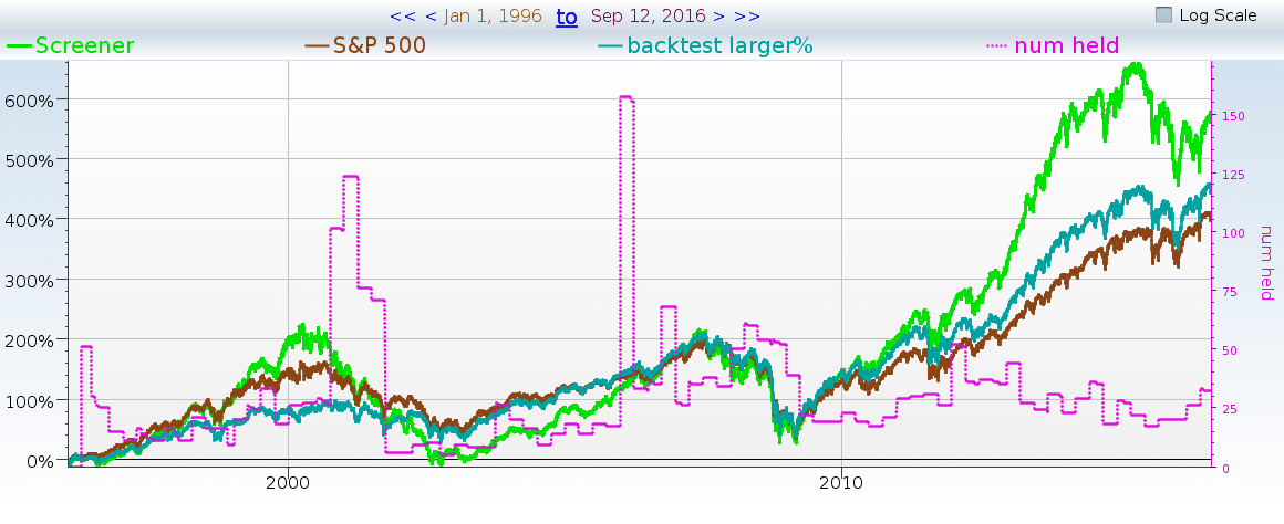
That works better! So are buybacks a fad? In short, no. Buybacks are just currently the best way to approach these large sum investments into these established (larger) companies. Are buybacks a harbinger of outperformance among large caps? Likely not. Notice that the bright green line (our “optimal” strategy) had a larger standard deviation.
We are a victim of the law of small numbers. Smaller groups of stocks are more likely to have more extreme performance. At this level we can see that there’s essentially no alpha to be gained from buyback hunting.
Death Crosses
What is a death cross? Why would we say, “it doesn’t work”? A death cross is a (very) vivid name for a short-term moving average slipping below a longer-term moving average. Technical analysts love to sell when they see death crosses and buy when they see golden crosses.
Keep reading this article to see the application of death crosses in a screener and some takeaways.
Let’s run some tests on companies with the dreaded death cross and find out some things for ourselves, rather than blindly following those who say to steer clear.
Death Crosses Tested Quarterly
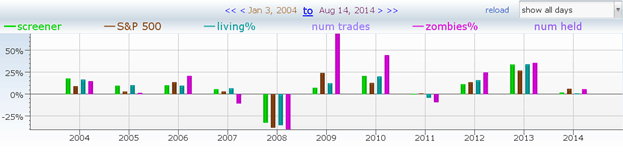
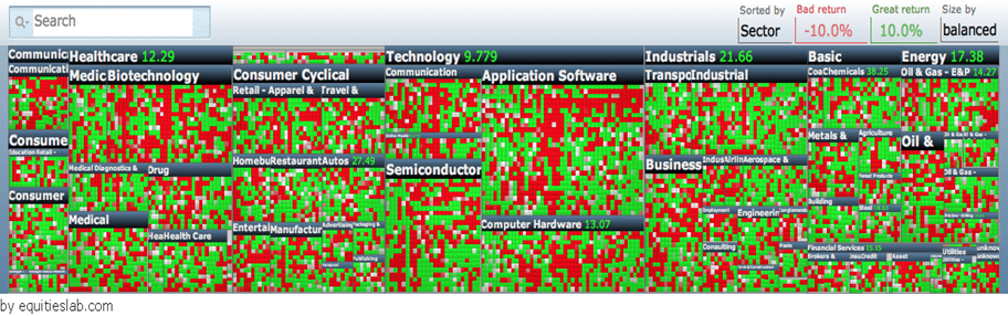
To start, let’s find a few companies that sport 50-day moving averages below their 200 days, like in the image below:

Wow! That’s a lot of stocks with 50-day moving averages below their 200-day moving averages… According to the technical analysts, these should all be dead stocks walking. That seems like too many dead stocks.
Will this hold true? Let’s test it further. Remember — green is good, and red is bad.
May 18-Aug 19th 2014,
That’s more green than expected! Let’s try another quarter.
Fed 15th to May 18th 2014
Better than expected! Let’s try another one!
Nov 15th, 2013 to Feb 15th, 2014
Those zombies don’t look very dead to me! Heck, the zombies actually managed to beat the S&P 500 equal weighted performance one quarter. Testing the non-zombie stocks (those with 50-day averages above their 200-day moving averages) for the same three quarters yielded more stocks but lower performance. The “living” stocks never managed to outperform the S&P 500 average. You might say this was a silly test. We just tested three quarters. Maybe we should give it more time to work…
Death Crosses Tested Yearly
The following chart shows the living stocks (green and cyan) vs the zombies (purple) and SPY (the S&P 500 index fund (brown)). As with the above screens, we have restricted ourselves to the S&P 1500 (smallcap, midcap and the S&P 500). We also rebalance weekly.
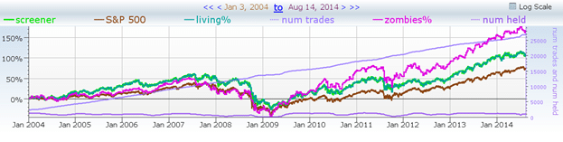
As you can see, the zombies were behind (slighty) in the period leading up to 2009, but they then outperformed from March 2009 onwards. The same data, different format, should make it easier to see:
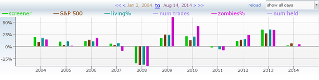
As we can see, even within the general trend, there is a lot of variability. What happens if we switch to an EMA (exponential moving average) rather than a simple moving average?
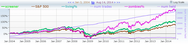
It worked, yay! But wait, the purple line is the zombies — the stock we are not supposed to buy under any circumstances, and to sell as soon as possible. Maybe the backtest by time or log scale will show us something different.
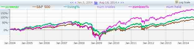
Nope.
Nope again. Maybe we are beta blasting, and the zombies really tanked when the market was terrible. Probably not — look at 2008, and how all the lines went down together.
Death Cross Takeaways
It is good to be cautious, but it is better to be informed! If we hadn’t done these tests, we would have ignored the opportunity to find these high-performing zombies and then believed that death crosses never have any positives.
If you are the type of person that wants to see things for themselves, then Equities Lab is the best software for you!
Altman Z Score
A Z-Score in statistics refers to how many standard deviations a particular data point is from the mean of the data. A Z-Score of 1 means the data point is one standard deviation from the mean. A Z-Score of 2 means two standard deviations. This is useful when comparing data points from different sets of data.
The Altman Z-Score, on the other hand, is an unrelated financial model that was created by NYU business professor Edward Altman, and is used to predict a company’s likelihood of declaring bankruptcy. Below is the formula for the Altman Z-Score .
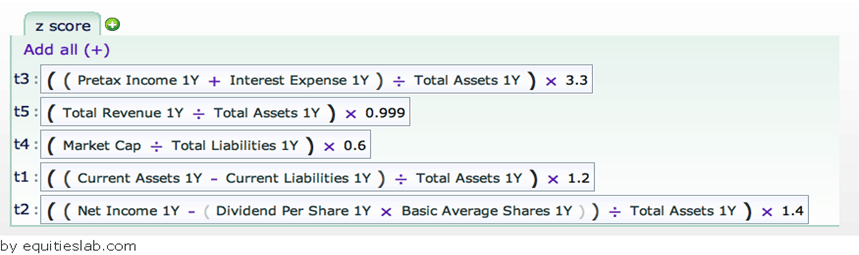
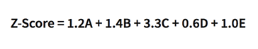
The How:
The Z-Score is calculated by weighing various business ratios and then adding them together. This number is then compared to a graded scale. It looks pretty complex, but it’s quite simple once you understand the different variables involved. Let’s break it down piece by piece.
A = working capital / total assets
B = retained earnings / total assets
C = earnings before interest and tax / total assets
D = market value of equity / total liabilities
E = sales / total assets
A Z-Score below 1.8 is an indicator of pending bankruptcy. A score of 1.8 to 3 indicates a company that might be headed to bankruptcy. Companies with a score over 3, are considered to be financially stable.
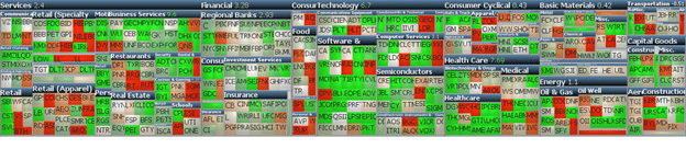
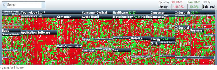
Let’s take a look at a backtest of the Z-Score formula in Equities Lab to see how accurate it has been. Below you can see the heat map and back tested chart of companies with an Altman Z-Score below 1.8, since 2000.
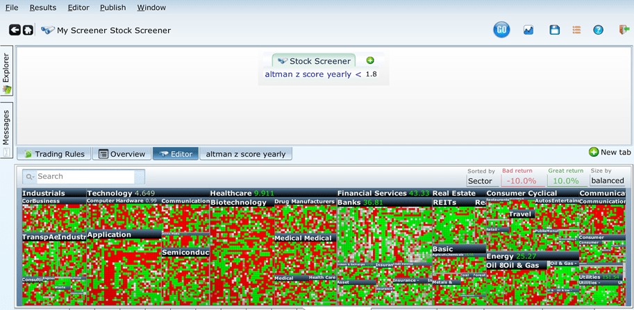
Well this is surprising! As you can see, of the many positions that we’ve held since 2000, the vast majority of them have performed well. Even more surprising, our portfolio of stocks that had poor Z-Scores, outperformed the market more than half the time. Perhaps the Altman Z-Score isn’t a good indicator of potential bankruptcy after all. Let’s continue our analysis by taking a look at companies that had Z-Scores between 3 and 1.8 for the same time period.
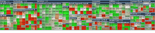
The surprises just keep coming! It seems that only a couple more companies with Z-Scores that indicate potential bankruptcy (1.8 – 3), performed better in comparison to firms with Z-Scores indicating impending bankruptcy. Additionally, the companies that fit into our updated screener underperformed the companies that had poor Z-Scores early on, but then the two groups had identical performances after 2008. They still outperformed the market as a whole, more than half the time. Let’s see what the results were for companies with good Z-Scores before we completely disregard the test.
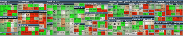
Surprisingly, or unsurprisingly, the backtest of companies with good Z-Scores didn’t perform well in comparison to our last two groups of companies. Even more unexpected, these firms didn’t outperform the rest of the market as much as the groups of firms with less than desirable Z-Scores. Perhaps the Altman Z-Score isn’t as prudent a tool for indicating firms that will go bankrupt. It is probably a good idea to add additional variables in addition to the Altman Z-Score to draw out more accurate results.
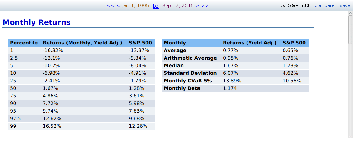
Stocks with 10% or higher yield
High yield stocks are currently all the rage. Some of our clients always ask for us to create screeners that search for the highest yielding dividend stocks in the market. This has resulted in asking the question “how good are just straight high yield dividend stocks?”
To start this experiment off we are going to purchase all companies that have a dividend yield of greater than 0.1 (otherwise known as 10%).
Well, that went horribly. This strategy is incredibly volatile and you end up making less than the market in the past twenty years. Let’s add some extra constraints on this strategy.
Here is the strategy if you make it so that it only returns companies that offer a yield greater than 0.1, and are capable of paying that dividend. We calculate this by making sure the EPS 1Y/Close is greater than the yield.
Nope, that’s even worse. Maybe larger companies that meet these criteria are better investments.
This screen takes all of the above restraints and makes it so that only companies that pass that criteria and companies that have a market cap over $1 billion are returned.
That’s not what we want to see either. There may be some investments worth having in the very high yield space — but tread carefully.
Traditional Scoring Technique (a technical analysis score)
This one is from ABG Analytics, a Quantitative investment site. In their technical analysis section there is something known as the “Traditional Scoring Technique” This technique looks good on the surface and hits all of the basic technical analysis points, but let’s test how it fares.

Here is the formula we will be using. Each line is pretty self-explanatory. The score itself goes from -6 to 6, but rarely does it go past five in either direction due to the RSI field parameters.
If you can’t tell from the formula, the higher the traditional technical score, the better. We can assume that a high score is going to outperform the benchmarked S&P 500, and that it will outperform a lower score. We can also assume that if a company has a very bad traditional technical score, that it will underperform the market and possibly even lose money.

Here is an example of the formula used in an instance where our screen looked for companies that sported a Traditional Technical score greater than 3. It does beat the market by a bit, but it does so at a higher standard deviation – resulting in a Sharpe ratio of .13 compared to the benchmark’s .16. In this instance, though these companies were supposedly the best according to technical indicators. Now, the strategy did beat the market in that time period, even if only for a bit. It does coincide with our assumptions.

That is more along the lines of what we want to see when running tests. Here we isolated companies that had a traditional technical analysis score of less than -3 and backtested it over the past 22 years. This screen averaged .38% annually at a massive standard deviation.

When you get a screen that does so poorly it’s usually the result of not having a lot of results or a couple of the results bringing down the overall average. We have the exact opposite happening here in the image above. There are 170 matches, and the average number of positions held in your account at any one point in time is 320. That’s not a small pool.
Overall, the traditional technical score did pass the minor testing we did to it in this article. Though I wouldn’t use it as a green flag indicator to find something to buy, it seems to work fantastically as a red flag indicator for companies to stay clear from.
Slow growth of Cash flow from continuing operations
How important is income growth when it comes to finding a company to invest in?
In our screen we go through and look for companies that have a market cap above 500 million, a positive cash flow from continuing operating activities for the trailing 12 months for both three years ago and today, and the growth in the cash flow from continuing operating activities has grown over the past three years. Here are the results when we test this.

Large, cash cow style companies don’t exhibit much growth in the way of income. However, many of these companies are incredibly stable and make good long term investments. Many of these companies are industry leaders in stable industries that can be considered “boring”.