
Investment Green Flags – High F-Score
High Piotroski F-Score
A recurring name throughout our software and website, the F-score has been continuously tested under many different circumstances and never ceases to amaze me. It may be simplistic, but, when used correctly, can be a very powerful tool for your portfolio.
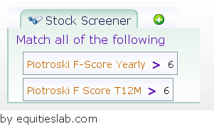
For this Green Flag we want to look at the two calculations we have in the system for the Piotroski F-Score – Yearly and Trailing 12 Months. If you are unsure of the difference, the yearly score is based on the most recent annual data, while the T12M relies on the four most recent quarters. This slight difference just means that the T12M score is two-quarters ahead of the yearly score data wise.
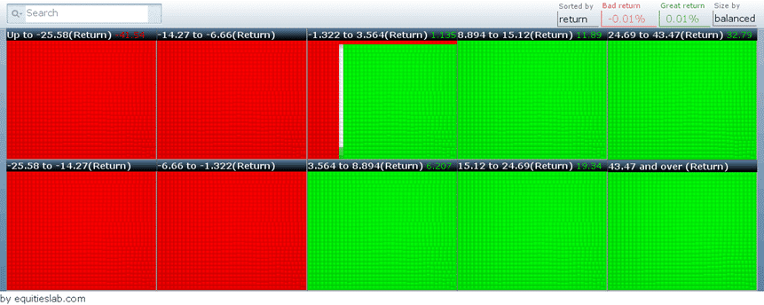
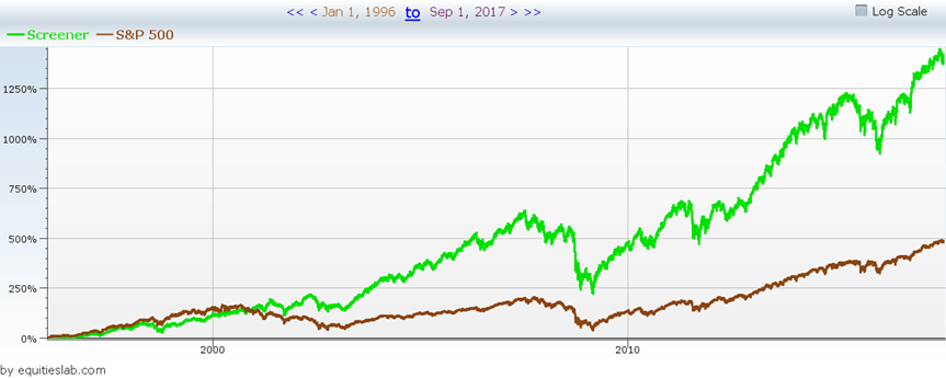
Following the same rules as all of our other Green Flags, “a high F-score” has given us just under a 60% success rate, and also beat the S&P 500 by a pretty significant margin since 1996 – returning over 12.5% annually.
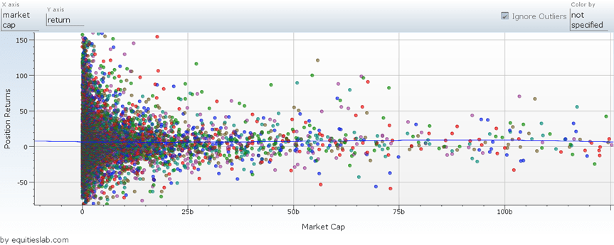
The Companies returned via this green flag range across the entire market cap spectrum. On top of size, these companies all vary widely in returns at the lower market caps and become seemingly more stable at the higher levels.
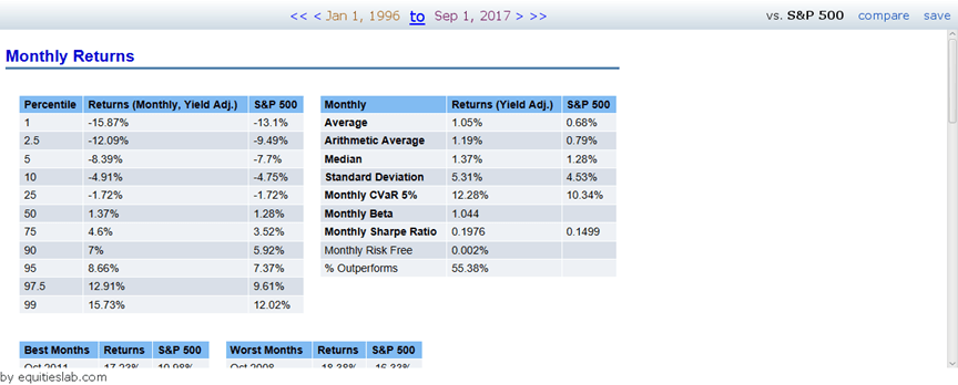
Since there is a slightly lower win rate for this flag, we want to make sure that the returns justify the risk. The easiest way to perform this check is to ensure that the Sharpe ratio of the strategy is greater than the Sharpe ratio of the benchmarked S&P 500. If you haven’t seen it before, the Sharpe ratio compares the returns of a strategy to the standard deviation of the positions taken on over the period. This calculation makes sure that the extra gain is worth the risk. Ie. If the Sharpe ratio is smaller than the S&P 500’s, then we would be better off taking the lower returns of the benchmark than the high-risk returns of the flag. In the case of the “high f-score” flag, we are sporting a Sharpe of 0.1976, which is considerably greater than the Sharpe of the S&P of 0.1499.
Like all of the other flags in this series, this shouldn’t be your entire strategy.