
Investment Red Flags – Close < 2
We are going to explore characteristics of the “Ultra Low Market Cap” red flag. It’s important to learn basic red flags in investing. Marketers often try to sell you on what will ultimately flop. If you want to learn even more about investments and trading, you can check out avatrade review to gain sufficient knowledge.
We will look for companies with a close of less than 2. This simple calculation will show several companies with market cap ranges from Micro to Small. These companies tend to have extremely poor fundamentals with a high probability of causing negative returns in your portfolio.
Let’s jump into what NOT to invest in.
The Formula
For this flag, the formula collects all companies with a close of less than two when screening. Many marketers will try to sell you the idea that you can make your fortune on these low-priced stocks. In some cases, that ends up being true. In the majority of cases however, you’re going to be stuck with a failing company without enough volume for you to exit the trade when you need to.
The Results
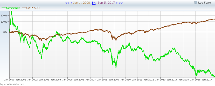
Now, all red flags in our system must follow a couple of simple rules. The first rule is simple, the strategy must lose money over the defined period—in this case, from 2000 to today. In the case of “RawClose < 2,” we have successfully lost money for the majority of the years specified. There was a small spike during the dot com bubble throughout the year 2000, but that was quickly corrected as the strategy went from +200% to -50% over the next two years.
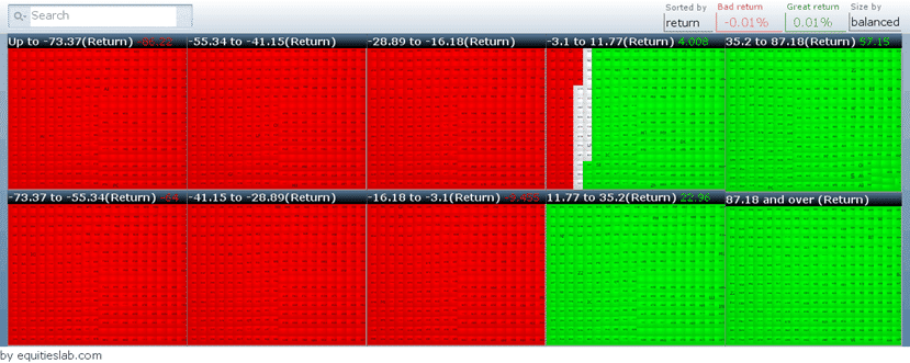
The other major requirement for our red flags is that more than 50% of all positions taken on during that time frame must lose money. In the image above, you can see that we have a loss rate of just over 60%. So if you wanted to make money over the past seventeen years, you would have needed to successfully pick the 1156 companies that made money in that timeline. This doesn’t seem too hard, but it becomes a bigger challenge when you made fewer than 3000 trades over those seventeen years. It’s probably smarter to stay away from these companies altogether.
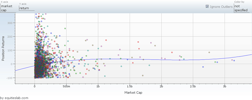
In the above scatter plot, we have plotted the market cap of all companies taken on by this flag and compared them to the total returns made by that position during the trade duration. The majority of the companies returned had a market cap of under $500m, which was to be expected. There were obviously some big winners – with some companies returning as much as 400%. However, most of the trades are in the chart’s bottom left-hand corner. This densely populated area is full of companies that have lost money.
Takeaways
There are obviously some clear red flags that pop up within this simple formula. Although not every small company will fit those criteria, reflecting on and using red flags benefits new investors. You could find parameters that found the best-performing low-priced companies, but when the majority of companies that have a price of less than $2 lose money, is it worth the risk?