What does negative EPS tell us about a company?
What is EPS?
Normal companies listed on stock exchanges exist for one purpose: to allow people to invest in them and share the profits the company makes. Since investors pay attention to earnings per share, or income, they will talk about companies with good EPS, or high income. EPS stands for earnings per share which is a financial metric that measures a company’s profitability by calculating how much money it makes per each share of its stock.
What is Negative EPS?
Sometimes for companies, things don’t go according to plan. The company makes revenue, pays expenses, and finds that they have actually paid more in expenses than they had in revenue. This means the company has lost money.
This article is about those companies. The companies with negative EPS, or negative income. The loss makers. Unprofitable companies. Money losers.
There are three intervals people use to talk about income:
- Annual Income — This is the income reported on the 10-K. It covers the year being reported on in the annual report at the SEC (Securities and Exchange Commission).
- Quarterly Income — This is the quarterly income reported to the SEC four times a year. Sometimes the annual report will also contain that quarter’s report, but Morningstar sorts this out so the data you get won’t have to worry about that.
- Trailing Twelve Months Income — This is simply the sum of the last four quarterly incomes. This can be different from the annual report because you might be a quarter or two or three from the last annual report.
Thus, zero, one, two, or all three of these can be negative. If none of these are negative, we have positive EPS, which is the normal happy condition. If one or two are negative, we have mixed EPS. If all three are negative, we have negative EPS. As you will see, negative EPS can be a harbinger of future financial displeasure. Mixed EPS is a much weaker signal. To summarize:
Mixed EPS, which refers to a company with negative EPS in any one or two of the quarterly, the annual, or the sum of the last four quarterly reports.
Negative EPS, which refers to a company with negative EPS in all three of the quarterly, the annual, and the sum of the last four quarterly reports.
An example: General electric
GE (General Electric) is a perfect example of what negative EPS can bring to your portfolio. They first lost money (in all three of quarterly, yearly and trailing 12 months) in February 2018. They had a stock price of $71.93 (split adjusted) when this happened. (small detail: the money loss was reported February 2018, for the period ending December 2017)

From there it grinds down more than 50% over a period of almost three years, no doubt causing many lovely conversations among many investment committees. Then, just to prove that no rule is without an exception, when it again lost money in 2022, it lost money but went off like a rocket before it stopped losing money. Over the entire span, it outperformed the S&P 500, but only by a slim margin, and only because of the last 18 months.

The Baseline: How does negative income affect a company’s stock price?
Negative EPS in normal companies is bad news: the returns since 2000 were negative. The maximum drawdown is also higher: 85+% vs the normal 55%. Also, as detailed later, it is very difficult to make a good screen with negative EPS.
Notice that the chart is down and to the right!
In the coming headlines, I try a out a bunch of common “ameliorating factors” or excuses, to see if any of them are worth paying attention to. That is if a company has X and also negative EPS, should I be willing to hang on? Alternatively, one can scan this section to see if there are any juicy -99% style returns that could drive a short or put buying strategy.
Trying the S&P 500?
At first I thought that was a trick question: The S&P 500 inclusion criteria mandates positive earnings for the last four quarters. But I tested it anyway, and lo and behold, companies matched. My guess is that they take time to get dropped. Investing in them is still not a great idea, especially compared to the rest of the S&P 500.
| Close on Jan 3, 2000 to Apr 4, 2024 | Returns | S&P 500 |
|---|---|---|
| Total Returns | 34.62% | 446.9% |
| Drawdown | 87.3% | 55.2% |
| Annualized Returns | 1.23% | 7.26% |
| Daily Beta | 1.435 | |
| Annualized Alpha | -8.35% |
The returns are ugly, with okayish returns many years, and awful returns the others. 2003 and 2009 are the exceptions, with great returns, just to prove that that all rules have exceptions.

Trying good momentum
I wanted to know which is more important: momentum or negative EPS?
| Score | Min Pct Qtr Gain | num matches |
|---|---|---|
| -1.03% | 0 | 111.65 |
| -21.17% | 8 | 86.25 |
| -21.23% | 4 | 98.3 |
| -43.74% | 12 | 75.55 |
| -50.99% | 16 | 64.25 |
| -68.76% | 20 | 55 |
| -73.33% | 24 | 47.8 |
| -78.42% | 28 | 41 |
| -81.06% | 32 | 35.75 |
| -90.77% | 36 | 31.05 |
| -93.51% | 40 | 27 |
Clearly both are important — in the same way. Negative EPS is bad, and so is too much momentum. Both together are terrible!
Trying bad momentum
Is negative momentum and negative EPS a less ghastly combination than positive momentum and negative EPS? Maybe they go hand in hand to profits.
| Score | Min Pct Qtr Loss | num matches |
|---|---|---|
| -78.74% | 0 | 88.95 |
| -78.98% | -4 | 78.3 |
| -88.62% | -8 | 66.7 |
| -94.28% | -12 | 55.45 |
| -96.64% | -16 | 46.75 |
| -97.73% | -20 | 38.6 |
| -98.28% | -24 | 31.05 |
| -98.64% | -28 | 25.45 |
| -98.18% | -32 | 19.8 |
| -98.95% | -36 | 15.65 |
| -98.16% | -40 | 12.2 |
Nope! It seems they both prefer losses. It seems clear from here that stocks with positive momentum near 0 winning choice. Investing in them gives you the ability to only lose 2%. Yay. More seriously, small and positive are keys to using quarterly momentum. Zooming in further, we look at it one percent at a time, I see a much grimmer picture.
| Score | Max Quarterly Performance | num matches |
|---|---|---|
| -94.33% | -5 | 5 |
| -67.86% | -4 | 8 |
| -57.15% | -3 | 11 |
| -67.14% | -2 | 8 |
| -99.23% | -1 | 4 |
| -71.9% | 0 | 6 |
| -54.74% | 1 | 6 |
| -91.73% | 2 | 5 |
| -35.51% | 3 | 9 |
| 469.5% | 4 | 4 |
| -94.35% | 5 | 6 |
Notice that the only happy path is in a terribly narrow range, with -94% performance on one side, and -35% on the other. The fact that only four stocks, on average, match this happy path makes me no happier about this. Taking a side trip, I rerun that screen with just 4, so I can see who matched, and what happened, and I see this:

The drawdown is 95%! Most years are bad, but the years that are good are really good. This dismal yet performant screen (it barely beat the S&P 500) helped hide all the bad performance of the other momentum values. I’d call it a fluke, rather than a repeatable strategy.
Trying the Piotroski F-Score
The idea here is that companies with stronger financials can survive being unprofitable. It turns out they can, as higher results are better. Since one point is denied them because of their money loss, the max achievable score is 8, but higher is in general better.
| Score | The Piotroski Score | num matches |
|---|---|---|
| -96.65% | 0 | 0.45 |
| -99.58% | 1 | 6.55 |
| -71.74% | 2 | 23.95 |
| -65.21% | 3 | 43.9 |
| 20.3% | 4 | 53.65 |
| 1.45% | 5 | 43 |
| 5.79% | 6 | 22.35 |
| 2,666% | 7 | 6.35 |
| 23.7% | 8 | 0.3 |
| 0% | 9 | 0 |
If the Piotroski score is below 4, it will make you poor. Keep that as a mantra and you will lose less money in the stock market. I feel like the Piotroski 7 result is the same kind of fluke that the momentum exactly equal to 4% is. Those outlandishly good results are hiding a grim reality of negative EPS stocks. That said, at least the neighbors (6 and 4) actually make money for their investors. Just not very much money.
Trying the Beneish M Score
I’m honestly not sure what the Beneish score has to do with money losers, but I decided to try it anyway. Maybe if the company is cooking the books and the score still flashes a warning, then we should panic, as opposed to the normal dread? Lacking the intuition here, I find a table of results helps my thinking.
| Score | The Max Score | num matches |
|---|---|---|
| -94.77% | -5 | 18 |
| -76.34% | -4 | 37 |
| 126.4% | -3 | 131 |
| 21.76% | -2 | 175 |
| -82% | -1 | 15 |
| -99.22% | 0 | 11 |
| -95.22% | 1 | 4 |
| -99% | 2 | 1 |
| -99.98% | 3 | 1 |
| -98.61% | 4 | 2 |
| -99.99% | 5 | 1 |
Again we see a seemingly narrow range promise good results. I like this result better for two reasons:
- The “happy” results have many many more matches — almost a third of the total
- The “happy” region is the expected happy region for Beneish overall, and the “happy” region for all stocks.
This tells us that if you find yourself holding a negative EPS company, you should check that its Beneish score is normal. If it isn’t, SELL!!!!
Trying the Montier C Score
Encouraged by the Beneish score, I thought I’d try out the Montier C Score. This one also checks for financial manipulation, but it takes a different approach. It has a six point checklist, like the Piotroski score. Unlike the Piotroski score, the best score is a 0.
| Score | The Max Score | num matches |
|---|---|---|
| -24.93% | 0 | 67 |
| -31.32% | 1 | 143 |
| -25.83% | 2 | 128 |
| -26.69% | 3 | 66 |
| -10.33% | 4 | 9 |
| -56.18% | 5 | 0 |
| 0% | 6 | 0 |
I don’t see anything here to recommend the Montier C Score when looking at negative EPS companies. All the scores are about the same until we get up into the 5-6 range, and then they diverge wildly. With no matches.
Testing lagged Montier had me excited briefly — lagging it one year did better. But lagging it two years was a bust, as was lagging it three years, and four years. So either life is somewhat random, or the Montier C Score has been designed with surgical precision to predict exactly one year in the future. I’m betting on the randomness of life.
How long does it last?
Now that we’ve decided that negative EPS is bad, we know we have to be careful. But how long does the caution tape stay up around our investment? Should we check the stock tomorrow? The day after? Next year? Never again. The easiest way to test the “never again” idea is to test all companies that had negative EPS a decade ago, and compare them to two other groups: the ones with positive EPS 10 years ago on all three measures, and the set of all companies that were “normal”, regardless of their EPS. In all cases, the “normal” conditions were checked as of the current time, and the EPS was checked in the past. We adjust the time intervals to fit our data, starting May 4,2005. The green line is the positive EPS (on all three measures), the red line the negative EPS, and the grey line is indifferent to EPS.

I was honestly surprised to see that it made any difference at all. We weren’t checking current income for these companies — we were looking a decade in the past. That said, I wanted push in further: checked each interval from 0 years ago to 10 years ago, for the negative EPS case.
| Score | Years Ago Lost Money |
|---|---|
| 45.53% | 0 |
| 71.35% | 1 |
| 37.14% | 2 |
| 60.59% | 3 |
| 144.3% | 4 |
| 169.4% | 5 |
| 193.2% | 6 |
| 169.1% | 7 |
| 174.8% | 8 |
| 134.7% | 9 |
| 202.6% | 10 |
We see that the numbers creep back towards the 318% that the dontcare line above had, but they never quite make it. I did not think the stock market’s memory was so long. Just to test that theory, I ran the same test for stocks that were normal now, and had a closing price greater than 0 at varying times 0 through 10 years ago. Since all stocks (that I’m familiar with!) have closing prices, we are simply checking that the stock existed at the time specified.
| Score | Years Ago Existed |
|---|---|
| 318.2% | 0 |
| 318.1% | 1 |
| 318.7% | 2 |
| 323.1% | 3 |
| 340.5% | 4 |
| 345.8% | 5 |
| 342.4% | 6 |
| 338.5% | 7 |
| 349.1% | 8 |
| 361.7% | 9 |
| 366.3% | 10 |
All the numbers converged on the don’t care line, and they are all fairly close together. Still puzzled, I ran the obvious test remaining: checking the green line (positive EPS) from 0 to 10 years ago. This meant that the company had a positive EPS for the quarterly statement, the annual statement, and the trailing twelve months statement.
| Score | Years Ago Made Money |
|---|---|
| 396.9% | 0 |
| 459.5% | 1 |
| 473.9% | 2 |
| 432.1% | 3 |
| 412.4% | 4 |
| 435.8% | 5 |
| 434% | 6 |
| 384.1% | 7 |
| 410% | 8 |
| 461.8% | 9 |
| 423.7% | 10 |
Notice here we are not simply finding companies that are not money losers. They have to be money makers in all three periods. Since most companies spend most of their time making money, the ask is not as big of an ask, and the effect is not as strong as the negative effect is for money losers. That said, EPS (positive or negative) seems to be the gift that keeps on giving. Even using EPS data a decade after its release date, insisting on money makers netted 50 basis points more than companies that existed a decade ago. Investing in companies that lost money a decade ago was worse, losing you 3% in annualized returns.
Based on this analysis, I would rate this flag as sticky, as it still can be detected a decade later, though it is not totally overwhelming.
What about companies with mixed EPS?
So the question here is what if only the yearly statement has negative EPS? Or just one quarter? Or just the trailing twelve months? The black flag refers to all three being negative. What if it’s not all three, but one or two of them?
As it turns out, that is not nearly as bad.

It still has the terrible drawdown, but much better performance. The mixed EPS line denotes companies that have one or more positive EPS figures. It is only slightly above the undifferentiated mass of normal companies denoted by the is_normal line, because most companies make money most of the time.
How long does this lesser problem last?
I tried the same test of decade old news about mixed EPS, and was not shocked, stunned, or surprised to find out that the market hardly cared.

Testing periods shorter than a decade, I got a more mixed picture.
| Score | Mixed EPS years ago |
|---|---|
| 174.8% | 0 |
| 151% | 1 |
| 192.4% | 2 |
| 272.1% | 3 |
| 269.5% | 4 |
| 335.7% | 5 |
| 309% | 6 |
| 348.6% | 7 |
| 288.9% | 8 |
| 282.2% | 9 |
| 323.7% | 10 |
Based on this, I would rate the effect as long lasting, though not sticky.
What should an investor consider when evaluating money losers?
The investor should ask:
- Do I feel lucky today? Really lucky?
- Do I know something game-changing about the stock that nobody else does?
- Do I have the time, willingness, and conviction to create an intricate, slightly unreasonable portfolio quantitatively, and use that?
If the answer to all three questions is no, the investor should look elsewhere.
Negative earnings as a flag
EPS is a figure that is closely watched by investors and is used to value companies. It is typically a positive number, but not always. In this article, we are going to delve into the dark side, and consider companies with negative EPS. Our objective is to do the following:
- Understand Negative EPS Stocks
- Find the reasonable stocks that have Negative EPS
- Wall off a set of stocks as truly hopeless (or maybe as good short selling candidates)
Why try to make money with THESE stocks?
In this article we will take a deep dive into an attempt to work with a negative EPS portfolio. If you are more interested in the meaning of negative EPS for your investment, head over to that article, and if you are interested in red flags, and how to use them, read about them here.
Once we are done, we will have an accurate understanding of what it means for a stock to have negative earnings, and how it contrasts with the wider market as a whole. Struggling with this set of stocks will give us bag of tricks, and a strong sentiment about stocks with Negative EPS. When we learn that a stock belongs to our set, we will either know that we can stop looking and go onto our next stock, or decide what we need to learn. Of course, there is an additional reason to try: for the thrill of it!
So, pick a side! Root for the power of the dark side, or for your gentle author. Pull up a chair, and get some popcorn for one of us will emerge victorious.
Our goals
Create a reasonable screen with negative EPS, that also meets the following criteria:
- 10% or more of the original set of stocks. Since we matched 200 stocks on average with our base restrictions, that is about 20 or more matches, on average, averaged over the last 20 years
- Maximum Drawdown of less than 60%
- More than 5% alpha annualized, on the quarterly rebalance.
- Reasonable robustness over different rebalance periods. That means that the three quarterly rebalances need more than 3% alpha, as do three of the yearly rebalances in January, April, June, and September.
- An easily explained screen, with a coherent strategy that is at least mildly intuitive.
If I win, achieving all the goals, with reasonable effort, then I would interpret negative EPS as a Yellow Flag. This would make it a warning, but not a deal breaker and just be one more thing to consider when buying a stock. If I were creating some sort of deep value “cigar butt” screen, I might run it against negative EPS companies, but the results would be just one more data point.
If I achieve some of my goals, with reasonable effort, I would interpret negative EPS as a Red Flag. I would think much harder before including negative EPS stocks in a portfolio, and be willing to screen them out for convenience or performance without worrying about it. I would further want to know how negative earnings play usefully into my investment thesis or screen thesis before buying. For instance, if I created a “cigar butt” type screen, I would want to test it (at the end) against negative EPS, or screen them out. If it did OK with negative EPS, I would not filter them out, because “cigar butt” companies are so deep value that they are expected to have issues.
Finally, if I lose, I would interpret negative EPS as a Black Flag. I would want to only include negative EPS if I had designed my screen with that in mind, and was happy with the results. Even then would I assume that my best case scenario would have whatever bad results caused me to declare defeat. When designing my “cigar butt” screen, I would probably filter out negative EPS stocks right at the beginning, because it would not be worth having them in the screen. I would regard screens built around negative EPS with definite skepticism.
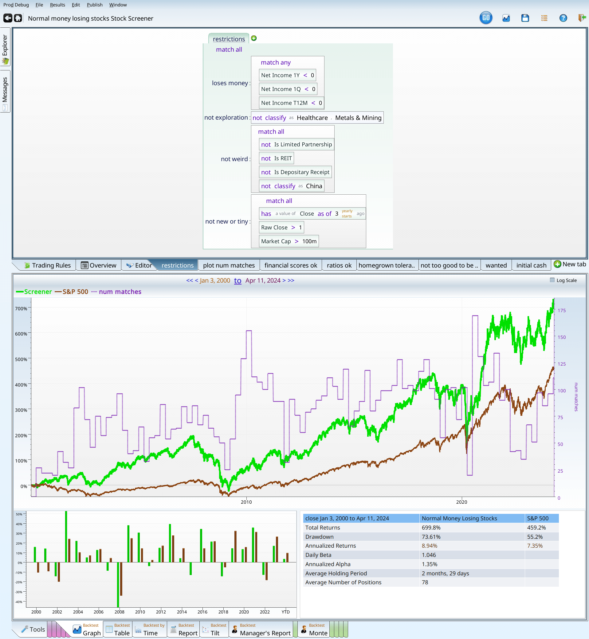
Examining normal money losers
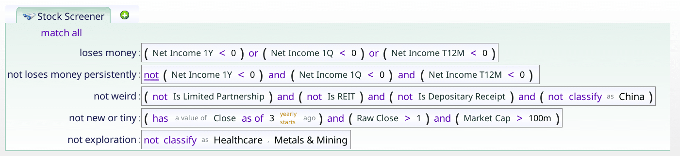
How does a stock qualify?
- Negative EPS/Income — we want companies that actually lost money, in the last quarter, the last trailing twelve months, and the last yearly report. We want no ambiguity, no excuses. Just 100% red blooded negative income stocks. Here we could have used negative EPS with almost the same results. Since every company I have ever heard of has positive shares, whether we do or do not divide by the number of shares is irrelevant. The only reason to look at income rather than EPS is to avoid rounding errors: companies with very small negative incomes will report 0 for EPS.
- No binary option type stocks — Biotech, metals and mining companies can all have very odd configurations. In any of these cases, companies are hoping to strike gold — either figurative gold, or literal gold. Either the company’s future blockbuster drug gets FDA approval, and they go up hugely, or they do not, and they go out of business. Investing in such stocks can be lucrative, or a way to lose your shirt. The financials will tell you nothing about whether they do or do not have a good drug. Similarly, mining companies will or will not strike gold. Either way, they are not what we are looking at here.
- No weird corporate structures — REIT’s, pipelines, ADR’s and Chinese companies can be wonderful or terrible investments. They definitely do not count as normal, however.
- No IPO’s or penny stocks, or micro-cap stocks — IPO’s don’t have a lot of financial history on which to judge the company and they can also feature large, locked up shareholders who will sell stock as their lockup period ends. Penny stocks are hard to invest in because you would have to invest too many shares to actually make a difference, and they typically lack liquidity. Micro caps (companies under $100M) also lack liquidity. In all three cases, they don’t really count as normal, so they will be excluded.
Here is the final criteria…
Who are These Companies?
Using the above criteria, we get around 400 stocks.

It looks like there is a bit of everything, (except healthcare), and quite a bit of technology. Breaking our results down further using Equities labs interactive pie charts, we can see that for the most part, the results are all over the place.
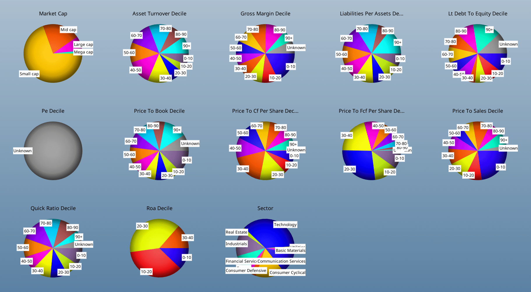
A few results that stand out: The P/E deciles are all “unknown” because stocks with negative earnings do not have P/E ratios. Perhaps people don’t use income as a pricing metric if it is negative… Similarly, the ROA decile pie chart is all 40 or less, indicating that 60% of companies make money, just not these ones.
With slightly less surprise, we can note that the companies tend to be on the small side. There are very few mega cap companies in our results. Price to X ratios all tend to be weighted to the lower values, as investors are willing to pay less for negative EPS companies than they are for positive EPS ones.
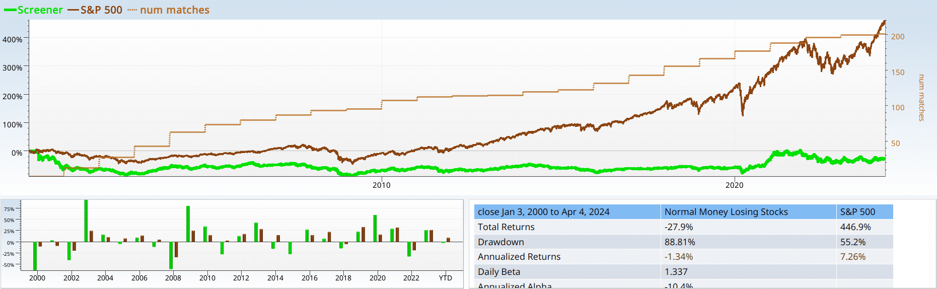
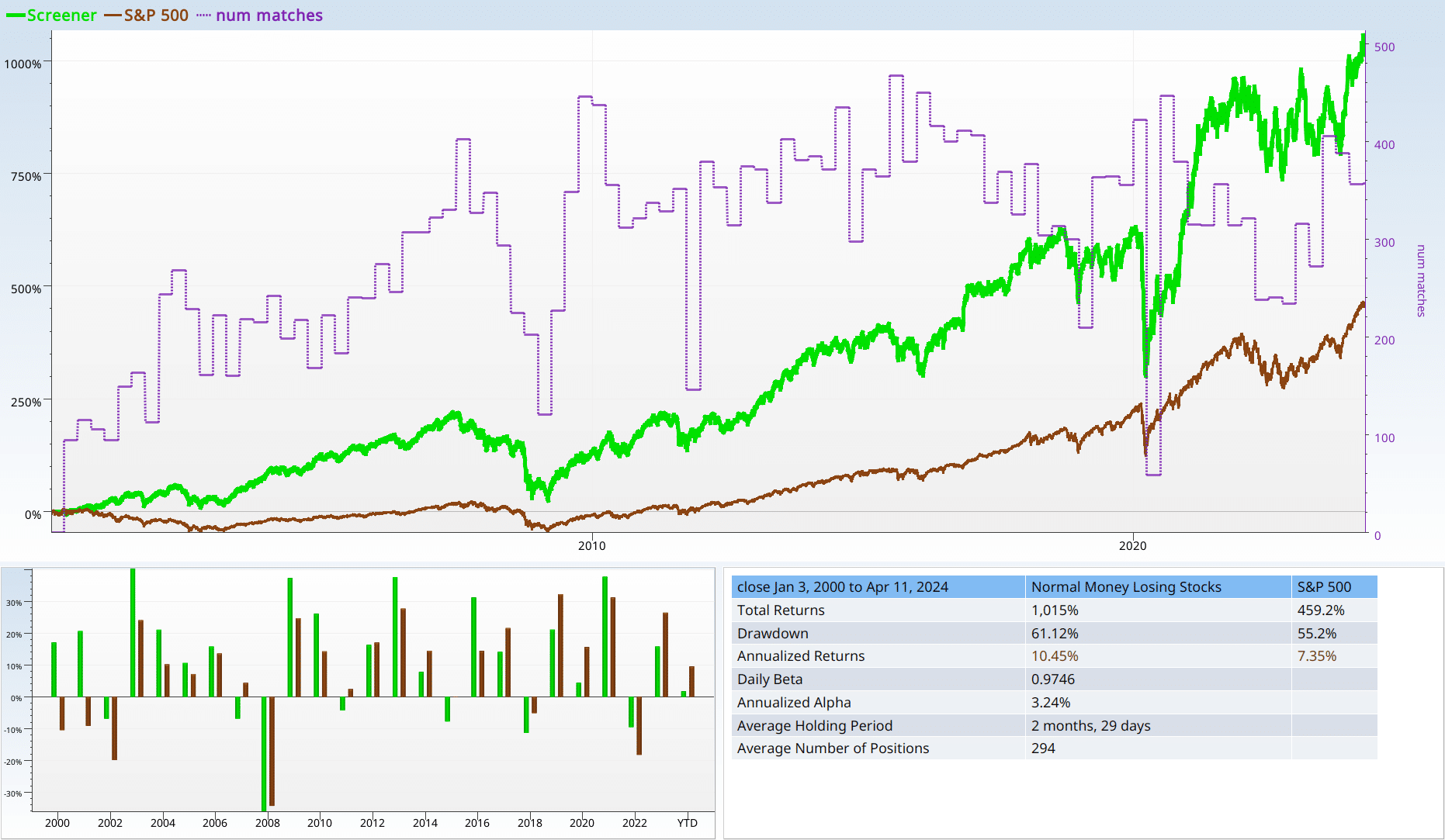
And now for The performance
I am delighted to tell you that if you follow a rigorous strategy of investing in normal negative EPS companies, rebalancing faithfully each quarter over a 24 year span, you can look forward with great anticipation to your $100,000 turning into …. $72,000. That is clearly not a good strategy.
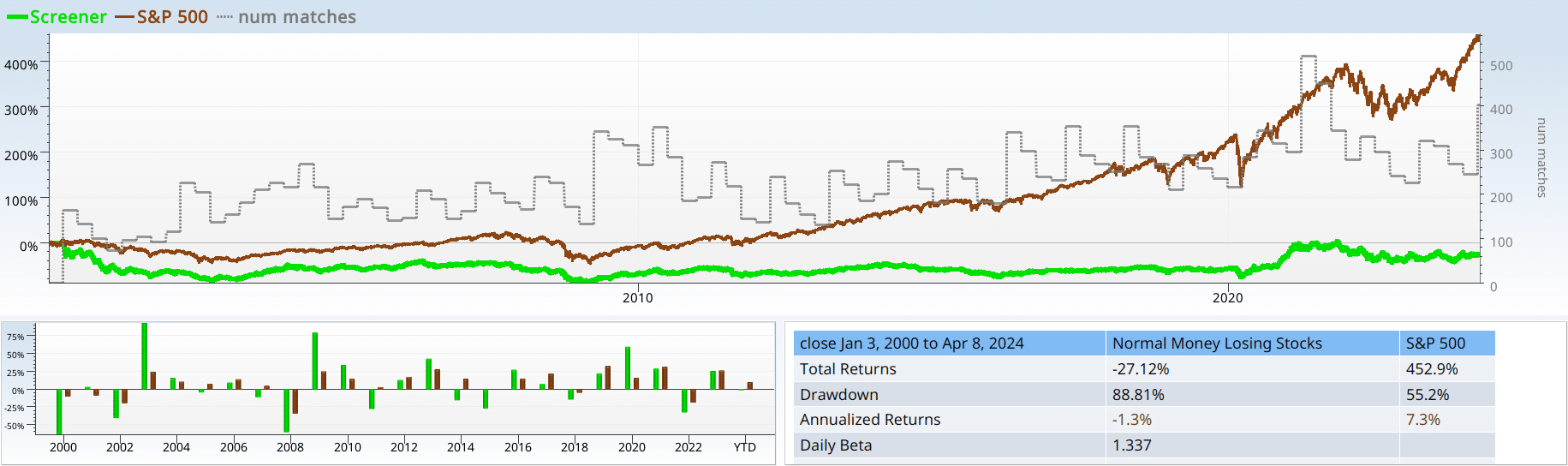
Yet, if you look at the backtest by time, it trounced the market in 2003, 2009, and 2020 and kept up with the market at other times. Then fell on its face 11 years out of the 24. Our alpha was -10%, and our drawdown was 88%. So yeah, not a winner! Notice also, that we have about 300 stocks on average in our portfolio. This will matter later, as we trim this number of holdings into fewer, hopefully better stocks.
Recap: Performance
If we do not know anything else, other than that a stock has negative income, we should not eagerly make it part of our portfolio. If we own a stock, and it is losing money (yearly, quarterly, and over the last trailing twelve months), we should strongly consider letting it go.
Tools in our fight
That being said, we are not going to slink off the stage without a fight. Here is a list of my go-to strategies for improving a screen:
- Large cap/High volume — maybe we can hide in a crowd…
- Validated academic regressions — maybe we can use an academically validated regression to control our junk, and get good results?
- Price per whatever — will focusing on P/E, P/S or sales per income (profit margin flipped) help?
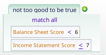
- Homegrown scores — using Income statement score, Balance Sheet score, Cash flow score, and Value Score to try to improve the results.
- Past Earnings — does it make a difference if a company used to have positive EPS?
Unprofitable Big dogs
My first thought is that this is a small cap problem. If I rule out small caps, I can get reasonable results, and build from there. I first tried $10B as a cutoff, looked at the 97% drawdown, and almost skipped to the next section without any further analysis. Then I realized there were usually only a few matches: 0 to 60, but mostly less than 30. I omit the num matches line from the future results as it makes the graph cluttered.

Trying out $1B, I got better results: more matches, and a smaller loss. These still are not really usable results. -19% is almost as bad as the original results, and we have thrown out most of our material. I put the graph below, so you can see that it makes a difference, but not much.

That said, I do not like these results enough to push on with market cap. So next, we try trading volume. Since daily trading volume is so variable, and not easy to grasp intuitively, I simply ranked them on deciles (lowest 10%, next 10%, and so on) to see if there is a clear winner there.
| Score | The Max Volume Pctile | num matches |
|---|---|---|
| -36.73% | 10 | 14.9 |
| 7.04% | 20 | 22.6 |
| -80.5% | 30 | 25.25 |
| -50.02% | 40 | 23.9 |
| -61.69% | 50 | 22.95 |
| 18.7% | 60 | 20.75 |
| -60.6% | 70 | 19.1 |
| -63.15% | 80 | 18.65 |
| 138.1% | 90 | 16.75 |
I am deeply unimpressed with the results. Most of them are dismal, and the few that don’t lose money are scattered randomly throughout. So size and trading volume are not a counter to the curse of negative EPS. The fractional “num matches” is because we are averaging number matches over the last 20 years (sampling at the beginning of the year).
Recap: Market Cap and Trading Volume
Popular stocks with negative EPS are likely still bad investments. So are large unprofitable companies. To repeat (or rephrase): negative income trumps popularity and size. There are counter examples (Tesla and Amazon), but the general rule is clear.
Validated academic regressions
Academic-validated strategies offer investors a structured and systematic approach to evaluating potential investment opportunities. Here is why they are useful:
- Quantitative Approach: It is hard to argue with numbers. They tend not to listen to your excuses, and that can be a good thing.
- Evidence-Based Investing: Academic papers tend to use regression analysis, consider lots of other theories, and delve more deeply into the ratio than the typical investor. They rely on fairly high quality data, which goes back decades.
- Relatively unbiased: Academic livelihood is not based on how many people read or act on their papers. Instead, it matters how many academics cite and build on their papers. This gives them a different angle on the market, which is useful.
Here, I chose to use the Piotroski and Beneish Scores to try to find the negative EPS companies worth investing in.
The Piotroski F Score
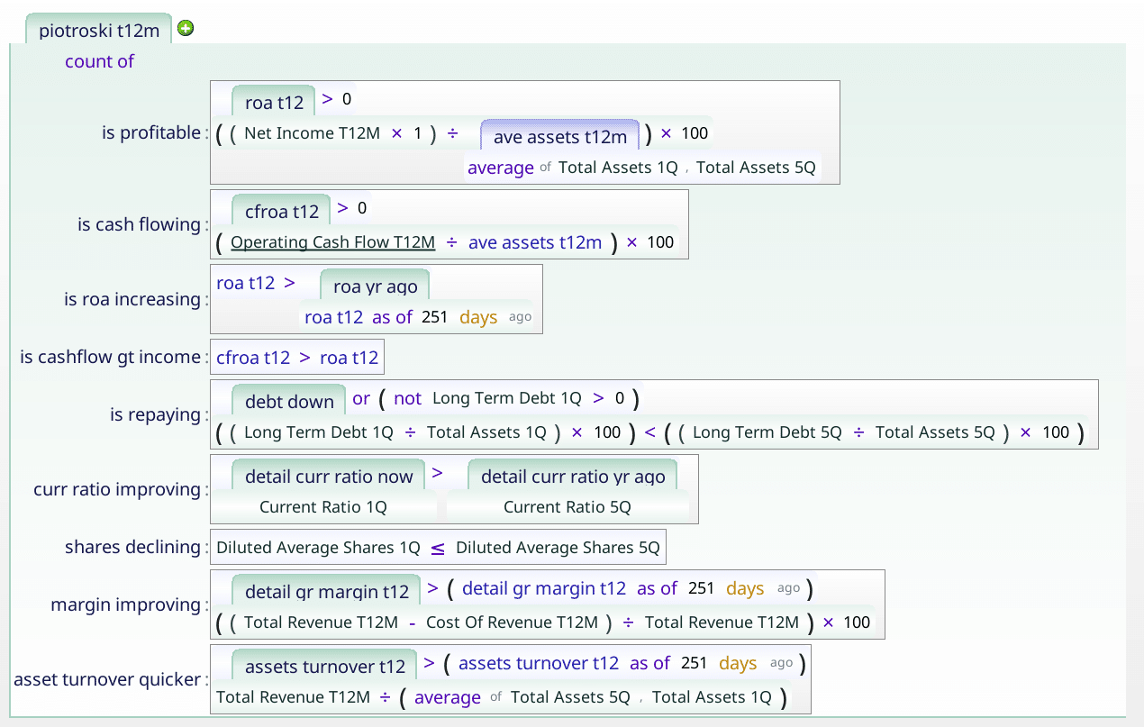
The Piotroski score is an amazing tool: it can repair a broken portfolio, and sneaks its way into quite a number of screens found in Equities Lab, and elsewhere. The Piotroski score is a checklist of nine items, it is (very) concisely summarized here. You get one point for each item that is true
The Piotroski score is the number of the following which are true:
- positive income
- Positive operating cash flow
- Increasing ROA
- operating Cash Flow > income
- Shrinking Long Term Debt
- Growing Current Ratio
- No shares issued
- Increasing Gross Margin
- Increasing Asset Turnover
So it is perfectly natural to try Piotroski here, and see what we get. Here we run multiple backtests at once to quickly see the results, and put the results in a table.
| Score | The Piotroski Score | num matches |
|---|---|---|
| -96.65% | 0 | 0.45 |
| -99.58% | 1 | 6.55 |
| -71.74% | 2 | 23.95 |
| -65.21% | 3 | 43.9 |
| 20.3% | 4 | 53.65 |
| 1.45% | 5 | 43 |
| 5.79% | 6 | 22.35 |
| 2,666% | 7 | 6.35 |
| 23.7% | 8 | 0.3 |
| 0% | 9 | 0 |
Sharp eyed readers will notice a lack of Piotroski scores of 9. Why? Negative EPS stocks automatically lose a point, because…. they did not make money. So there are no 9’s. What of the others? While we could get super excited by the performance of the Piotroski 7 group, we can not use that as a strategy. Too few stocks matched, and it seems likely something weird was going on (over half the excess performance was due to GME — GameStop).
Recap: Piotroski F Score Performance
The only stocks worth including were those with a score of 4 or higher. We should be really happy with the Piotroski score, because those stocks that failed the test … failed badly. Do not buy stocks that lose money, if their Piotroski score is less than 4. Trust me, just don’t do it!
The Beneish Score
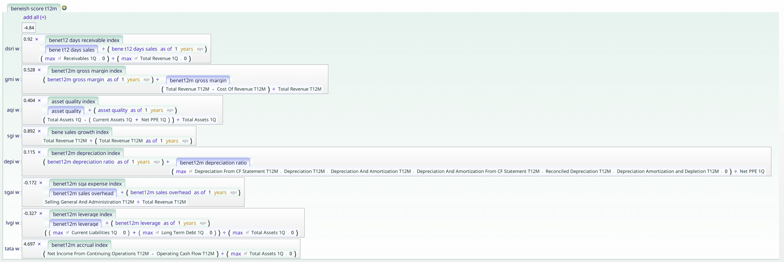
Next we try the beneish score (without the Piotroski score) out on the negative EPS stocks. This score, created by Masood Beneish, is designed to find earnings manipulators, aka those who cook their books. It is a weighted sum of 8 factors, where you are given a certain amount of leeway, and then as you accumulate these factors the leeway is used up.
Beneish Score Definition
- Days’ Sales in Receivables Index (DSRI)
- Gross Margin Index (GMI)
- Asset Quality Index (AQI)
- Sales Growth Index (SGI)
- Depreciation (DEPI)
- Sales, General and Administrative Expenses (SGAI)
- Leverage Index (LVGI)
- Total Accruals to Total Assets (TATA)
The Beneish score = -4.84 + 0.92DSRI + 0.528GMI + 0.404AQI + 0.892SGI + 0.115DEPI – 0.172SGAI + 4.679TATA – 0.327LVGI
In theory, anything less than -2.22 is good. For normal companies, anything between -2 and -4 gives good results when we backtest. So what happens with our negative EPS companies?
| Score | The Max Beneish Score | num matches |
|---|---|---|
| -99.95% | 3 | 1.15 |
| -99.18% | 2 | 1.6 |
| -93.94% | 1 | 2.8 |
| -99.19% | 0 | 5.65 |
| -80.72% | -1 | 13.9 |
| 21.56% | -2 | 77.45 |
| 124.4% | -3 | 60.3 |
| -78.55% | -4 | 16.45 |
| -94.82% | -5 | 5.85 |
| 195.9% | -6 | 2.95 |
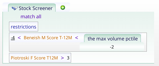
We break it into blocks of 1, starting at -6 (i.e. -6.99 to –6.00). We see that -4 to -3 is the perfect range, and that -3 to -2 isn’t as good, but it is still positive. Here you can see the first problem I face when trying to build a screen. It is really easy to get too selective early in the process, and run out of raw material to build with. Therefore we keep -2 to -4, and Piotroski 4 to 9.
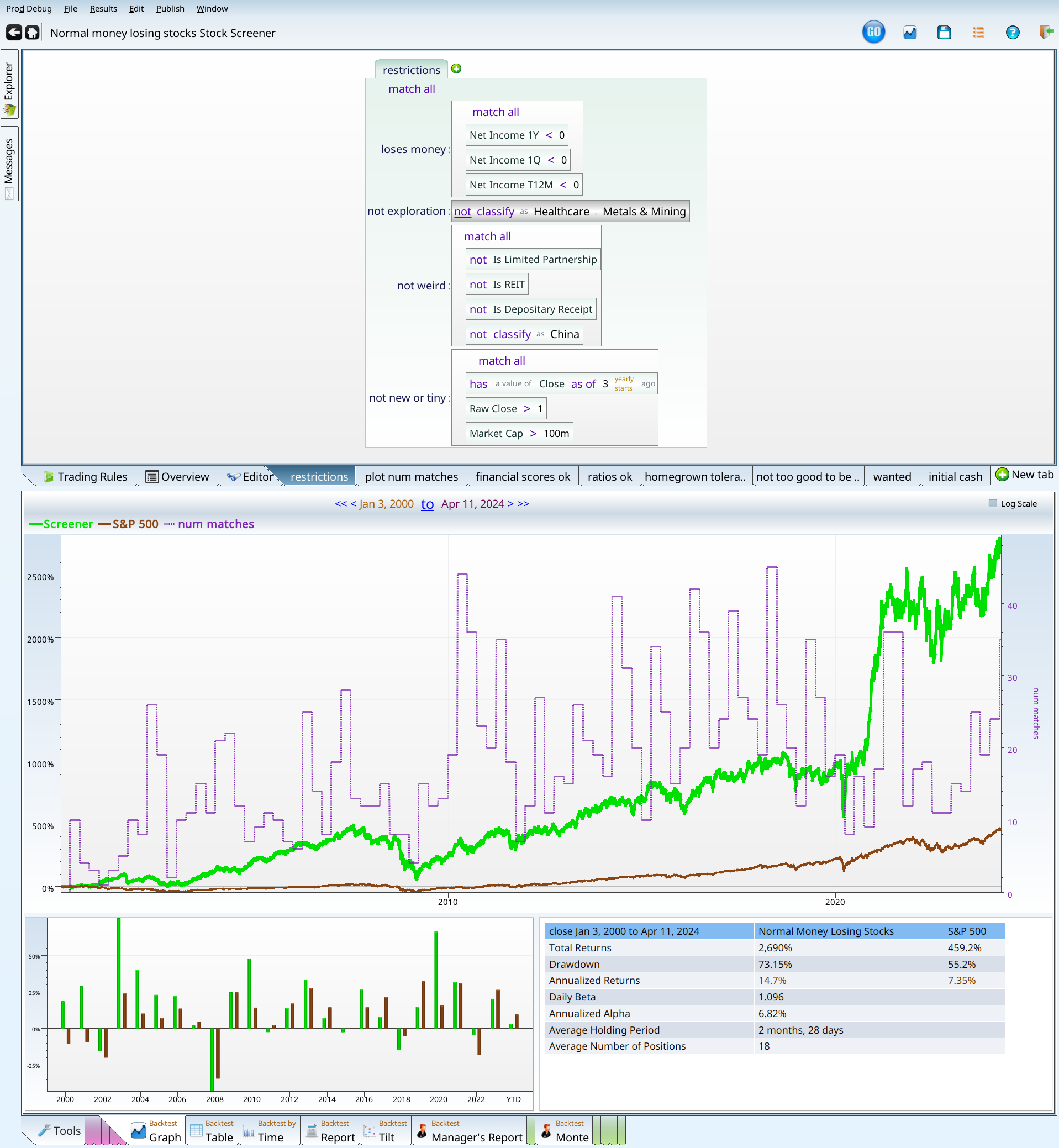
Putting our criteria so far together, we get:
Which produces the following results.

This trails the market, and at least makes money.
| Close on Jan 3, 2000 to Mar 26, 2024 | Returns | S&P 500 |
|---|---|---|
| Total Returns | 203.1% | 453% |
| Drawdown | 78.57% | 55.2% |
| Annualized Returns | 4.68% | 7.31% |
| Daily Beta | 1.266 | |
| Annualized Alpha | -4.07% |
Recap: Validated academic regressions
It seems that the Beneish score and the Piotroski score are really really good at excluding bad stocks. This makes sense — that is their job. It is encouraging to see that they work even when used in a restricted domain where no one makes any money. We have also learned that some combinations of Piotroski and/or Beneish lead to irrecoverable loss, so make sure you test out lots of combinations.
At this point, negative EPS has to be either a red flag or a black flag; throwing two very good scores at it left us 4% behind alpha-wise and with a drawdown of 75%.
Can pricing ratios save us?
Price to earnings
First up let’s try the P/E field, because it is popular and everybody uses it… Oh, wait, we have no positive earnings. Joke’s on me! What if we just calculate it ourselves? P/E is simply Market Cap divided by Net Income trailing twelve months. If we calculate our own, and accept negative values (all our values will be negative), then we can go on. Interpreting a very negative P/E makes my brain hurt. Does a PE of -423 mean the stock is overpriced (bad), or that it is almost profitable (good)? Lets turn to the data to find out. We first test from -1000 to 0, in blocks of 100.

Here are the results:
| Score | The Min Pe | num matches |
|---|---|---|
| -11.13% | -1,000 | 0.05 |
| 28.19% | -900 | 0.1 |
| -59.13% | -800 | 0.05 |
| 5.13% | -700 | 0.25 |
| -91.61% | -600 | 0.3 |
| 48.84% | -500 | 0.55 |
| 59.69% | -400 | 0.75 |
| 23.11% | -300 | 2.1 |
| 128.3% | -200 | 5.7 |
| 167.7% | -100 | 83 |
Notice that almost all our matches are in the -100 to 0 range. So having learned nothing, we now try -100 to 0 in blocks of 10.
| Score | The Min Pe | num matches |
|---|---|---|
| 748.3% | -100 | 0.9 |
| -88.99% | -90 | 1.4 |
| 100.3% | -80 | 1.35 |
| -81.28% | -70 | 2.85 |
| -17.37% | -60 | 3.6 |
| 59.06% | -50 | 3.75 |
| -73.91% | -40 | 6.6 |
| 343.5% | -30 | 9.75 |
| 217.8% | -20 | 20.15 |
| 132.2% | -10 | 32.65 |
Below -30 we have lots of very negative results, and few matches. Hopefully, trying from -40 to 0 in blocks of 4, we can learn more.
| Score | The Min Pe | num matches |
|---|---|---|
| -60.11% | -4 | 13.15 |
| 344.1% | -8 | 13.5 |
| -29.37% | -12 | 10.5 |
| 472.4% | -16 | 9.1 |
| -80.55% | -20 | 6.55 |
| 33.43% | -24 | 4.7 |
| 423.3% | -28 | 3.35 |
| -60.33% | -32 | 3.25 |
| -95.28% | -36 | 3.05 |
| 16.76% | -40 | 2 |
Lets look at that as a bar chart to see if it is any clearer.

Nope! No matter how much we want that to make sense, it just won’t. So, let’s shift gears and try revenue per dollar earned.
Sales to Income
This idiosyncratic measurement is the inverse of profit margin. The idea is that this lets us distinguish companies that are losing a lot of money (relative to sales), without having to worry about valuation.
| Score | The Min Sales Per Income | num matches |
|---|---|---|
| -78.72% | -4 | 17.65 |
| 231.8% | -8 | 21.75 |
| 58.26% | -12 | 10.7 |
| 1.85% | -16 | 7.7 |
| 52.35% | -20 | 6.1 |
| 1,982% | -24 | 4.9 |
| 346.8% | -28 | 2.5 |
| 251.5% | -32 | 2.45 |
| -59.46% | -36 | 2.45 |
| -9.29% | -40 | 2.1 |
Hooray! We have 17 matches worth of disaster, and a bunch of better values after that. This table makes me want to push in at the -10 and down, so I do just that. We decide that anything that had a sales to income ratio of -4 or more lost a lot of money, to the point we can just avoid them.
| Score | The Min Sales Per Income | num matches |
|---|---|---|
| -98.06% | -1 | 3.5 |
| -99.98% | -2 | 3.8 |
| -91.94% | -3 | 4.85 |
| -49.94% | -4 | 5.5 |
| 15.37% | -5 | 5.9 |
| 55.2% | -6 | 6.1 |
| 7.97% | -7 | 4.75 |
| -18.63% | -8 | 5 |
| -77.37% | -9 | 3.55 |
| -13.16% | -10 | 2.85 |
With the financial scores enabled, and our sales per income being less than -4, we are ready to filter on sales yield.
Price to Sales
The idea here is to put valuation back into the equation, now that we have handled the companies that somehow lost tons of money. So I step through price to sales from 0 to 10 in bands of 0.5, using the following formula:

This gives us the following bar chart. Notice how far up the positive bars go, and how this obscures how far down the negative bars go.

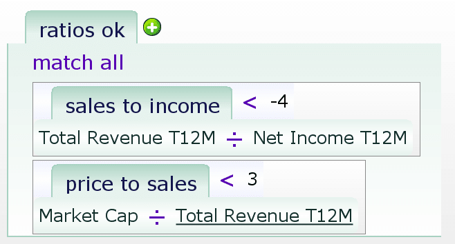
I like the values up to 3.0. Most of the matches are in the 0-3 range, the 3-3.5 range lost 88% of its value, and the 3.5-4 bar lost 94% of its value. So price to sales must be less than 3. This gives us two usable criteria:
- Price to sales < 3
- Sales to Income < -4
Which, when stored in the ratios_ok variable looks like this:
Recap: price per whatever
When we just run the financial scores and valuation ratios (sales per income and price per sales), we outperform the market.

Finally! Should we cheer? Here are the stats, for your enjoyment:
| Close on Jan 3, 2000 to Mar 26, 2024 | Returns | S&P 500 |
|---|---|---|
| Total Returns | 956.1% | 453% |
| Drawdown | 80.19% | 55.2% |
| Annualized Returns | 10.22% | 7.31% |
| Daily Beta | 1.207 | |
| Annualized Alpha | 1.78% |
| Trade Summary | Results |
|---|---|
| Average across positions | 7.36% |
| Median across positions | 2.54% |
| Standard Deviation | 52.02% |
| Average Holding Period | 5 months, 2 days |
| Average Number Held | 64 |
| Above 0 | 54% |
| Above benchmark | 47% |
| Worst Position | BGPIQ(-97.61%) |
| Best Position | BYON(1,751%) |
We have also learned that the two academically validated financial scores are really good at getting rid of bad companies. They do better than pricing ratios (price per sales, p/e, sales per income).
Notice we have about 64 stocks being held at any given time, so we are not done yet. We have to be careful about what we cut from here, though. We have created a portfolio that beats the market (barely), while being totally useless as a portfolio.
We have also demonstrated that negative EPS is a possible black flag. 80% drawdown is a disaster; nobody would want to hold through that complete of a loss. The alpha of 1.78% is not even remotely exciting enough to make that worthwhile. Our screen will get increasingly fiddly and unlikely — making this more like a Himalayan climb with oxygen than the Appalachian hike that investing should be, most of the time.
All that remains is to verify for sure whether negative EPS is a red or black flag. How reasonable is it to create an investment strategy based on negative EPS? If we can’t create a reasonable strategy, even if it is artificial and overcomplicated, then we have a black flag. If we can crest that summit, even if it is a Himalayan one, we have a red flag. Of course the dividing line between red and black is a subjective one, but so is the reaction. It is the difference between “Have fun storming the castle”, and “Don’t bother; it really can’t be done”. That line is subjective.
I next turn to homegrown scores, and see how they stack up. I consider five scores, each of which range from 0 to 10 (inspired by the Piotroski Score).
Where do we stand so far, with our academic financial metrics, and valuation ratios?
- 10% or more of the original set of stocks. Since we have 58.95 matches on average, we are still fine.
- Maximum Drawdown of less than 60%. Argue as we might, 80.1% drawdown is much worse than 60%. So we are not still fine.
- More than 5% alpha, annualized, on the quarterly rebalance. Our annual alpha is 1.78%. Not good enough.
- An easily explained screen. So far we’ve used two complicated academic formulas, and some pricing ratios. The pricing ratios are simple, and the academic formulas are at least known. So, I suppose so.
- Reasonable robustness over different rebalance periods.
This, we answer with a table, that summarized no in seven lines.
| Rebalance period | Annualized Alpha |
| Quarterly FebMayAugNov | -0.35% |
| Quarterly MarJunSepDec | 1.56% |
| Yearly January | 2.95% |
| Yearly April | 1.28% |
| Yearly June | 0.34% |
| Yearly September | -0.95% |
| Monthly Week 1 | 4.93% |
Enter the homegrown scores
These are all scores I have developed over the years for my own investing, so don’t be surprised that you have never heard of them. They each count the number of conditions or “points” a stock gets. This counting of booleans is more robust than insisting that everything be true. While these scores are not widely used (since they are homegrown), they at least follow a certain logic. We don’t describe them here; instead we have their full descriptions in the glossary at the end of the article.
All the tests that follow build on the prior sections, so the stocks being filtered all have the right ratios and scores. We’re just working on the 60ish stocks that remain, and trying to see if we can achieve any of our five objectives.
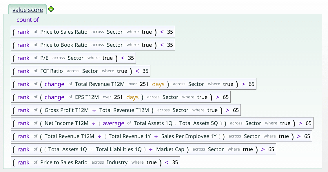
The Value Score
The value Score doesn’t look for amazingly cheap stocks as much as it favors stocks that are cheap across a broad range of valuation metrics.

So how does it do, once we have all our other criteria in place? The simplest way to test this is to backtest the criteria, with one more: value score = X. Varying X from 0 to 10, we can see how each does.
| Score | The Value Score | num matches |
|---|---|---|
| -2.3% | 0 | 2.45 |
| 366.5% | 1 | 5.5 |
| 928.9% | 2 | 9.6 |
| 724.5% | 3 | 11.5 |
| 609.9% | 4 | 12.6 |
| 2,061% | 5 | 10.45 |
| 14.63% | 6 | 5.1 |
| -86.94% | 7 | 1.35 |
| 678.7% | 8 | 0.4 |
| 0% | 9 | 0 |
| 0% | 10 | 0 |
| 0% | 11 | 0 |
When we look at the entries, we see very few matches for 0 and for anything over 5. Both look worse than the baseline, but we have just too few entries to make a good decision. How do we fix this? Go get more data, of course. In our case, I do this by disabling the financial_scores_ok and ratios_ok terms, so we get more matches. This means our conclusion is based on all normal money losing stocks, not just money losers with healthy scores and good ratios. That said, we do get more stocks.
| Score | The Value Score | num matches |
|---|---|---|
| -97.43% | 0 | 14.6 |
| -89.11% | 1 | 33.15 |
| -66.38% | 2 | 40.65 |
| -2.94% | 3 | 38.35 |
| 74.52% | 4 | 31.85 |
| 514.8% | 5 | 25.1 |
| 26.6% | 6 | 12.65 |
| -79.69% | 7 | 3.35 |
| 469.3% | 8 | 0.75 |
| 8.97% | 9 | 0.05 |
Those results seem pretty clear: really low value scores are no good. We can say the same about some of the high value score results, but even with our extra stocks we still don’t have enough stocks to make a good conclusion. So, I’m going to add the condition that the value score must be over 0, and see where we are.

| Close on Jan 3, 2000 to Mar 26, 2024 | Returns | S&P 500 |
|---|---|---|
| Total Returns | 1,101% | 453% |
| Drawdown | 80.45% | 55.2% |
| Annualized Returns | 10.81% | 7.31% |
| Daily Beta | 1.208 | |
| Annualized Alpha | 2.37% |
So, we have a screen that can lose 80% of its value, but gets 2.37% alpha. I think we have to keep pressing on, because we have arrived at a useful portfolio, and we aren’t making enough extra return to add this as a slice of risk to some other portfolio.
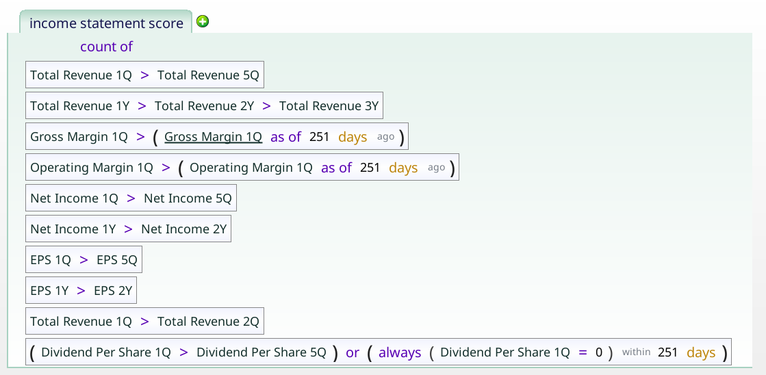
The income statement score
The income statement score is a 10 point checklist of things we like to see on the income statement part of the company’s financials. We can use this to see if it helps in the weird corner of the market we are in.
My first worry was that, like the Piotroski, it would lose a point or two right off the bat. But, no, there’s no references to 0 in that term. Since -1.5B income is greater than -2B income, if a company was losing $2B and managed to only lose $1.5B, it would get that point.
Running our income statement score on top of the other criteria produces the chart below which argues that high income statement scores are bad.
| Score | The Income Statement Score | num matches |
|---|---|---|
| 332.4% | 0 | 2.1 |
| 554.2% | 1 | 5.25 |
| 3,558% | 2 | 5.95 |
| 284.2% | 3 | 7.3 |
| 701.7% | 4 | 8.2 |
| 163.7% | 5 | 8.45 |
| 1,472% | 6 | 7.75 |
| -26.03% | 7 | 6.35 |
| 607.9% | 8 | 3.3 |
| -94.76% | 9 | 1.75 |
This is a good time to highlight the role of intuition or “gut feeling” in building screens. I really don’t like high income statement scores being bad. That said, after some thought, I do see the rationale — if a thing seems too good to be true, it probably is. So we let the high income statement stocks go.
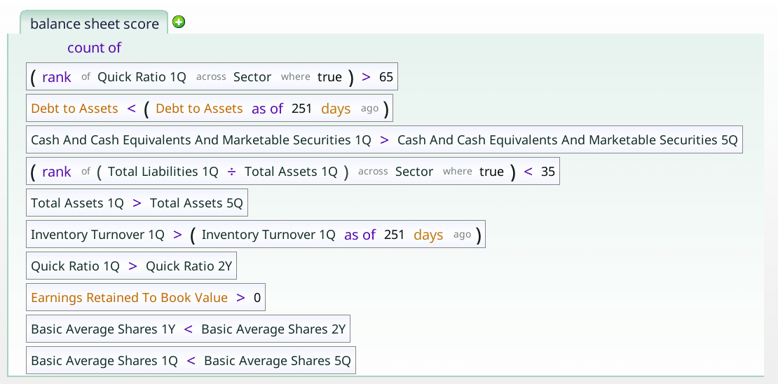
Balance sheet score
The balance sheet score is a simple check up on how indebted a company is versus its assets, and similar. Does it have lower debt to assets than its sector peers. Does it have a higher quick ratio than its sector peers? Is its inventory turnover getting better, or worse?
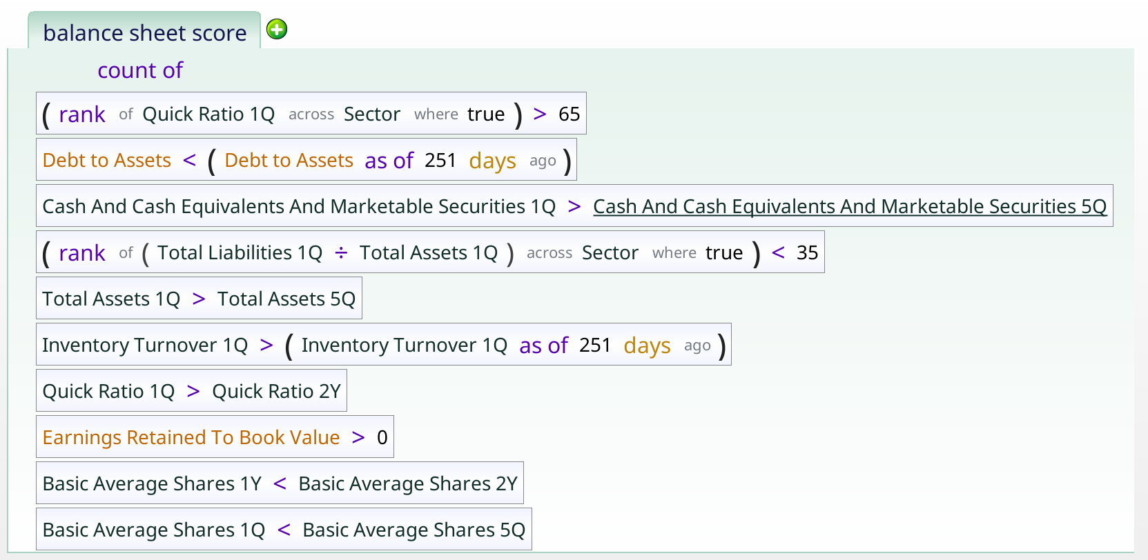
As with the other scores, we simply add it onto the other ones, to see what effect it can have.
And we get the following table:
| Score | The Balance Sheet Score | num matches |
|---|---|---|
| -79.58% | 0 | 1.8 |
| 535.6% | 1 | 6.25 |
| 1,212% | 2 | 9.4 |
| 608.1% | 3 | 10.45 |
| 1,255% | 4 | 9.4 |
| 2,620% | 5 | 5.3 |
| 70.03% | 6 | 1.95 |
| 172.3% | 7 | 0.4 |
| 7.15% | 8 | 0.05 |
| 17.03% | 9 | 0 |
Ruling out the Balance sheet 0 seems like the best option. We may also want to get rid of the balance sheet 6 and over, but I don’t see why, so I think I’ll decide not to.
Homegrown score recap
We have tested and validated three more scores, to add to the mix.

We actually tested several others, but they didn’t do as well. They are “featured” in the glossary, for reference, but they play no part in our story here. We have now arrived at an uncomfortable spot. We are no longer losing to the benchmark, but the drawdown of nearly 80% is pretty hard to take. Especially for the return we now have. We are also no longer reasonably simple or intuitive. Unless we add more black flags (stay tuned for more articles!), we are left with a very intricate way to invest in money losing companies on the long side. Also we have not quite gotten our 5% annualized alpha. It looks like we have lost, even if not by a huge margin. Normal, negative EPS on a yearly, quarterly and trailing twelve months basis looks like a black flag, even if by a narrow margin.

| Close on Jan 3, 2000 to Mar 26, 2024 | Returns | S&P 500 |
|---|---|---|
| Total Returns | 1,792% | 453% |
| Drawdown | 78.97% | 55.2% |
| Annualized Returns | 12.9% | 7.31% |
| Daily Beta | 1.196 | |
| Annualized Alpha | 4.53% |
Is this the last word? Apparently not! Read on…
Past Earnings
Everything was fading to black (metaphorically) when a thought occurred to me: does having made money in the past make a difference? Just to check, I added the term “NetIncome_2Y > 0” to the screener, and was blown away.
| Close on Jan 3, 2000 to Mar 26, 2024 | Returns | S&P 500 |
|---|---|---|
| Total Returns | 2,722% | 453% |
| Drawdown | 77.72% | 55.2% |
| Annualized Returns | 14.78% | 7.31% |
| Daily Beta | 1.15 | |
| Annualized Alpha | 6.65% |
Just to check to make sure I wasn’t hallucinating, I tried one year before that, changing the NetIncome_2Y to NetIncome_3Y.
| Close on Jan 3, 2000 to Mar 26, 2024 | Returns | S&P 500 |
|---|---|---|
| Total Returns | 4,186% | 453% |
| Drawdown | 75.82% | 55.2% |
| Annualized Returns | 16.78% | 7.31% |
| Daily Beta | 1.162 | |
| Annualized Alpha | 8.59% |
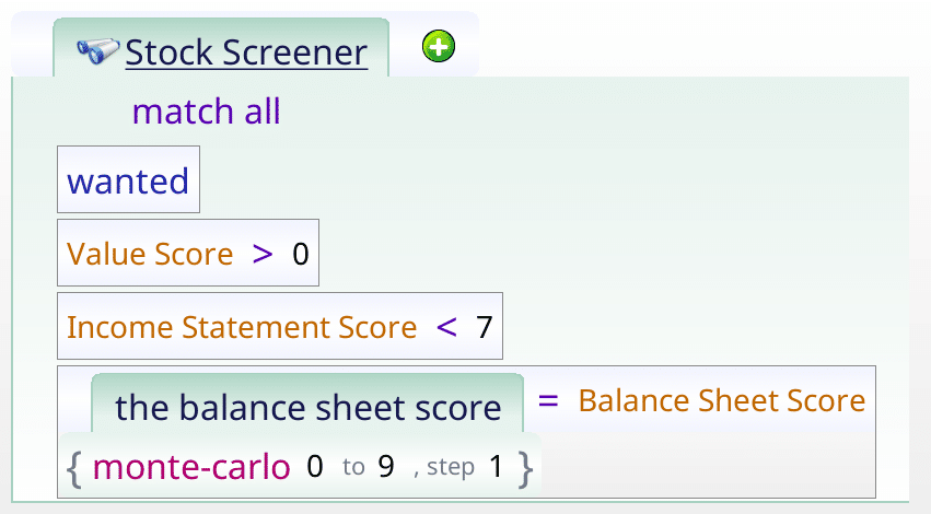
In all both cases, the number of matches is really small, which means we want to combine screens. So we try the lovely “or” operator, to give us the larger group of still awesome money losers we want, insisting that it had to make money two years ago, or three years ago.
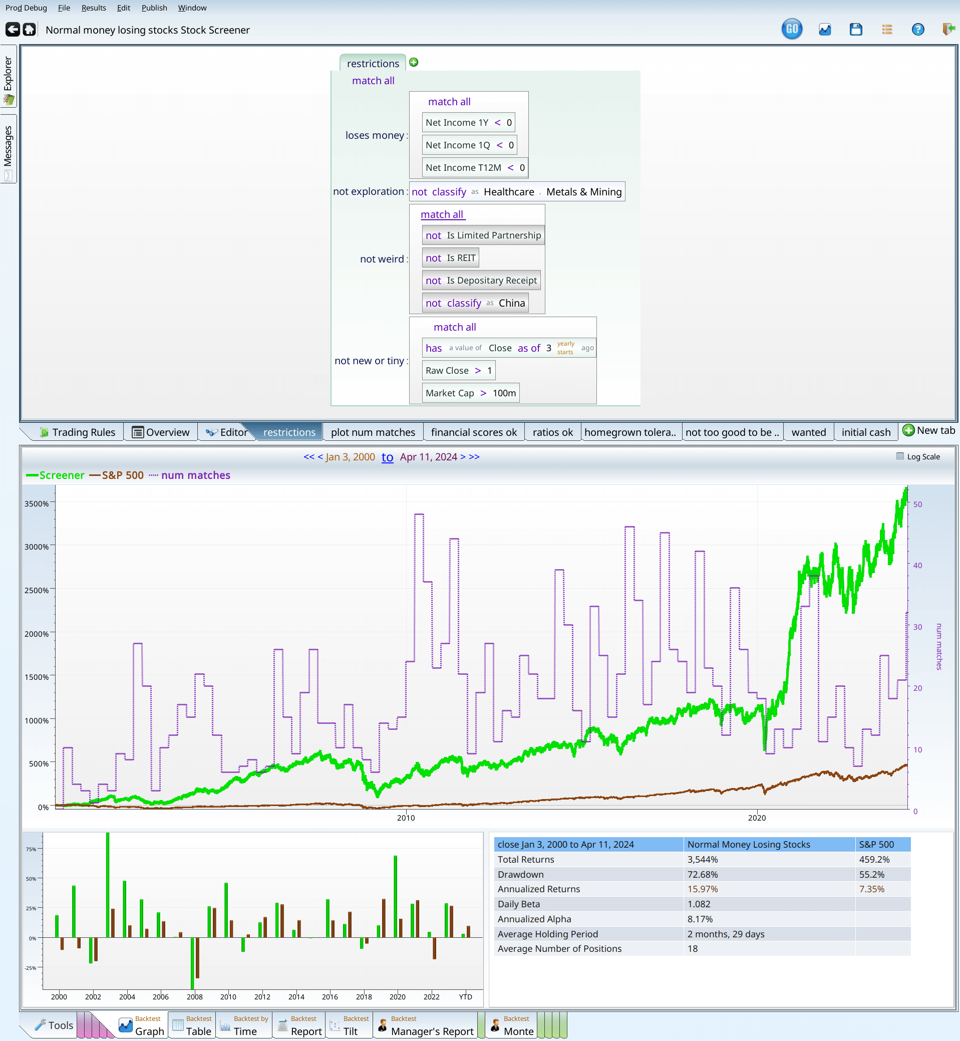
The final term, with our screen parameters.

| Close on Jan 3, 2000 to Mar 26, 2024 | Returns | S&P 500 |
|---|---|---|
| Total Returns | 3,714% | 453% |
| Drawdown | 76.74% | 55.2% |
| Annualized Returns | 16.22% | 7.31% |
| Daily Beta | 1.158 | |
| Annualized Alpha | 8.05% |
And now, finally, we are done adding terms to the screen.
Final strategy recap
Where do we stand so far?
- 10% or more of the original set of stocks. Since we have 23.3 matches on average, we are still pass. By 3.3 stocks.
- Maximum Drawdown of less than 60%. Sadly 76.74% is slightly better than 80.1% drawdown, but much worse than 60%. So we still lose here.
- More than 5% alpha, annualized, on the quarterly rebalance. Our annual alpha is 8.05%. That is plenty good enough.
- An easily explained screen. So far we’ve used two complicated academic formulas, and some pricing ratios, and three homegrown scoring formulas. Worse, we decided to throw out the good values on one of the homegrown formulas. So, I think we left the realm of simple and intuitive some time ago.
- Reasonable robustness over different rebalance periods.
This, we answer with a table, that summarized no in seven lines.
| rebalance period | Annualized Alpha |
| Quarterly FebMayAugNov | 5.38% |
| Quarterly MarJunSepDec | 7.99% |
| Yearly January | 6.58% |
| Yearly April | 4.75% |
| Yearly June | 3.58% |
| Yearly September | 0.43% |
| Monthly Week 1 | 11.02% |
Examining the results
The drawdown
So, we’ve decided that Normal negative EPS is a black flag, and the attribute we could not fix was the drawdown.That said, the beta is not as high as I’d expect given its drawdown. Looking back at the returns by time (or hovering over the drawdown number) tells you that the crash happened during the Great Financial Crisis, when everyone lost their mind. The 8 years before that had been so absurdly great that 28% of your portfolio still beat 45% of the S&P 500.

Notice that the green line is still positive, having managed to more than double your money (even after cutting it in 4!). The S&P 500 just looks sad by comparison.
Validating the screen
Before we can spend the time required to mold this strategy into something useful, we need to verify that it isn’t some cute artifact of the data. We can do this in several ways.
Using Positions
Our first tool is to look at the positions. The positions tabs consist of every trade placed by the system. In order to get more detail I reran the backtester with the new style backtester, which is enabled by adding an “initial_cash” tab and setting the term to 1m. Any value there would do, but $1 million makes the math easy. We want to make sure that one (or a few) positions don’t have all the return in them, leaving nothing but dregs for the rest. To do this I click on the positions tab, and then on the positions table tab, and sort by score.
There’s a lot of green at the top of the positions table — as there should be. But there are also no huge 12,000% gainers that gained everything in a few months. If there were I’d want to make sure we hadn’t accidentally bought a stock that went from $0.03 to $34 in one day. Pricing errors happen to good backtests. If there was an error like that, we’d have to add a “not ticker is XXX” to the criteria, and screen again. Luckily for us, there was no such error (there usually isn’t), and so we can move on to the next.
Next I look at the positions map, and sort it to see if there are any obvious patterns that worry me. First step is to sort by returns, and look at the results.

This yields a hoverable map of all all the trades. If you look at the headlines of each box, you can see the cutoffs (uncolored text), and the averages within that box. You can see that there are five boxes that are all winners, one box that is a mix of winners and losers (uncolored text -1.628), and four boxes with losers. Each box represents 3 months with a company, so you can see right away that these stocks are volatile. That makes sense given the drawdown.
Lastly (for the positions) we head over to the positions breakdown.

We can see that the various company sizes went up about 4%, and that sector returns positive in almost all sectors.
Backtest over time
We look at the returns year by year, to see if all the returns are concentrated in one year or time period. This can sometimes happen, but it doesn’t make for a very good screen, as spending years underperforming waiting for your magic to work is frustrating, at best.

We can see from the chart, that we outperform in 13/24 of the years under test. This is unimpressive, but not horrible. More concerning is that many of the rediculous outperformance years are in the deep past. But not all of them. 2020 was remarkable. 2022, and 2023 weren’t bad either. That leads me to conclude the screen probably still works. Probably. But there are no guarantees.
What have we learned?
Avoid money losing stocks
If you look up at the tables where we found the ideal ranges, you can see that many of them are money losing, and almost all of them lag the S&P 500. As an exercise, go back through the tables, and see how often numbers greater than 452% show up. That 452% is the market return. Negative earnings prove to be an extremely worthy opponent to your portfolio’s returns. Creating a usable screen using negative EPS stocks as a base is very hard.
Validated financial formulas are incredible
Notice that we turned a corner, and started to make real progress after we used the Piotroski and Beneish scores, exactly as directed. This is no accident. Their hard research paid off here. Other validated scores can be useful, but we wanted an article of finite length.
Homegrown scores can work
It can be worth creating your own sensible screening conditions, and what works in one place will often work in others.
Looking back in time is worthwhile
This screen had no glimmer of hope until the constraint that it used to make money was added. When that happened, it transformed from a disaster to a dangerous curiosity.
Questions and answers
What if a company only lost money for a short time?
For the original screen we insisted that a company had to lose money quarterly AND over the last trailing twelve months, AND on the last yearly report. That made it have negative earnings. What if we only insisted that at least one of those had to be negative, so that we allowed mixed earnings?
This is actually kind of disturbing. I would expect that allowing companies that were not as losing in would boost returns, or at least not impair them as badly as it did. So I decided to disable the money losing criteria, and got this:
This beats the market, as did the other one, but not nearly as soundly. Lastly, for sheer curiousity, I tried a run where the companies had to make money quarterly, annually, and over the last twelve months. The results were almost identical to the screenshot above.
Does the strategy fail with “abnormal companies”?
For this test we first disabled the exploration condition, allowing speculative biotechs and mining companies back in.
When we disabled the exploration term (notice the shading), we got similar returns. Not quite as good, but still good. Next up, I reenabled the exploration term, and disabled the “weird term”.
This is also good. Disabling both gave me results similar to what’s above, but slightly worse. Still got 13% annual performance, so yay.
Does the rebalance choice matter?
Somewhat. Our negative EPS screen seems to work better with quarterly and monthly rebalances, though yearly ones are fine.
Is it OK to hold matching stocks for the long term?
Performance does go down, as the holding period increases, but it retains 4% alpha even with a two or three year holding period.
The glossary
Here I list all the tabs we have so far, just to refresh people’s memory as to what’s going on. One should be able to type all these formulas in to your favorite investment tool, and get similar results. Of course no data set is the same, and exact reproduction of results is not possible. It is enough that they go in the same general direction, and react the same general way to the same inputs. I wish for more precision than that, but the real world is a messy place.
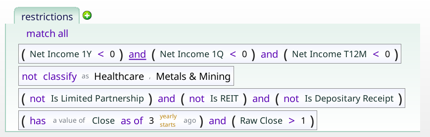
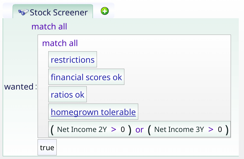
Restrictions
This is the set of stocks we are trying to make into a decent screen. This is a pretty harsh set of stocks to start with. Investing in them loses you 27%, while the broad market gained 452%.
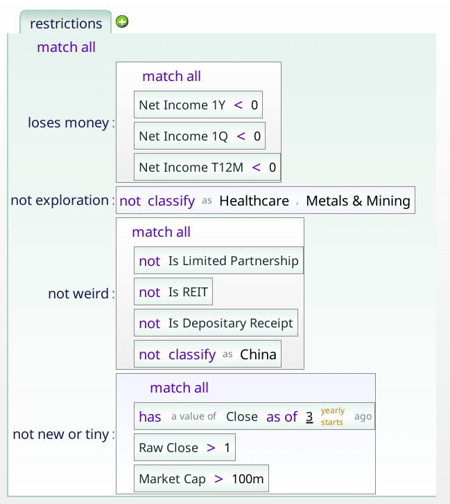
The little labels are related concerns that build up restricted set. For instance, all of the negative income parts are filed together in “loses_money”.
plot_num_matches
This just gives us that line over the graph that tells us how many stocks we have.

financial_scores_ok
This is the pair of academically validated financial fitness scores we used to markedly improve our results.
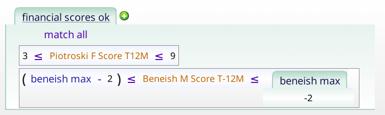
The sharp eyed reader will notice that we include Piotroski values of 9 even though it is impossible for those to happen.
ratios_ok
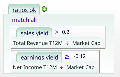
We just want to make sure that the earnings yield is not too negative, and that the sales yield is not too terrible.
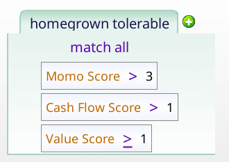
homegrown tolerable
This uses three homegrown scores to filter out the worst stocks in the money losing collection.
Not too good to be true
We use this to filter out stocks with too good of scores, given that we are talking about money losing stocks. I have an intuition that this distinction will be important later. Stay tuned.
Piotroski f score t12m
The Piotroski score checks nine points, to assess how financially sound a company is.
Beneish m score t12M
This linear regression checks how likely a company is to be cooking their books.
Value Score
This checks in how many ways a stock is cheap. A high value suggests that a stock in undervalued using a variety of metrics.
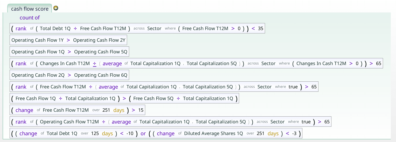
Cash flow score
The cash flow score checks how the company’s cash flow is doing. For instance, are operating cash flows increasing?
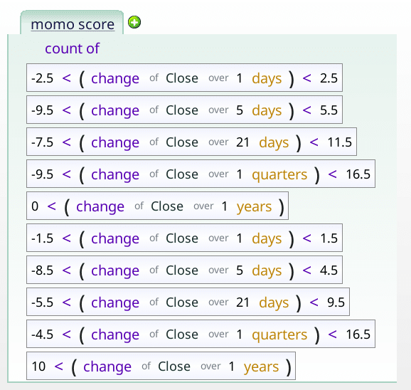
momo_score
This checks to see if the price movement is reasonable for the stock over a variety of time periods.
balance_sheet_score
This checks a variety of balance sheet related items that speak to the solvency of the company. Is it drowning in debt, for instance.
income_statement_score
This checks how many of income, revenue, earnings per share, operating margin and dividend payments are all going in the right direction.