
Utilizing Plot Panels
Stock Analysis
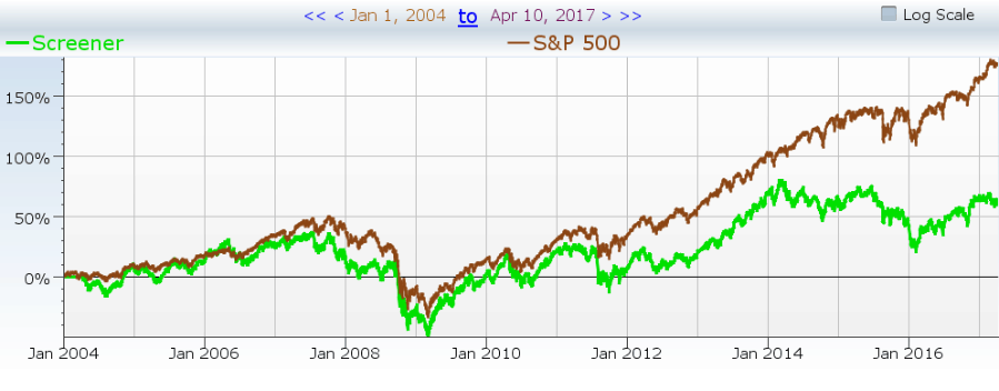
We have found a few indicators that we trust and use more than others—essentially using those variables whenever analyzing a strategy. This is a time-consuming process, where you have to re-plot every time you create a new strategy. So, we built a feature that allowed you to turn this:
Into this:
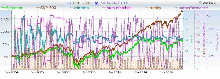
All with just the click of a button. This is available to you, and you could plot those exact variables over your backtest by using the “Default Backtest” plot panel which can be found under the trading rules tab. Let’s learn how to build your very own.
- In order to create your first plot panel, you need to go into the explorer and create a new formula.
- Name the formula whatever you would like, but be sure to preface the name with Plot Panel. This will ensure that the formula is stored in the accessible portion of the system when you click on the “Add Plot Panel” option when building a screen.
- Unlike building tear sheets, plot panels are more straight forward.
- Rename the “My Formula” tab to something along the lines of plotPanelX as this will ensure that the system doesn’t run into any duplicate variables across different screeners.
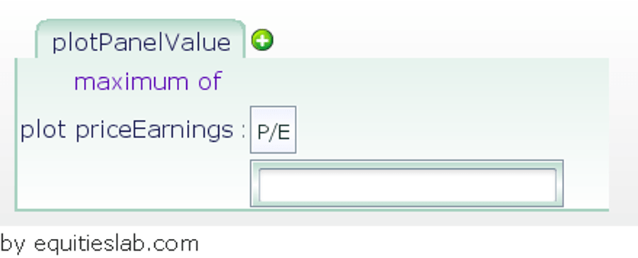
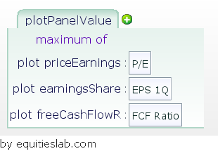
- Add the operator “maximum of” in place of the default “and”
- Create a plotted variable for whatever item you’d like to be plotted whenever you select this panel.
- Finishing up the build
- Filling in the plotted variables can take a bit of time if you have a large number of items you’d like to plot. In our case, it only took a few minutes as we are only looking for extremely basic Value investment metrics.
- Implementation
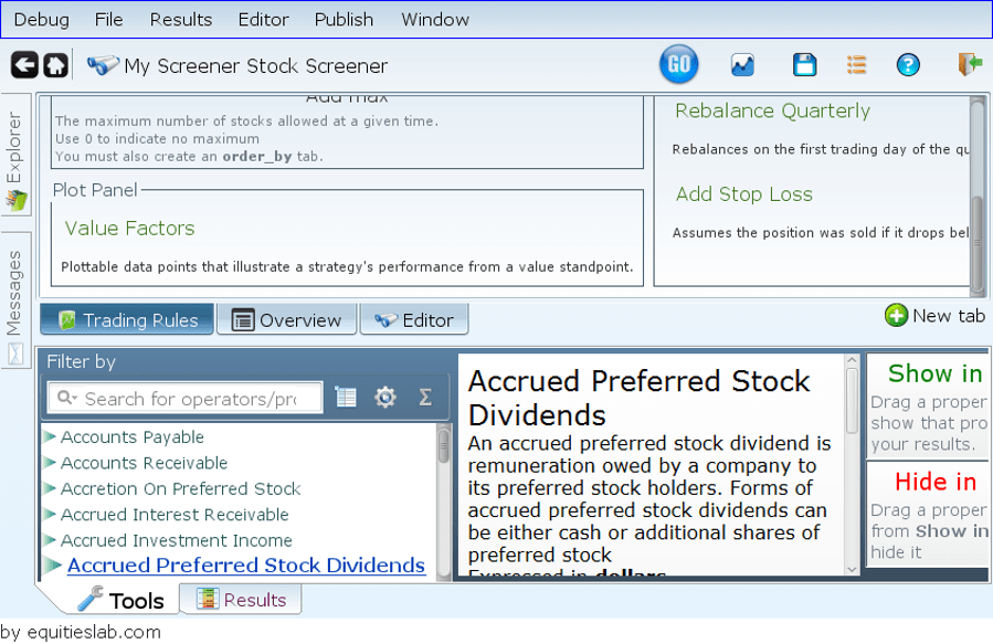
- Being a fairly straight forward feature, you can find the plot panel options under the trading rules tab when creating a screener. Simply click on Add Plot Panel and select from the menu. If you named your panel properly you should see it right away.
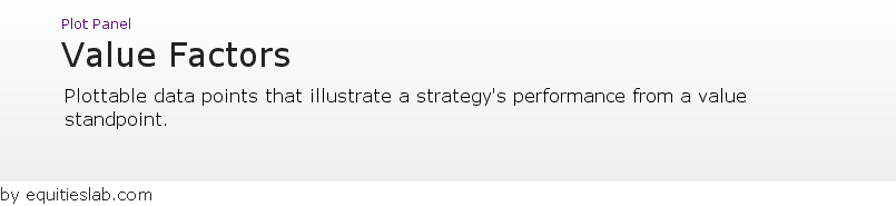
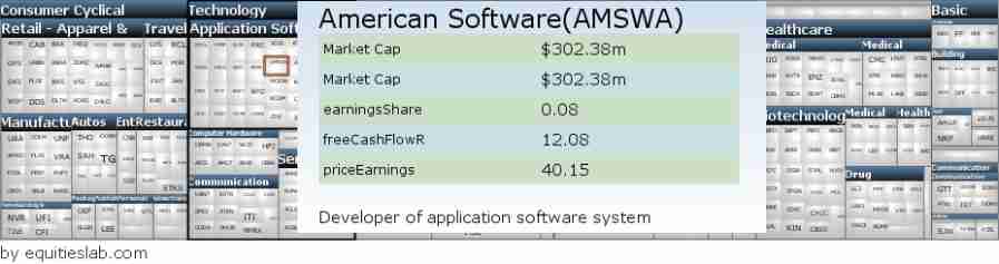
Selecting our brand new Value Factors plot panel we can almost instantly get the data we are looking for on the companies within the screen without having to plot anything new.
That’s all fine and well, as it creates a sort of instant profile for companies, that cuts down on analysis time, but there’s no point in analyzing if the backtest doesn’t show promising results.
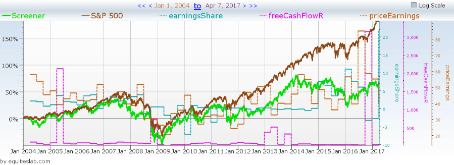
In the case of this completely random screen, it doesn’t look like it is made up of companies that fit the traditional view of what a value company is. Without having to look at any of the companies or delve into the strategy further, we know that we would not want to include this in the value section of our portfolio. So go out there, create the perfect plot panel to reflect your general analysis techniques, and take your investments to the next level with Equities Lab.