
Why is the P/E Line Broken
Why does my P/E look strange?
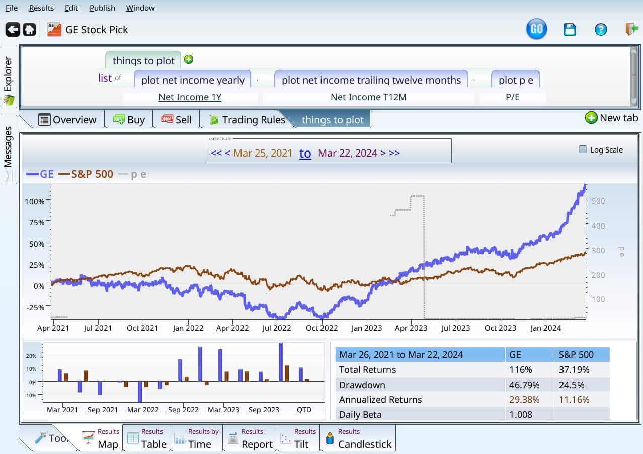
Occasionally you are looking at a stock, and evaluating its P/E ratio(price to earnings ratio), and you see something like this:
Price to earnings ratio of GE
The grey line is the P/E ratio — but it is totally absent before 2023! What’s going on? GE has been around since forever (1892, to be exact, according to the company founding page).
Thinking about the Price/Earnings ratio yields the first clue: either the price is weird, or the earnings are. The price is in blue, and is clearly present, it makes sense that the earnings are suspect. So plotting the earnings should help. There are two reasonable choices for the earnings:
- NetIncome_T12M — the sum of the last four quarterly earnings
- NetIncome_1Y — the net income off of the last yearly statement. This could be up to a year out of date, or it could have been reported in the last quarterly statement, if it was also an annual statement.
Plotting them both gives us this:
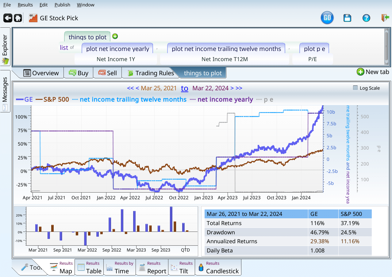
GE with both incomes plotted in addition to P/E ratio
Notice that the teal and purple lines (both incomes) go back to the left edge of the chart. What gives, then. Notice where zero is (look on the left edge of the chart). The teal income (trailing twelve months) was less than zero. By convention, people commonly do not regard P/E ratios as valid for money losing companies. And GE was, sadly, a money losing company from mid-2021 to mid-2023.