
Visualizations
Explore, analyze, and interpret data instantly
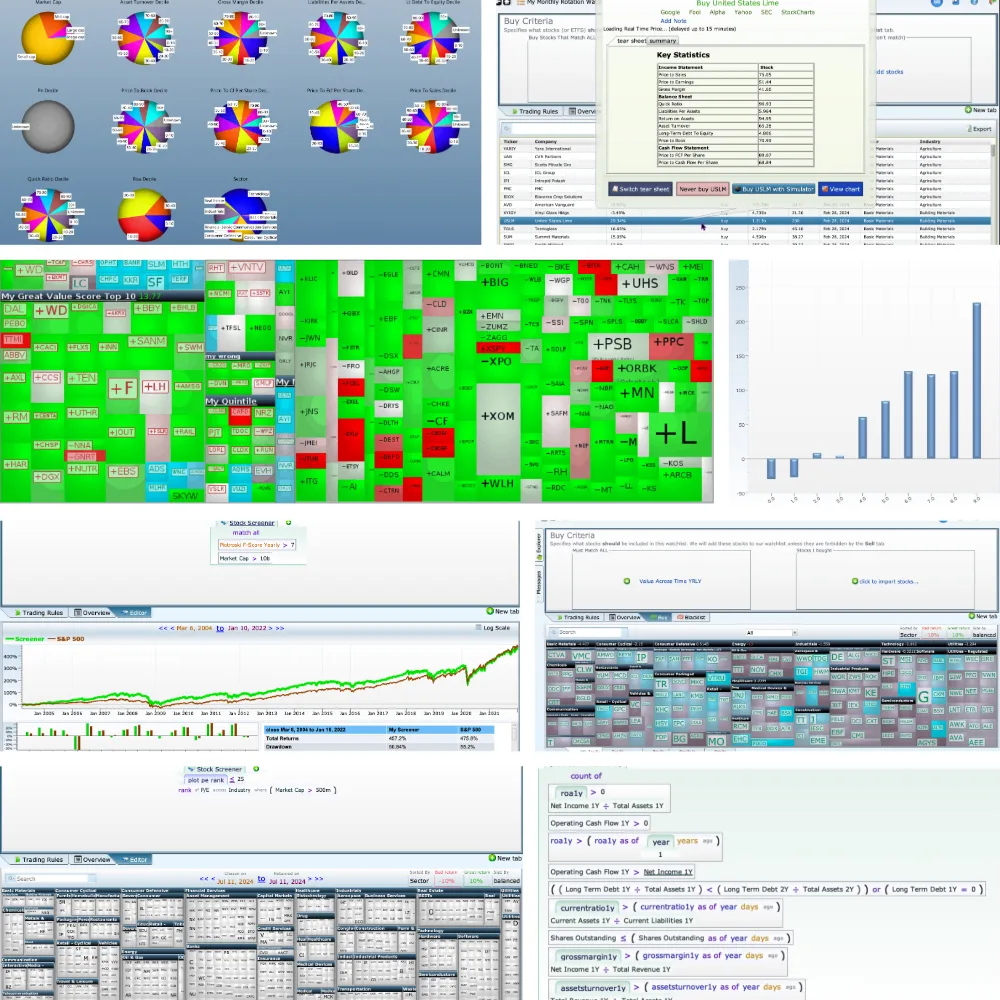
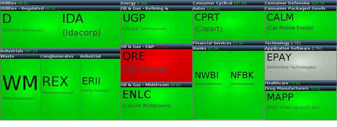
Comprehensive Range of Visuals Equities Lab provides a robust suite of interactive and customizable visuals to analyze your investments, including pie charts, diverse graphs, visual landscapes for every backtest, scatter plots, heat maps, and more. Our platform delivers real-time, up-to-date data across multiple perspectives.
Unparalleled Visual Experience What sets Equities Lab’s visuals apart? A user-friendly interface, easy accessibility and sharing, the ability to export visuals with a click, and high-quality, reliable data you can trust..
Interactive Pie Chart

One of Equities Lab’s stand-out features is the interactive pie chart. This dynamic tool visually represents your stock portfolio’s composition over time, including sector classification, market capitalization, and other key attributes—all without the need to constantly sift through numbers. In addition to portfolio composition, it provides performance insights by displaying average returns, helping you refine your investment strategy for maximum returns.
Visualizing Comprehensive Charts and Graphs
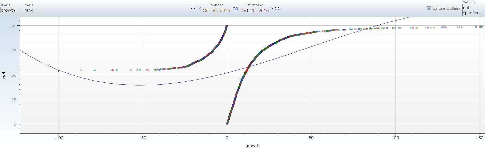
When you backtest, you will receive a wide range of intuitive and visually engaging data. These visual models include line charts, bar graphs, scatter plots, and more, each designed to highlight different aspects of your analysis and provide actionable insights. For example, line charts can track the performance of individual stocks or your entire portfolio, helping to identify trends, patterns, and potential investment opportunities. Bar graphs allow you to compare the performance of multiple stocks or sectors, emphasizing their relative strengths and weaknesses.
Why Choose Equities Lab’s Visuals?
Equities Lab offers high-quality visualizations that enhance your understanding of data and empower you to make informed investment decisions. Whether you are using backtest breakdown pie charts, versatile line charts, bar graphs, or scatter plots, our visuals provide comprehensive coverage of your stock portfolio with the data that matters most to you. These visual tools enable you to analyze data effectively, identify trends, and optimize your investment strategy for success.