O’Shaughnessy Tiny Titans Screen
PLEASE NOTE: This article has been recently expanded and updated. Although the conclusions are similar, the numbers quoted are different than the old article’s numbers. Since all the numbers involve extreme market outperformance and micro cap stocks, real investors are unlikely to get exactly the same results. They are still likely to do well with this strategy.
Since the release of his book “Predicting the Markets of Tomorrow: A Contrarian Investment Strategy for the Next Twenty Years” O’Shaughnessy has become one of the most trusted names in stock screening. His most powerful, and undoubtedly best performing screener, is known as Tiny Titans.
Tiny Titans focuses on low-price micro-cap stocks. There has been much research done on the topic of investing in this area and this sector has continuously been shown to outperform the overall market, given the right critera. Tiny titans are one example of such a filter, that really seems to work — a blend of value, safety, and momentum.
Building the screen
We’re going to start with a baseline — all US microcaps that can be invested in. We’ll then add criteria one by one, describing them, and create the default O’Shaughnessy screen. Then we’ll tweak it from there.
The baseline
I’m going to create a baseline, so we know where the performance is coming from, which will be:
- Market Cap > $50 million
- Average daily trading volume for 63 days > $500,000
- Traded on US Echanges
- Raw Close > $1.00
- Market Cap < $250 million
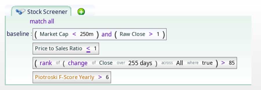
These criteria protect us from seeing and evaluating investments we can’t actually invest in. #1 protects us from buying up enough of the company that the price would be beaten around by our trading. #2 does the same thing, by focusing on daily volume. We don’t want to take more than 10% of the liquidity, and a position smaller than $50,000 is likely to be too small. #3 is just a factor of convenience: we have US equity data, and US brokerages specialize in stocks traded on US echange. Were this article in Japanese, the choices would be different. #4 gets rid of the need to buy an absurd number of shares to get our position. Many brokerages charge by the share. That makes tiny share prices painful. #5 is just so we focus on micro-caps. I don’t think Alphabet and Meta are Tiny Titan material.
As it turns out, #1, #2 and #3 are all invisibly baked into the universe variable. Although you can customize it with the universe variable, if you do not, you get #1, #2 and #3 for free. We need to explicitly list #4 and #5, and we do this on the first line. For our first screen, we have the criteria lines as well, but they are disabled (grey background).
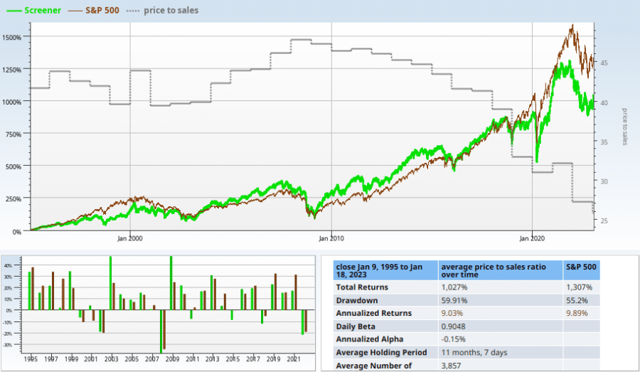
We plot the returns of that screen, rebalanced quarterly below. The chart starts from 1995 and continues until 2023.

The chart above doesn’t really impress. But that’s OK, since it tells us that the magic is not in the micro-cap nature of the stocks. The baseline has a few hundred stocks in it, which tells us we have more work to do. Nobody wants to invest in hundreds of stocks.
The Tiny Titan Criteria
- Price to Sales Ratio < 1
- The stock’s momentum is in the top 15% of the market over the past year
- The stock must have a Piotroski F-Score T12M greater than 6
1 Price to Sales Ratio
Price to sales ratio (the ratio of total market cap to yearly revenue) is a good way to get a rough bead on how expensive a given stock is, because revenue is harder to manipulate than earnings. Here we want stocks to have a relatively small price to sales ratio of 1.0 or less. Plotting price to sales for the whole investable market (see Information: average price to sales ratio over time), we see that the average is much, much more than 1. Even if we clamp the outliers to a max of 100, as we do.
If we take the stock-years (one stock for one year), and sort them according to price to sales, we see that lower is definitely better.
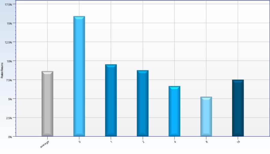
Now we see why price to sales is loved by value investors as a valuation metric. The evidence suggest that price to sales < 1 is a reasonable rule, so it is our first criteria to go in. When we apply it (rebalancing quarterly) to our restricted universe of micro-cap stocks, we get significantly better performance than the baseline.
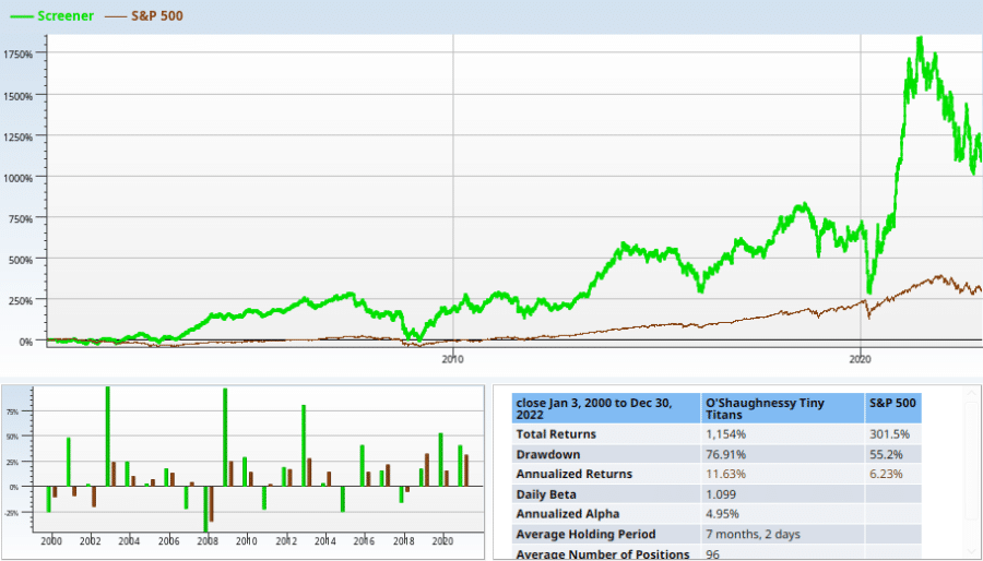
Staring at the chart, this criterion seems like a good one for our screen.
2 Yearly Momentum rank over 85
Momentum (how well a stock did in the past) is another indicator that is popular. Unlike price to sales, there’s no slam dunk for high momentum ranks. We rank how well each stock did over the last year, and the chart below indicates more mean reversion than momentum.
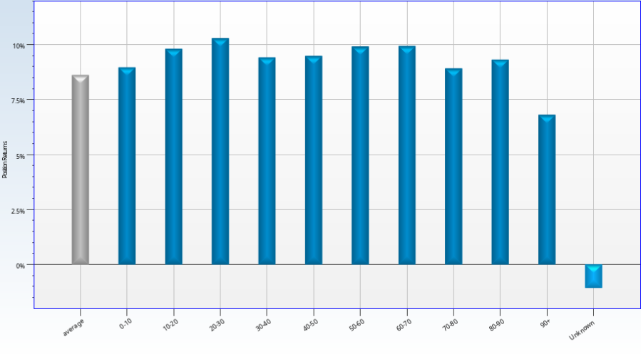
This does not seem to really indicate momentum works, but maybe it works in combination with everything else. Quarterly rebalancing of yearly momentum worked no better. When we ran it on our micro cap stocks, the results were dismal.
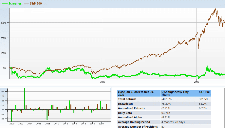
It doesn’t seem to be an auspicious addition to our screen — but it may work anyway. And, if it doesn’t, we can always tweak it to see if one of momentum’s innumerable variations would work better.
3 High Piotroski
The Piotroski score is a stock safety checklist that tests how likely a company is to go bankrupt. It uses 9 factors, and has a more complicted formula as a result. I won’t repeat the results of our examination of it here, but I will comment that the Piotroski score test markedly increases the odds that the stocks which match will survive to be sold. Unsurprisingly, higher piotroski scores mean better performance.
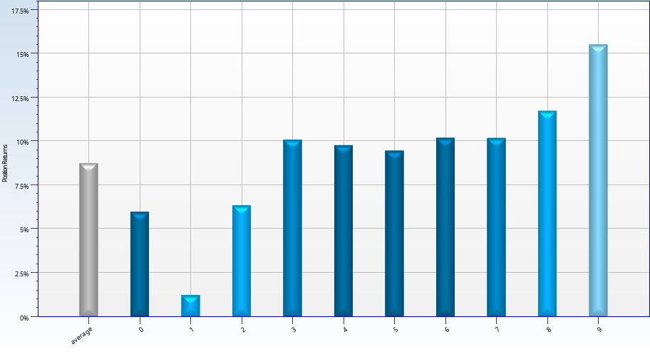
How did the Piotroski score do in our micro-cap situation? This screen evaluates, rebalancing quarterly, all stocks with a Piotroski score of 7,8, or 9, that are also micro cap stocks with a raw close > 1.
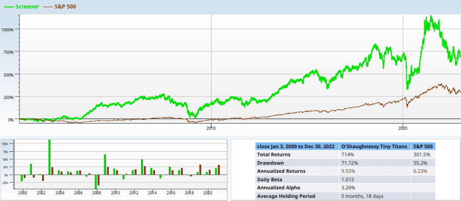
The safe screen isn’t very safe looking. It performs well enough, but loses 25% several times in the last 20 years.
Putting it together
When we actually look at the three criteria we have, we can combine them in seven ways: 3 for each of the three single factor tests (above), three tests where we leave one factor out, and one final one where we include it all. We start by neglecting safety, thus combining value and momentum.
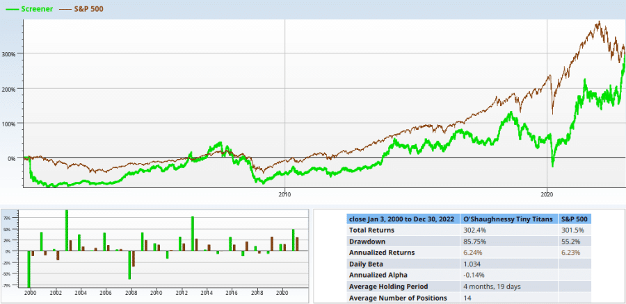
You could argue that this screen’s problems are due to its 80% loss in the Dot Com crash, and you’d be right. But it repeats its losing (66% or more) act twice more, once during the Great Financial Crisis, and once during the pandemic drawdown. If you could predict market trouble perfectly this screen is perfect. But if you had such a crystal ball, you probably would not need a screen like this.
Next up, we neglect momentum, using just the value and safety. This screen (probably due to the safety) manages to lose 66% of its value only once, during the great financial crisis. It’s performance is definitely better, too, managing to beat the market by 10% per year! Perhaps we should just celebrate here, and not look at the two choices remaining, and then tweak the winner. But that would lead to a truncated article, so we’re not going to do that.
Neglecting value, we get the following pile of beans.
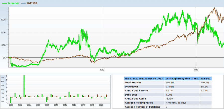
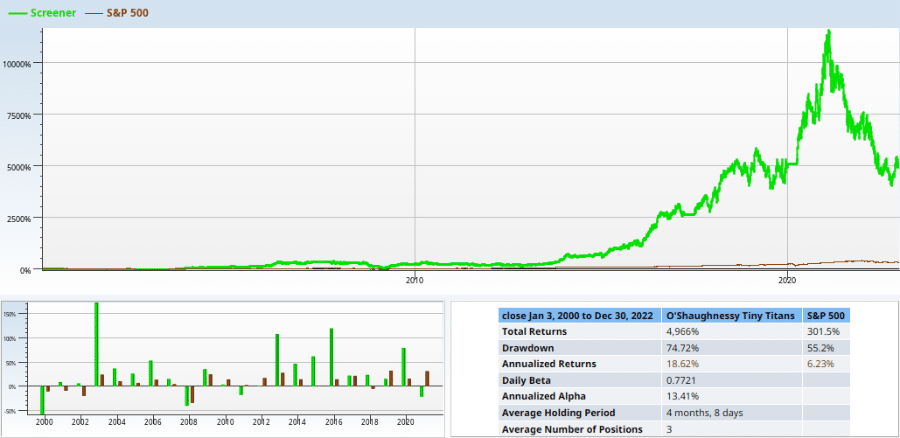
Removing value from the screen gives us much volatility and nothing else, except in 2003, where the screen went up more than 200%! Finally, finally, we try running the O’Shaunessy engine on all cylinders.
Tweaking the Titans
That 50% drawdown right at the end saps my motivation to invest in this screen. The average number of positions being 3 saps it further. Can we fix this screen?
The first thing we try is to change the rebalance period. The other two quarterlies are below:
Rebalance in February/May/August/November

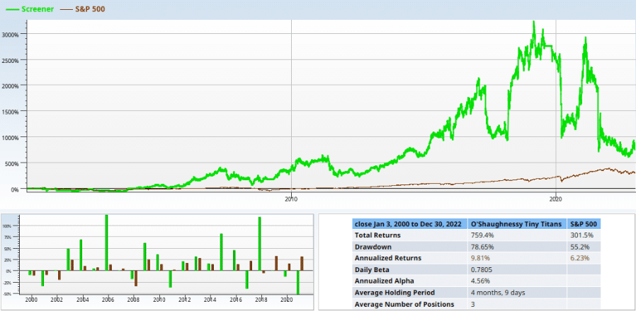
Neither of these screens impress. And neither does the one below (Monthly week 1).
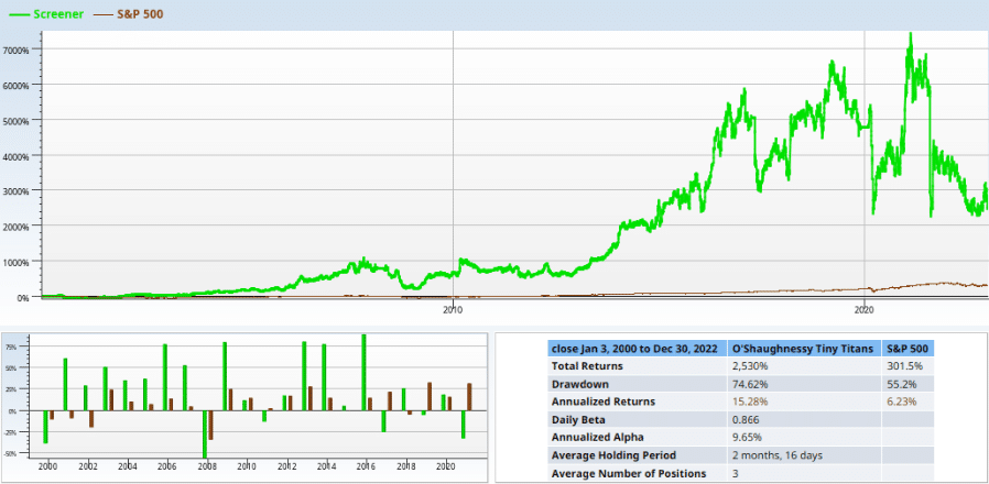
To put more color on it, all of these rebalance alternatives crush the market. The S&P 500 line is this little tiny line at the bottom. These screeners just aren’t done yet — they don’t match enough stocks, and they have too much volatility to make them perfect, even if they are a good thing to have in a portfolio with other strategies.