
My Holdings
If you have one or more Watchlists saved, or you have “bought” stocks in Equities lab, your home page you will show a set of stocks similar to the picture below.
Your portfolio shows all of your watchlists on one heat map on your Home page.
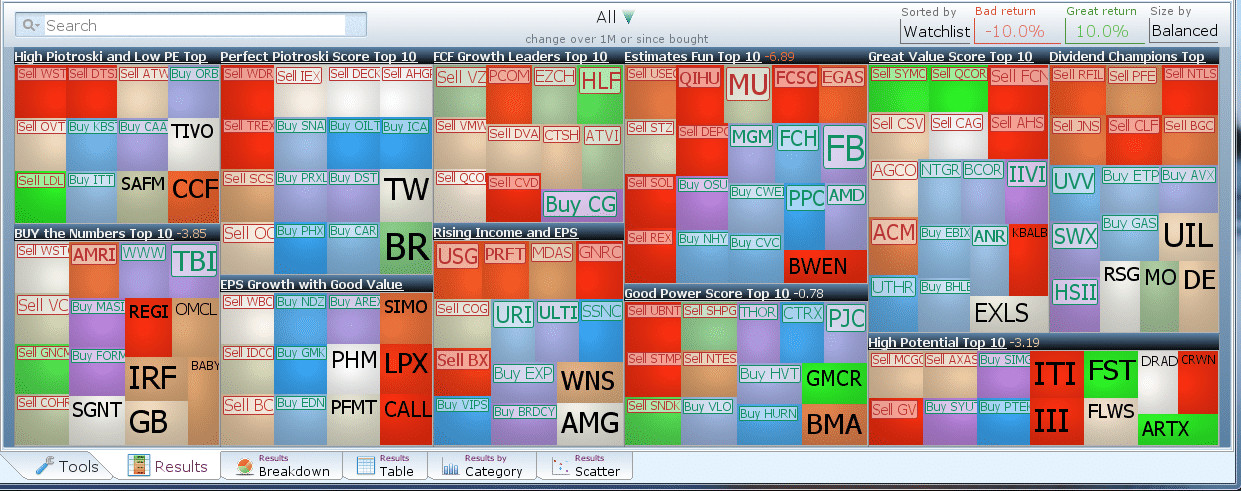
Stocks are separated based on which watchlist they belong to. (The stocks colored red-green are the ones you have bought and the purple-blue colored stocks are buy suggestions from your watchlists.)
If there are any stocks on your watchlist you do not want to buy, click on that stock and select “Never Buy” (this will add it to your blacklist and it will never be used in your analysis).
In this particular account we have 11 watch lists. We want to show you how to analyze each of them.
The scoring we use is a bit tricky, so pay attention:
- If you bought the security within the last month
- Use the price change from the day you bought it
- For all other stocks
- Use the price change from 1 month ago.
With this scoring, you can easily see your stock suggestions and how they have done.
Results By Category
Switch to the Results by Category tab to see which watchlist contains the highest performers over the past month

The Y-axis of the graph is the score. According to the Graph, the stocks currently in the “Rising Income and EPS Growth Watchlist” have performed the best over the past month.
Results Breakdown
Switch to the Results Breakdown Tab at the bottom of the program

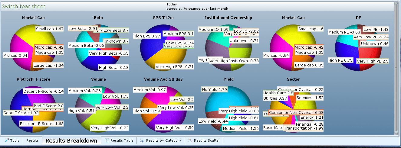
These pie charts tell you a lot about the collection of stocks within your watchlists.
The results of the “Market Cap” pie chart tell us that we probably have too many small-cap and mid-cap stocks (usually means higher volatility).
The Yield pie chart tells us that most of these stocks do not pay a dividend.
The PE pie chart leads us to believe that we have high PE stocks on average.
Plot Extra Information
Switch to the tools tab and search for the property “P/E to Dividend Adjusted EPS Growth Trailing”. Click and drag the property to Show in Results.

Refresh and it will take you back to the heat map where you can hover over a stock to see the P/E to Dividend Adjusted EPS Growth Trailing value.
Try switching to the Scatter Chart and changing the X-axis to sort based on P/E to Dividend Adjusted EPS Growth Trailing instead of Market Cap.
