- Watchlist Introduction
- Whitelisting Stocks With The Buy Tab
- Find Stocks to Buy
- Plotting Data
- My First Watchlist
- Receive Buy and Sell alerts
- Blacklisting Stocks With the Sell Tab
- Breakdown Results With Pie Charts
- Compare Performance Across Categories
- Visualize Composition with Scatter Charts
- Results Table
- Trading Rules
Visualize Composition with Scatter Charts
Learn how to use the Scatter Chart and analyze results with the Scatter Chart properly.
Open the featured watchlist “BUY the numbers” from the Explorer tab.

Switch over to the Results Scatter tab so that we can begin to analyze the results.
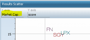
The stocks that show up on the scatter chart currently pass the BUY the numbers stock screener.
The X-axis is sorted by market cap so this chart tells us that the majority of the stocks that pass the BUY the numbers stock screener are small cap.
Also, since the Y-Axis is sorted by score, which is the price change over the past month, this chart tells us that the majority of the stocks in this stock screener had a pretty high price change over the past month.
Is this Watchlist full of high beta stocks or low beta stocks, or high and low? Let’s find out
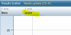
Click on the “X-Axis” function in the top right of the scatter chart, then select Beta from the drop-down menu.
*NOTE: Beta is available for selection by default because it is part of the default Synopsis tear sheet. Change the tear sheet to get different properties to sort by.
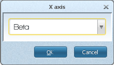
The result of the actions above is a scatter chart that Beta sorts on the X-axis and scores on the Y-axis, like the image below.
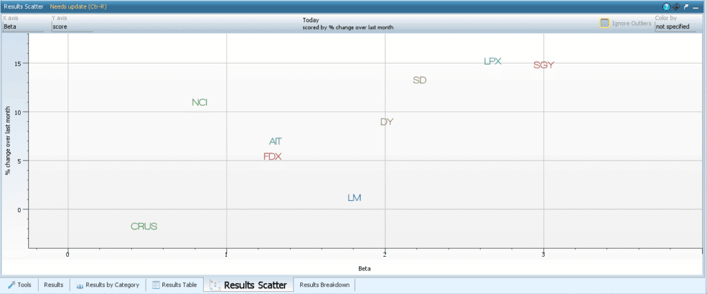
It looks like the BUY the Numbers watchlist yields high beta stocks, which could indicate higher volatility yet higher possible returns.
Now let’s sort the Y-Axis by PE.
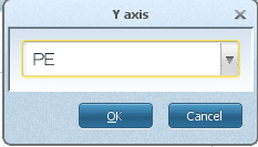
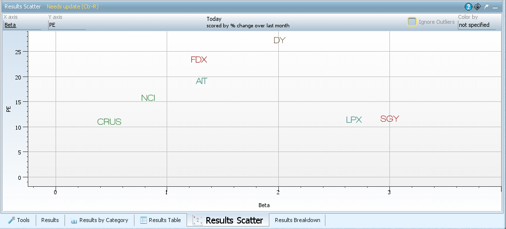
The result of the actions above is a scatter chart that is sorted by Beta on the X-axis and PE on the Y-axis, like the image below.

Over Half of the stocks have a PE below 20. On average, we can conclude that the BUY the numbers watchlist is a standard PE watchlist.
Now click on the Color by function at the top right of the graph and select “score.”
**Score in Watchlists will ALWAYS be price change over one month.

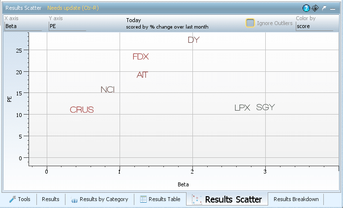
Now the stocks, which were colored randomly at first, are colored by score, which is the price change over the past month. A green stock indicates a higher score relative to the others, and a red stock indicates it had a lower score relative to the others.