Overview
Crafting Strategies
Backtesting
UI Features
Common Models
Filtering and Ranking
Filter and Rank
These screenshots from our software start very simple and will get progressively more elaborate.
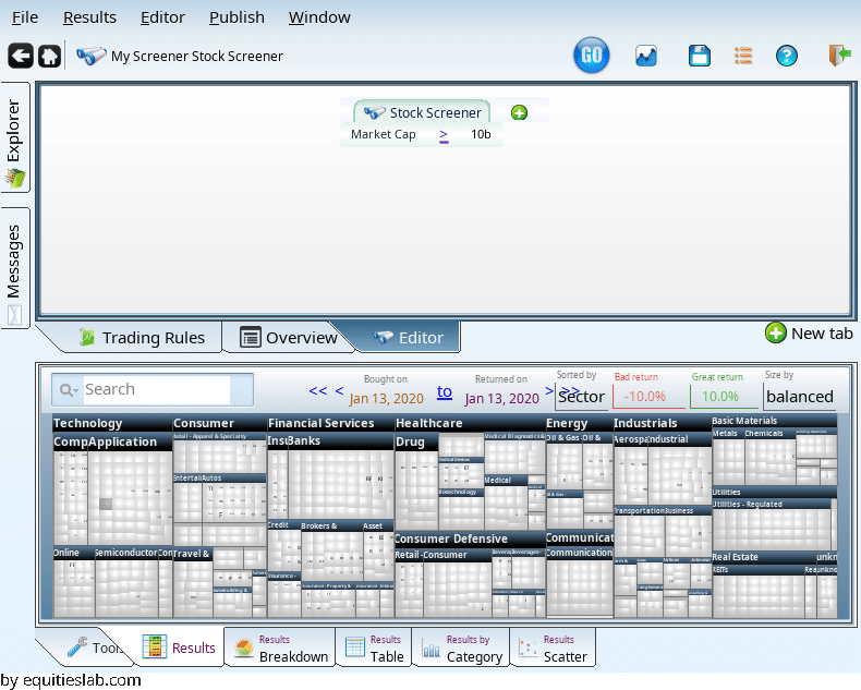
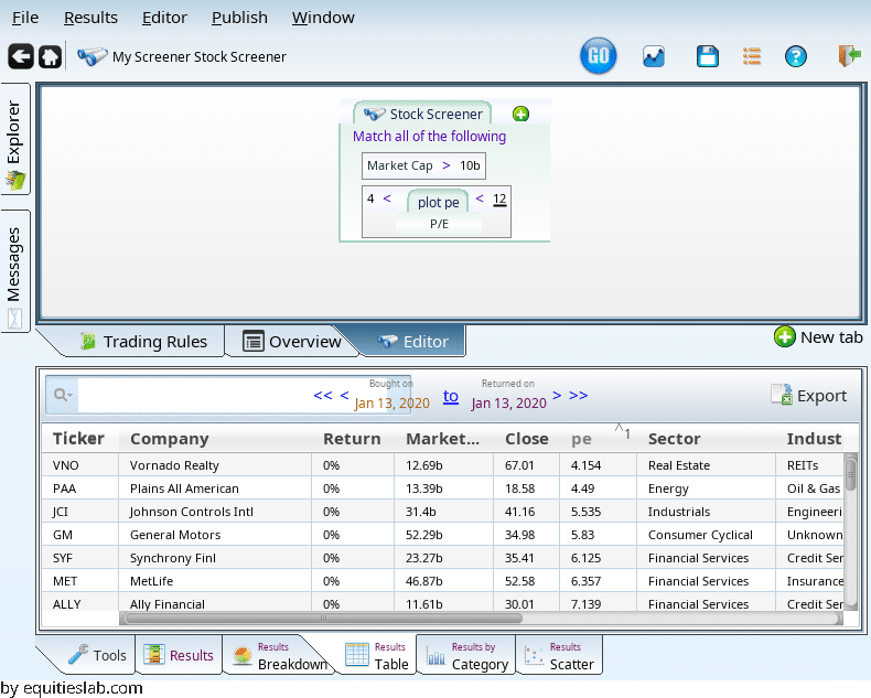
First, lets find large companies!
Now, within that set of companies we want to find companies with decent valuation. We will do that by looking for companies who have a P/E that is less than 12.
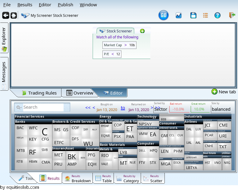
That’s nice, but now we have some companies with really tiny PE values:
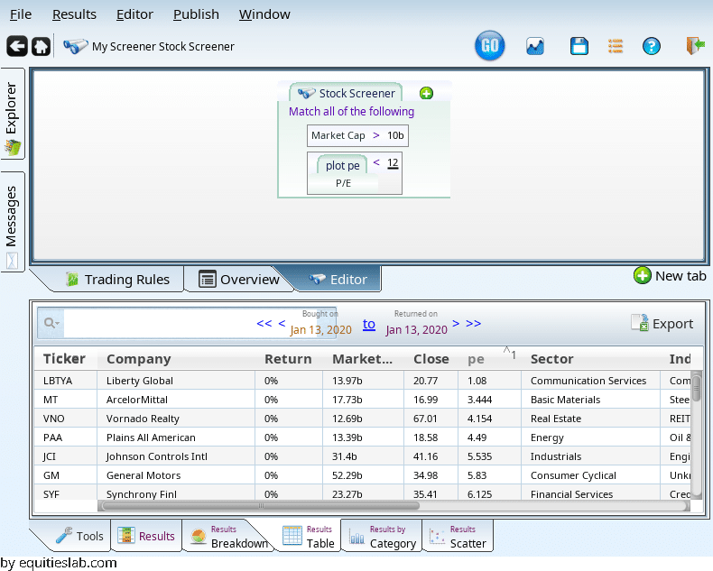
Let’s filter them out (using “add term” on the “<“, and dragging and dropping the terms):
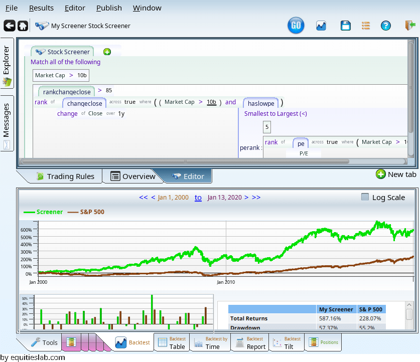
This is nice, but where did I get the 4 and 12 from. Lets do something more molded to the stocks in question. Enter the rank-across operator:
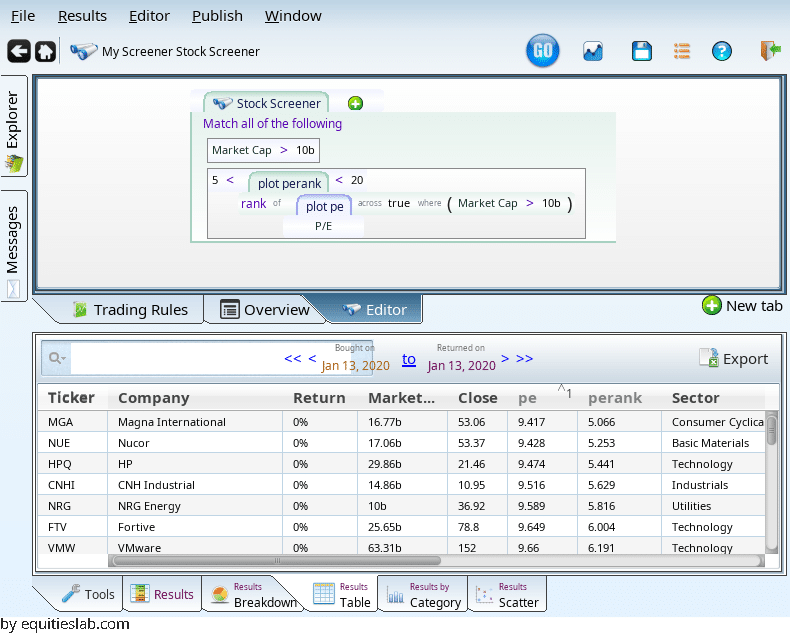
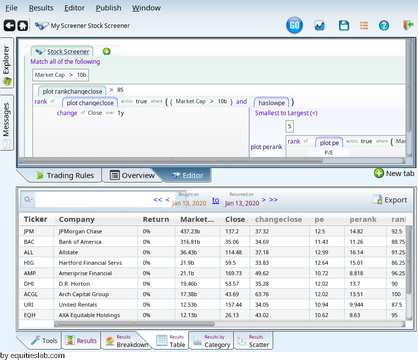
We quickly learn that among large caps, that P/E range is too strict: the 5th percentile is a P/E of 9.47. The 20th percentile is a P/E of 15.We can do multiple rankings:
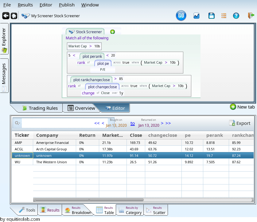
Where did they all go? It turns out that the two overlapping ranks outlawed a lot of companies, since P/E and momentum work against each other. We can nest our rankings, and get more results.
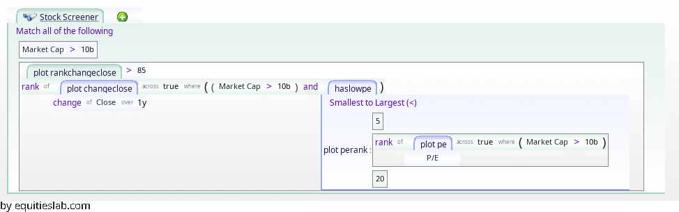
This term gives us the top 15% of the prior matches, sorting by momentum.
How does this do? It is not amazing in the last few years, but before that…
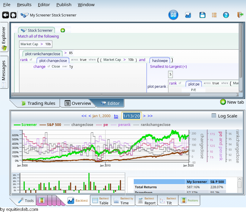
it does pretty well. (If all those average P/E, rank, etc lines are confusing you can un-plot them all with Ctrl-Shift-U)